
Framed! European picture frames from the Johnson Collection, an exhibition at the Philadelphia Museum of Art
Curator’s introduction
A picture frame can be a work of art in its own right. This installation explores how European frames changed from the 1500s to the 1800s, focusing on examples from the John G. Johnson collection. Whilst the artists who made these frames rarely signed their works, their labour and skill remain evident even when their names are lost.

Frames have a practical purpose – they protect the edges of the paintings and make them easier to hang – but they also reflect shifts in artistic tastes. European frames have their origins partly in church altarpieces, which embedded paintings within complex, multimedia structures. In the 15th and 16th centuries, however, as it became more common to display pictures in homes and civic spaces, artists began to think of paintings and frames as separate objects.
Paintings often have several frames over the course of their lives, each revealing stories about the places and people they encountered. Sometimes painters design frames themselves, or work closely with teams of craftsmen to produce frames in keeping with their artistic vision. At other times, the original commissioners or purchasers of the paintings may select their first frames. As pictures change hands, collectors and dealers commonly replace frames to suit their tastes, harmonize with interior designs, or appeal to new buyers. Because the styles of frames alter along with trends in painting, sculpture, and architecture, each new frame can be radically different from the last.
Framed! runs to the end of spring, 2025, with no definite end date – so do check before you go.
An interview with Tara Contractor, curator of the exhibition, and Nicolette Absil, conservator
The Frame Blog : Well, first of all, why are you holding an exhibition of picture frames?
Tara Contractor: When we give tours of the collection at the Philadelphia Museum of Art, frames are always something that visitors are curious about. I wanted to make a show which would respond to that curiosity.
TFB : This is a small exhibition – only thirteen frames – but it includes quite a wide range of nationalities, periods and styles. How did you select the thirteen?
TC : There were a couple of factors. To begin with, I wanted to give visitors an introduction to frames which would encourage them and give them the tools to look closely at frames throughout the Museum. I wanted to highlight examples of the kinds of frames which show up in our galleries, and the kind of information which these frames can teach us about the history of the paintings.

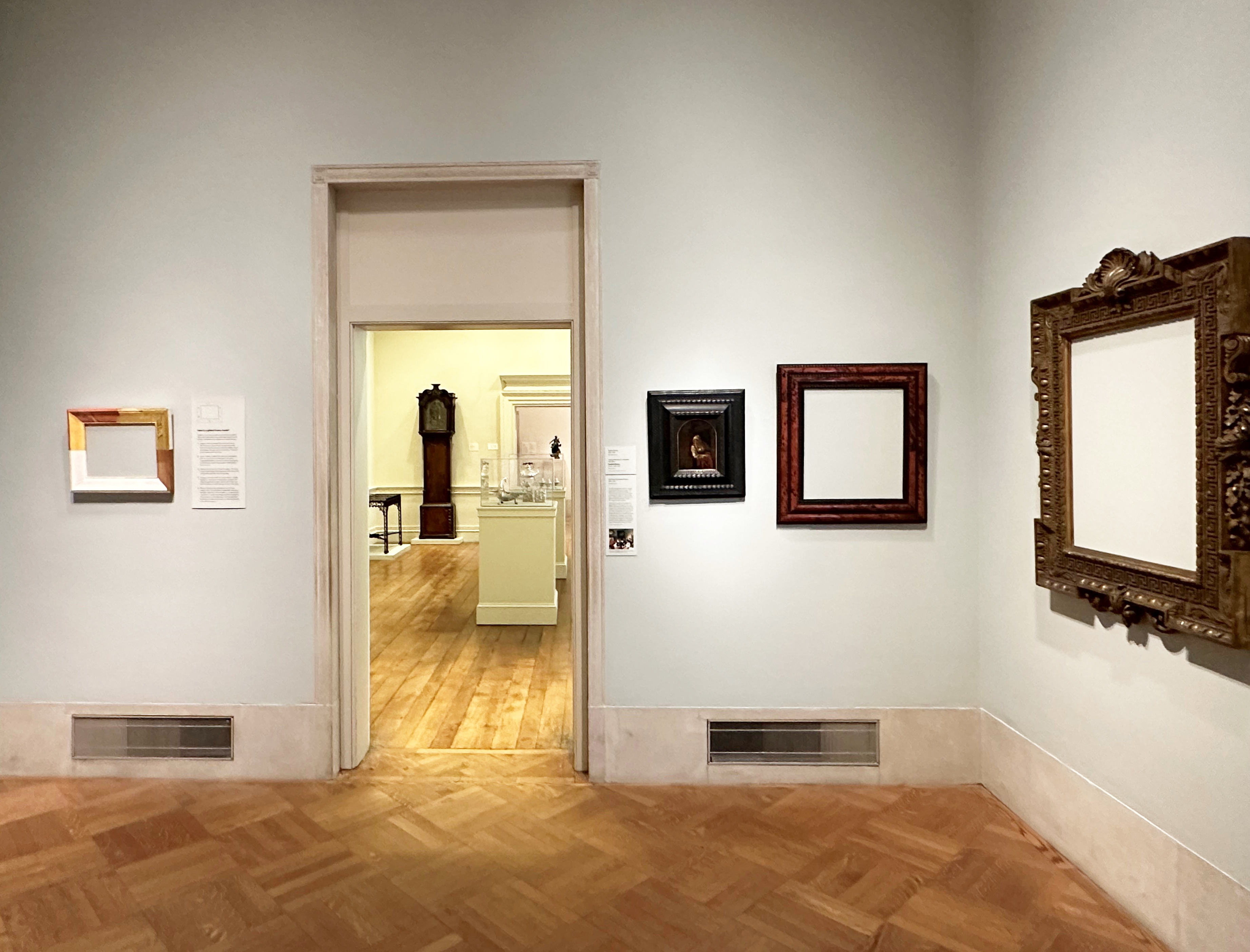
Wall of exhibition, showing (l to r): 17th century black & parcel-gilt cassetta on Leonardo (after), Woman’s head; 16th century Italian? polychrome & parcel-gilt cassetta on Netherlandish School, Courtly scene, c.1525-30; Italian Baroque 17th century giltwood (looking-glass?) leaf frame; small late 16th century parcel-gilt walnut Sansovino frame, possibly provincial; Philadelphia Museum of Art
The show was also specifically developed for the Johnson Study Gallery in the Museum. This is a small space where we present research into the John G. Johnson Collection – a collection of European paintings which was given to the city of Philadelphia in 1917 by Johnson, who was a lawyer here. There are fabulous things belonging to the collection scattered throughout the Museum, but I like to use these annual Study Gallery shows to bring interesting things out from storage which we might otherwise get few opportunities to display.
TFB : Did you think of including more frames, from other collections in the Museum, and widening the scope even more? What about Spanish frames – or Scandinavian – or South American?
TC : Oh, absolutely! We were working with a small space and a small subset of the collection for this installation, but I’d love to do a larger project along these lines, especially since we have Spanish, Scandinavian, and South American frames in the Museum which are well worth further research. My hope is that we could do a larger virtual presentation sometime in the future which would show off the full range of PMA’s frames.
TFB : They are all antique, although not all are original to the paintings they hold (those which do hold pictures); however, two which do have contents stand out for their disparity in date from their paintings. The little panel of St Nicholas of Tolentino, 1481, has a frame made over 400 years later, and the French frame on Van de Velde’s Dutch seascape dates from more than a century later. Why did you include these?
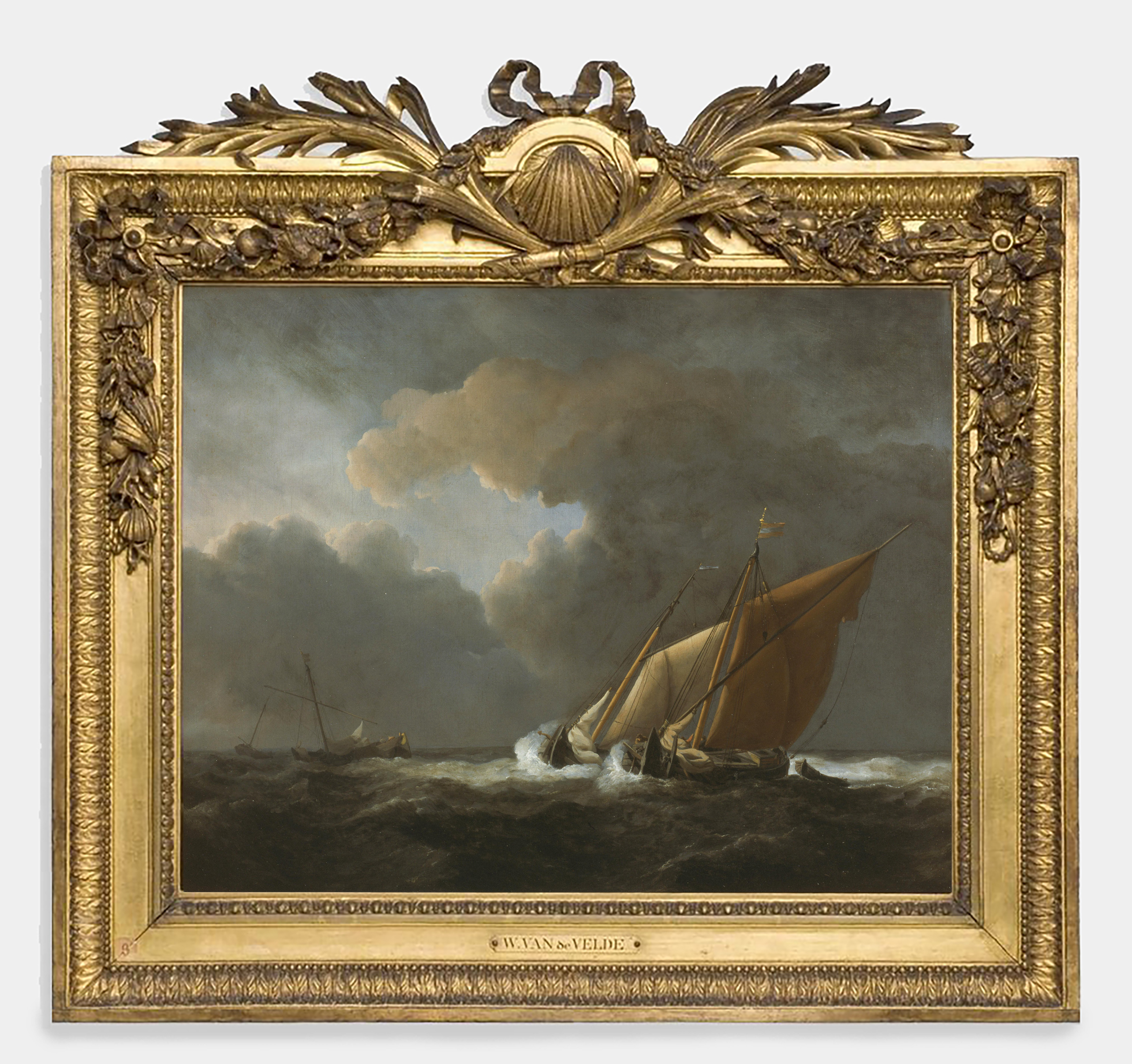
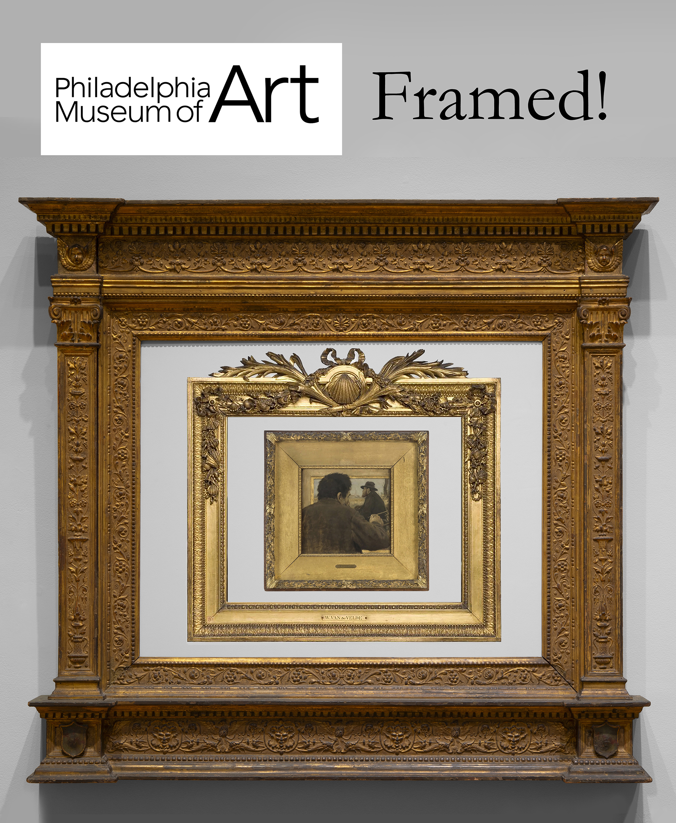
Willem van de Velde II (1633-1707), Two Dutch vessels close-hauled in a strong breeze, c.1672, o/c, 43.8 x 55.7 cm., in French NeoClassical carved giltwood frame with scallop shell, palm leaf and ribbon crest, and festoons of naval trophies and seashells, c.1780, presumably commissioned specifically for this painting; cat. 51, Philadelphia Museum of Art
TC : I wanted to demonstrate that a frame doesn’t have to be original to be interesting. I love thinking about the places where paintings travel over time, and frames can immediately evoke these fantastic journeys. The frame on the Van de Velde tells us about the period that the painting spent in France in the 18th century, probably in an aristocratic residence. And the NeoGothic frame now on St Nicolas of Tolentino gives us such a vivid snapshot of the reception of early Renaissance art at the beginning of the 20th century, and the way in which altarpiece fragments were being reframed to hang in the mansions of the Gilded Age.

Piermatteo Lauro de’ Manfredi (fl.1467-1503), St Nicholas of Tolentino, 1481, tempera & gold leaf/panel, 120.6 x 41.9 cm., part of a polyptych, in Italian NeoGothic frame, 1907, giltwood and polychrome, with barley sugar columns, internal cusped and foliated arch with scrolling tendrils in the spandrels, and inscription on the base (misidentifying the saint as Bernard), made for the collector John G. Johnson, cat. 140, Philadelphia Museum of Art
TFB : Why not include only frames which contain paintings, since that is the reason for a frame’s existence? – and how do you come to have so many empty frames? (seven of the thirteen are empty).
TC : I wanted the gallery to be visually surprising, and to signal straightaway that the focus of the installation would be on frames. I think that emptying the frames forces viewers to view them as sculptures—they might complement paintings but they are also works of art in their own right.

British Palladian ‘Kent’ giltwood frame, c.1730-50, on right, compared in the wall captions with the console table montaged below (William Kent for Chiswick House, London, now V & A)
TFB : What is the theme, if any, of the exhibition, and what do you hope that people will take away from it?
TC : The exhibition is an introduction to frames, and particularly to frames as objects which, like paintings, provide interesting windows into history. I hope that visitors leave the show feeling empowered to look closely at and enjoy the frames across the rest of the Museum.
TFB : What needed to be done, to make all these objects ready to be seen in an exhibition?

Italian giltwood altarpiece frame, possibly c.1512?, possibly Venetian? with anthemia (honeysuckle) and leaf buds in the entablature, symbolic rose (the Madonna) and grape vines (the Eucharist) on the pilasters, a rose vine around the inner frame, dolphins (Christ) and birds (the soul) on the base; usually framing Gerolamo da Santacroce (fl.1503-d.56), Madonna & Child with SS Peter and Giles, o/panel, 73 x 92.4 cm., cat. 184, Philadelphia Museum of Art
Nicolette Absil : The majority of these frames have been on display in the recent past, or were in good condition and needed simply a dusting or minor in-painting. Others needed significant conservation work.
For example, the aedicular frame (for cat. 184, the Madonna & Child with SS Peter and Giles) needed quite a bit of work. Many elements needed to be stabilized with glue. Large areas of dark overpaint – which covered losses – were removed, but also water-gilding. These areas then needed to be in-painted with watercolour and shell paint [mordant gilding] to be visually integrated with the rest of the frame. The shields, which are painted, appeared dark and dirty, so we conducted tests to see which method of cleaning would best remove the grime while maintaining overall cohesion. As a result, the shields were enzyme cleaned; the colouring and some of the decorative elements can now be better appreciated. There were also many areas which needed gilding consolidation.

15th century Italian arched parcel-gilt and polychrome tabernacle with classical palmette crest, rose acroteria at the sides (attribute of the Virgin), inscribed below ‘MARIA MATER DEI’ (Mary, Mother of God), winged cherub’s head in the apron, c.1480; usually framing Master of the Samaritan woman (fl.1490-1510), Madonna & Child, o/panel/canvas, 78.7 x 47cm., cat. 66, Philadelphia Museum of Art; with detail from Carpaccio, Vision of St Ursula, 1479-98, Gallerie dell’ Accademia di Venezia, showing a related domestic altarpiece
Another example which was satisfying was the work completed on the frame for cat. 66 [the round-arched Madonna & Child]. A major decorative gilded element from the top [the palmette] had fallen off and been stored separately. The fragment was recently identified as a part of this frame and reunited with it for this exhibition.
TFB : What particular techniques, in making and decorating frames, are illustrated by these examples?
NA : These frames encompass a broad range of techniques including, but not limited to, woodworking construction and carving, water-gilding, oil gilding, parcel-gilding, faux shell finishing, compo, ebonizing wood and ripple moulding, and painting with and without sgraffito.
TFB : for each of you, which is your favourite frame in this group, and why?
NA : My favourite frame in this group is the aedicular frame for painting cat. 184 [Gerolamo da Santacroce, above]; it’s Italian, and possibly from 1512. It needed quite a bit of work, so I spent a lot of time with this frame and am very happy with the results. Revitalizing this frame was rewarding and gave me the opportunity to appreciate at close quarters the craft and artistry which was used to create it.

Jean-François Raffaëlli (1850-1924), Artist painting, c.1879, o/panel, 52.1 x 53 cm., in French artist’s frame, c.1879, with plaster garland of oak leaves & acorns (strength and endurance), wide oak frieze gilded on the wood, cat. 1065, Philadelphia Museum of Art
TC : This is a hard one! I definitely have a few favourites, but since I haven’t mentioned it yet, I’ll choose the frame on Raffaëlli’s Artist painting. I love it that the frame is so crucial to the painting’s composition, and draws out the self-referential quality of the overall image. It’s a work which communicates so elegantly how important frames are.
TFB : Thank you for answering these questions, and for arranging such a fascinating display in a small compass.

Teaching frame, included in display; it shows, from bottom right, the bare wood; layering of gesso along the bottom rail; incised leaf ornament, lower left; yellow bole, upper left; added red bole, top left; and gilding, top right, partly burnished to a bright sheen
*******************************************
