
A private view of Victorian frames
Martin Beisly’s gallery in Ryder Street, St James’s, has an extremely striking group of Victorian paintings in its present hang, which includes artists’ frames, attributive frames, and depictions of frames, all in a quite small but very rich compass.

William Holman Hunt (1827-1910), The birthday (Edith Waugh), 1868-69, o/c, 40 ½ x 28 5/8 ins (102.9 x 72.7 cm.), Martin Beisly Fine Art
The most striking and important frame is one of Holman Hunt’s own designs for his group of family portraits, on the opulently decorative image of his second wife-to-be, Edith. There are five of these family frames, two of which are on his own self-portraits; the original was given to the collection of artists’ self-portraits held by the Gallerie degli Uffizi, and – until recently – was displayed in the Vasari Corridor.

William Holman Hunt (1827-1910), Self-portrait, 1867, o/c, 40 7/10 x 28 7/10 ins (103.5 x 73 cm.). Photo: courtesy Gallerie degli Uffizi

William Holman Hunt (1827-1910) & Edward Robert Hughes, Portrait of Holman Hunt, post-1907, o/c, The Athenaeum, Pall Mall, London
The copy of the self-portrait (by Hunt with the help of Edward Hughes), made forty years later, also has a replica of the frame. This portrait hangs in the stairwell in the Athenaeum on Pall Mall, where the patina of decades has modified its outré glamour until it more or less fits in with the classical sobriety of Decimus Burton’s architecture.

William Holman Hunt (1827-1910), The birthday (Edith Waugh), 1868-69, o/c, 40 15/16 x 28 ¾ ins (104 x 73 cm.), Toledo Museum of Art

William Holman Hunt(1827-1910), Mrs. George Waugh, 1868, oil on fabric, 33 15/16 x 26 ins (86.2 x 66.1 cm.), The Cleveland Museum of Art, Mr. and Mrs. William H. Marlatt Fund 1984.41
The other two portraits in the series are of Hunt’s first wife, Fanny Waugh, sister of his second wife, Edith, the subject of The birthday, and Fanny’s and Edith’s mother, Mrs Waugh. All five frames (counting the replica on the copy of the self-portrait) derive from the geometric designs which characterize many Pre-Raphaelite frames – those of Millais, Hunt himself, Ford Madox Brown and Rossetti – as well as of Frederic Leighton.

François-Joseph Heim (1787-1865), Charles X presenting awards to the artists at the close of the 1824 Salon, exh. 1827 Salon, o/c, 173 x 256 cm., Musée du Louvre

Camille-Léopold Cabaillot-Lassalle (1839-88), Le Salon de 1874, 1874, 32 x 39.4 ins (81.5 x 100 cm), Christie’s, 21 January 2009
These were frames which were created in revolt from the revival French Baroque and NeoClassical designs filling the exhibition halls of the Royal Academy in London, and, in Europe, the Salons of the major institutions of contemporary art. 19th century revival patterns generally had settled into a conventional and curvaceous vocabulary of convex, ogee or concave profiles, with swept rails, small overall decoration and/or large centre-&-corner ornaments; or with classical architectural motifs, usually applied in multiple ranks. They had the smooth finish of gilding on plaster or compo; when hung in exhibitions they were fitted edge to edge (like jigsaw pieces) on the Salon walls; and when they were purchased from an exhibition, there were few Victorian interiors where they wouldn’t instantly settle into their surroundings.
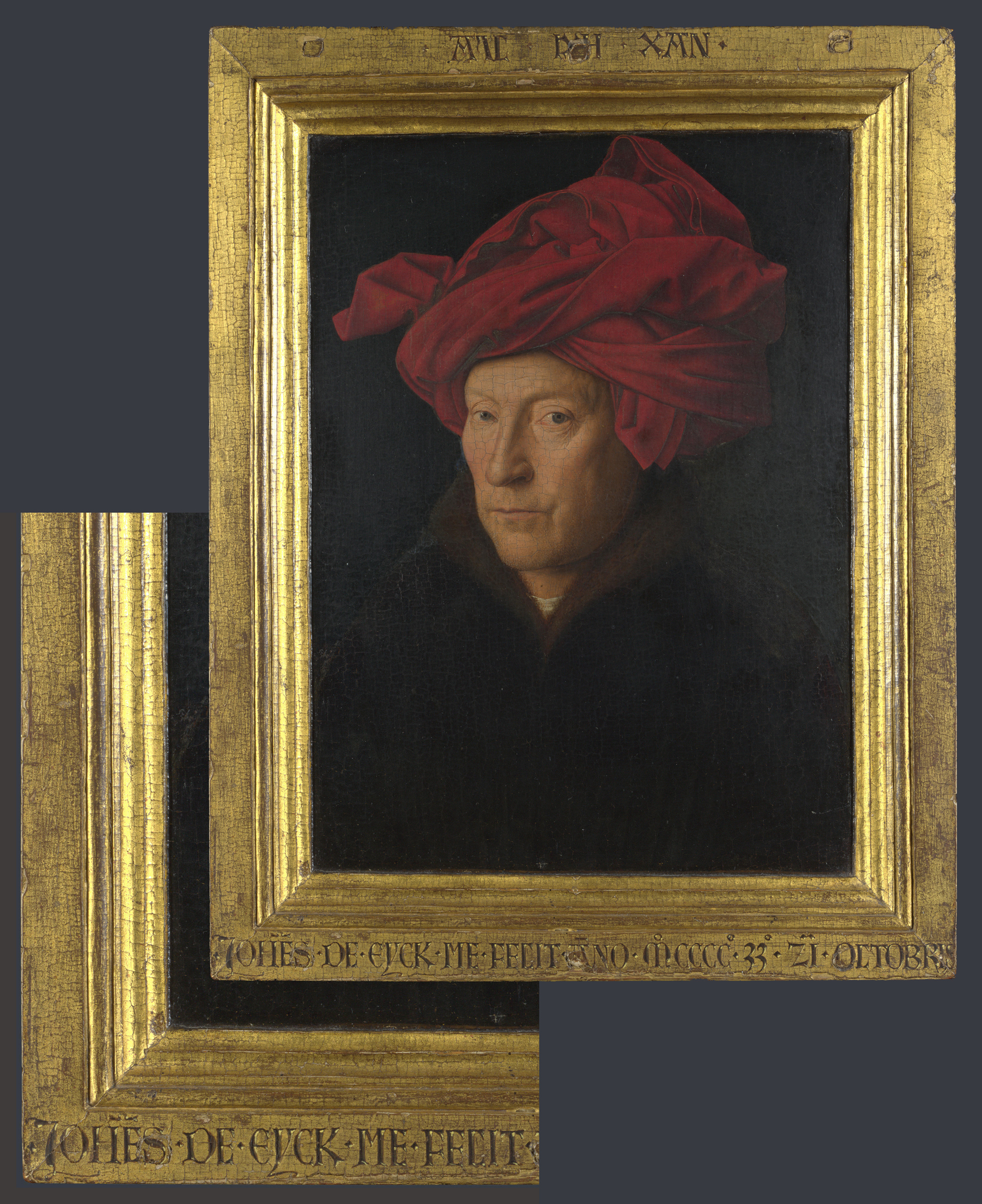
Jan van Eyck (fl.1422-d.1441), Man in a turban, 1433, o/panel, 26 x 19 cm., National Gallery, London
The frames developed by the Pre-Raphaelites, stimulated by and sometimes in partnership with the slightly older Ford Madox Brown (who had grown up and trained in Belgium, and was saturated in the example of Northern Renaissance art, rather than that of the Italians), had a rocky experimental and mediaevalizing start, but gradually settled into a style which broke with traditional profiles and ornament. One of the more avant-garde designs which emerged had a wide flat frieze bordered at the back and sight edge by a small, subtle arc or a canted plane, so that it looked like a thick gilded plank or a slim bar of gold. This appears to have been derived to some extent from the frames of Van Eyck and other Flemish artists familiar to Brown, and encountered by Holman Hunt and Rossetti on an early visit to Belgium and Paris, as well as in the National Gallery, London.
Charles Allston Collins (1828-73), Convent thoughts, 1850-51, o/c, 84 x 59 cm., frame designed by John Everett Millais (1829-96)), Ashmolean Museum, Oxford
The earliest surviving Pre-Raphaelite design (of a non-Gothic revival sort) was famously Millais’s frame for his friend Collins’s Convent thoughts, which is striking for its very minimalist, flat profile. This had great influence, and it is a pity that Millais didn’t – unlike Ford Madox Brown, Rossetti and Hunt – continue to design frames for his or others’ work.

William Holman Hunt (1827-1910), The scapegoat, 1854, o/c, 87 x 139.8 cm., Lady Lever Art Gallery, Liverpool
Hunt used very similar flat or plain cushion profiles throughout his career, with a generally sparing amount of decoration which could occasionally burst into a riot of spectacularly ornamental or symbolic enrichment across the whole face of the frame. These were so spectacularly different from the traditional types of academic frame anticipated in a public exhibition that they, as well as their colourful and minutely-painted contents, must have appeared as strange and alien as the objects displayed in the Chinese Collection of 1842, and in the Japanese Court at the International Exhibition of 1862. Along with Hunt’s The birthday in its extraordinarily innovative and unVictorian frame, Martin Beisly is showing a work by William Frith; Frith used conventional French Baroque revival styles of frame for his work (amongst others), so it seems appropriate to illustrate one of his paintings from the collection of the V & A to illuminate the vast chasm between his and other Academicians’ frames and those of Hunt and his Pre-Raphaelite colleagues.
The Pre-Raphaelites had been influenced, not only by such comparatively unfashionable models as Netherlandish Renaissance frames, but by the views of the writer and critic John Ruskin, one of whose tenets was that architecture and furniture should be constructed from local materials, and from materials which were ‘honest’, in that they did not pretend to be what they were not. Ormolu, for example, was suspect because it was aspiring to be seen as solid gold, and compo was also dishonest, since it aped carved wood, and put the carver out of business by replacing his unique work with infinitely repeatable clones of cast ornament. The Pre-Raphaelites therefore preferred to use carved wood wherever possible, but this was an expensive alternative, and part of the reason for the minimalism of their early frames might be an inability to pay for hand-carving – or at least for the more sculptural and three-dimensional kind. The frame of Frith’s Dolly Varden shows the generally accepted decorative surface of a mid-century frame.

William Powell Frith (1819-1909), Dolly Varden, 1842, o/c, 54.6 x 44.5 cm., © Victoria and Albert Museum
It has an ogee profile, thickly encrusted with low-relief foliate ornament, with rocaille cartouches in the corners, scrolling leafy centres, and a small-scale S-scrolled contour. All the decoration is made of applied pressed compo, covered with uniform oil-gilding, which was a less labour-intensive alternative to water-gilding. The difference from, for example, Hunt’s frame for the small version of The afterglow in Egypt (below), made twenty years later, The finding of the Saviour in the Temple and The shadow of death, could hardly be more extreme.

William Holman Hunt (1827-1910), The afterglow in Egypt, 1861, o/c, 82 x 37 cm., Ashmolean Museum, Oxford

William Holman Hunt (1827-1910), The finding of the Saviour in the Temple, 1854-56, Birmingham City Art Gallery
William Holman Hunt (1827-1910), The shadow of death, 1870-73, Manchester City Galleries

Frederic Leighton (1830-96), Sisters, 1862, o/c, 76.2 x 38.1 cm., Private collection
Other artists who picked up on the flat or architrave profile as a mute rebellion against the revival French Baroque academic frame were Frederic Leighton and Albert Moore. Leighton sometimes used painted decoration to stand in for the more costly hand-carved kind on his solid, smoothly gilded frames for smaller paintings; Moore used rows of small architectural ornament carved into a flat profile.
William Holman Hunt (1827-1910), The birthday (Edith Waugh), 1868-69, and detail, Martin Beisly Fine Art
Another geometric design, Hunt’s The birthday uses the completely flat architrave frame which had been the basis for the small Afterglow in Egypt of 1861. Like the other family frames in the series, it is constructed using right-angled butt-joints which swing round the four corners in a swastika pattern, highlighted by zig-zag strokes engraved over them as though they had been riveted together. A line of square bone inlays crosses the corners diagonally; there are roundels outside these diagonals, and the inner contours have triangular indentations. This could almost be an art deco design from the early 20th century.
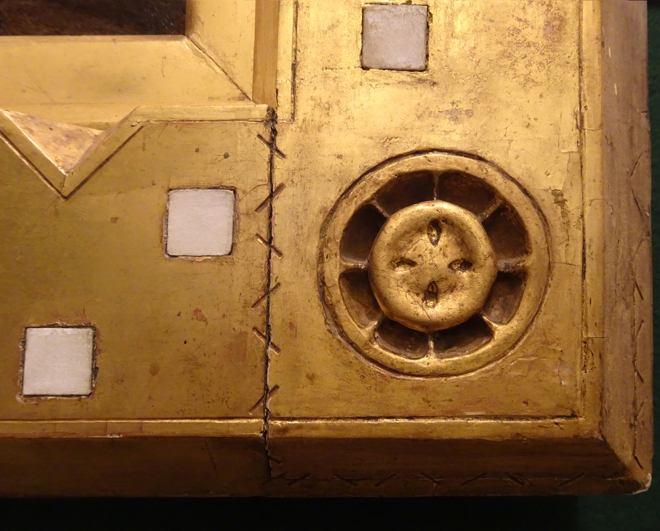
Hunt, The birthday (Edith Waugh), detail of roundel
The roundels in the corners are interesting; scooped out in segments within an outer edge like peel, and with an applied circular patera stamped with pip-shaped grooves, they mimic half of a cut lemon or orange, and recall Rossetti’s fruitlike medallions; perhaps they even inspired Rossetti’s versions, which he used from c.1868/71 – i.e. from at least a year after the frames for Hunt’s Self-portrait and his painting of Fanny.
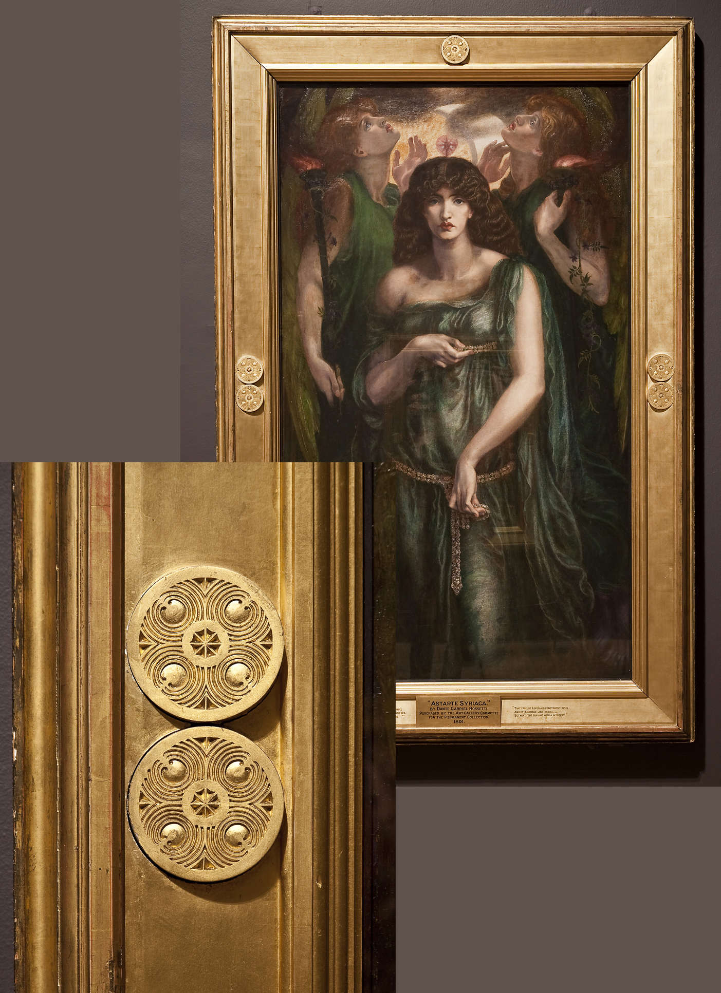
D.G. Rossetti (1828-82), Astarte Syriaca, 1877, o/c, 185 x 109 cm., Manchester CAG
Alastair Grieve has compared Rossetti’s medallions to ‘the seed formations of an exotic fruit’, and they are partly pomegranate-like (with reference to the pomegranate as a symbol of resurrection in Greek and Christian mythology [1]), partly apple-like (the apple being generally used as the fruit of the Tree of the Knowledge of Good and Evil), and with underlying hints of citrus in the central segmental core.
Citrus fruit (oranges) were interpreted as the golden fruit growing in the garden of the Hesperides, rather than apples, and thus as being symbolic of marital love, since they grew from the original fruit given by Gaia, the earth, to Zeus and Hera on their wedding day. Oranges also appear on the windowsill in Van Eyck’s Arnolfini marriage portrait, a painting which Hunt particularly remarked upon in his memoirs, where they are similarly connected with marital love. Citrus (lemons) were also associated with death and resurrection. For both these reasons, Hunt may have chosen to represent them on his family frames, celebrating his love for and marriage with both the Waugh sisters, and his bereavement of Fanny. Mrs Waugh is shown in modified mourning, and the roundel is equally appropriate for her loss of her daughter.
The bone inlay takes the form of squares in the portrait of Edith, wedges on Mrs Waugh, and – on the three portraits of Hunt, the copy Hunt, and Fanny – quatrefoils: not the round intersecting circles of a British Gothic quatrefoil, but the pointy Islamic quatrefoils which Hunt would have seen on his travels in the near East. Bone inlay was a very Victorian use in inlaid furniture, also showing Syrian influence, and replacing the need for ivory. Like the triangular indentations in the corners of the frames, the pairs of which open the corner itself into a half a six-pointed star, the bone inlays, especially the quatrefoil inlays, were a specific link to Hunt’s travels, as was the costume he wears in his self-portrait.

William Powell Frith (1819-1909), The private view at the Royal Academy, 1881, o/c, 40 ½ x 77 ins (102.9 x 195.6 cm.), Martin Beisly Fine Art
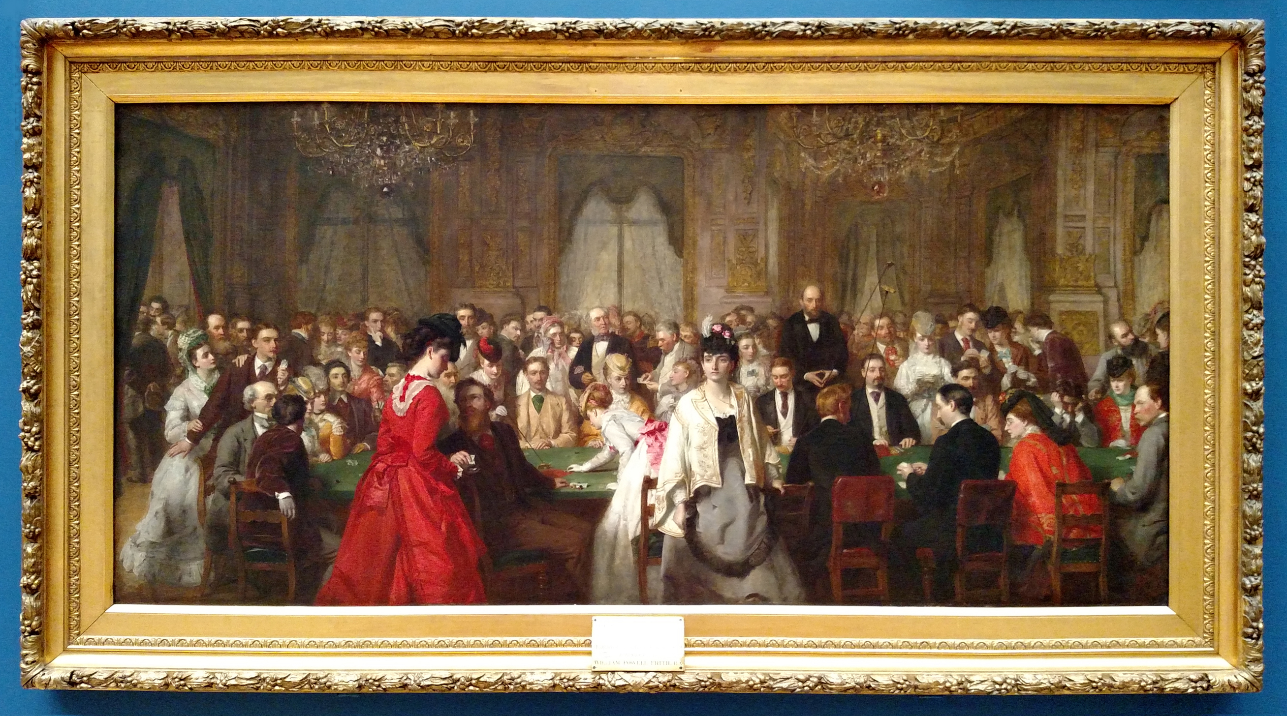
Also in Martin Beisly’s exhibition was Frith’s A private view at the Royal Academy (now sold) – one of the artist’s great ensemble paintings, like his Derby Day, The railway station, and The Salon d’Or, Homburg. It was topical, satirical, and immensely popular with Frith’s contemporaries, although it has a great deal in common with the apparently straightforward descriptive paintings by Heim and Lasalle shown here – the public exhibition as a cultural and social event, and a celebration of the artist and his art.
François-Joseph Heim (1787-1865), Charles X presenting awards to the artists at the close of the 1824 Salon, exh. 1827 Salon, o/c, 173 x 256 cm., Musée du Louvre
Camille-Léopold Cabaillot-Lassalle (1839-88), Le Salon de 1874, 1874, 32 x 39.4 ins (81.5 x 100 cm), Christie’s, 21 January 2009
The catalogue produced on Frith’s painting records the facts that Frith was granted permission by the Council of the Royal Academy in July 1881 to make drawings out of hours in Gallery III of the RA, and that he later wrote for further permission for a photographer to be allowed take pictures of the same gallery [2]. The paintings in the hang were thus recorded very accurately, and presumably the frames as well; they give a fair impression of the variety of patterns used by contemporary academic artists: plain concave frames, fluted NeoClassical frames, cassetta-style frames with canted or flat friezes, French Baroque revival frames with centre and corner emphases, frames with garlands of leaves, stepped frames and reverse mouldings.

William Frith, The private view at the Royal Academy, 1881, detail of Millais and a ‘connoisseur’

J.E. Millais (1829-96), A Jersey Lily (Lily Langtry), 1878, o/c, 109 x 85 cm., Jersey Museum & Art Gallery, St Helier
The portrait of John Caird by Millais, hanging immediately behind the artist, appears for example to have a ‘Watts’ frame, a type Millais used quite often for his portraits – as on his painting of one of the other characters in Frith’s Private view, the actress Lily Langtry; a portrait which had been exhibited in these same galleries three years earlier. On the other hand, the frame on Alma-Tadema’s Sappho and Alcaeus, the object of earnest study by the little man next to Millais, has a frame which really has only its wide canted inlay in common with the artist’s frame still on it in the Walters Art Museum, Baltimore. Frith’s accuracy cannot be taken for granted. The one thing that we can tell from the massed ranks of gilt-edged tesserae mosaicking the walls of the Royal Academy in the background of his picture is that the rule making gilded frames compulsory in the Summer Exhibition, laid down in 1847, was still in force in 1881 [3], just as in the French Salon – although there an enormous concession was made in 1884, allowing ‘as well as gilded mouldings, frames which were black or made of stained wood’ [4].

William Frith, The private view at the Royal Academy, 1881, detail of frame
Frith’s own frame was always going to be a gilded pattern, almost inevitably decorated with compo, although updated from the style of his Dolly Varden frame nearly forty years earlier. It is rectilinear, with three orders of classicizing ornament – astragal-&-double bead on the back edge, enriched acanthus moulding, and an imbricated leaf bud above the wide inlay (used for a key to the figures who throng the private view). It is possible that Frith ordered it from Agnew’s, the Bond Street dealers who had started out in Manchester where they had a framing factory. Their stock books include details of the artists who every year ordered their frames for the Royal Academy exhibition (one of whom was Millais); a convenience, since Agnew’s was so close to the RA.

William Powell Frith (1819-1909), Derby Day, 1856, o/c, 101.6 x 223.5 cm, Tate Britain
Frith’s large crowd scenes are spread out through his career; the first being Ramsgate Sands of 1851-54, then Derby Day of 1856, The railway station (1862), and The Salon d’Or (1871). The frame of Derby Day is completely plain; a heavy, solidly architectural entablature, weighting down the frivolities of its subject with a hefty bit of carpentry, but not requiring any expensive input in terms of decoration. The painting was commissioned for the set price of £1,500, which may explain this; many artists liked to pass on the cost of the frame to their patron or purchaser, but the extra cost had to be agreed on beforehand, or the artist was liable to run into difficulties with his client and subsequent criticism by his peers – as Turner found out with his frame for The Bridgewater Seapiece.

William Powell Frith (1819-1909), The railway station, 1862, o/c, 46 x 101 ins (116.7 x 256.4 cm.), Royal Holloway College
The railway station, on the other hand, has a decoratively extremely rich frame. Once again it’s very weighty: a wide moulding frame with a Baroque profile, covered over most of its width with moulded ornament, including a skin of finely-detailed pressed compo decoration in the hollow, and raised corner motifs. The painting was produced in a kind of partnership with a dealer, Flatow or Flatou, who purchased it, along with the studies made for it and all the reproduction rights; it was exhibited in a commercial gallery, and those who went to see it were encouraged to order an engraving. It was then bought outright, along with the list of subscribers, by a firm of engravers. Flatow would presumably have ensured that it was given a frame which would display it to best advantage in the gallery, and make the spectators more eager to possess an engraving, so this is almost certainly the original frame (regilded). The cost of buying The railway station from Flatow, along with the list of subscribers, was quite high; his profit was over £13,000 on an outlay of around £5,250, which was a great deal of money in 1862 [5], and the engravers would thus probably not have wanted to pay for a change of frame as well. When it was finally sold to Thomas Holloway in the early 1880s, he was building up a collection of paintings for the art gallery he saw as a desirable attribute for Holloway College, which he had set up in 1879 specifically for the tertiary education of women; he was thus also unlikely to wish to spend unnecessary money on a new frame whilst there were still paintings to acquire.
William Powell Frith (1819-1909), The Salon d’Or, Homburg, 1871, o/c, 49.3 x 102.5 ins (125.1 x 260.4 cm.), Rhode Island School of Design, Providence
Frith exhibited The Salon d’Or at the Royal Academy in 1871, having previously sold it the year before, also to Flatow. This has a revival Louis XIII-style frame which is unlike those on Frith’s other ensemble paintings, being lighter – less solidly Victorian and academic. It may have been chosen to support a Continental subject with a vaguely Salon pattern, and thus might be more inventive in its intention than Frith’s other frames for these large crowd scenes appear to be. It is interesting how much all four frames shown here differ from each other – more, perhaps, than can solely be explained by the years between them. However, the Salon d’Or frame does also hint in a circular way at the possibility that Frith was using the style of frame chosen by many exhibitors in the Royal Academy as appropriate for A private view (Millais’s late landscapes, for example, had very similar frames), and to underline the opposition between the establishment style of the art hanging on the walls, and the satirically-presented intrusion of aesthetes into the exhibition.
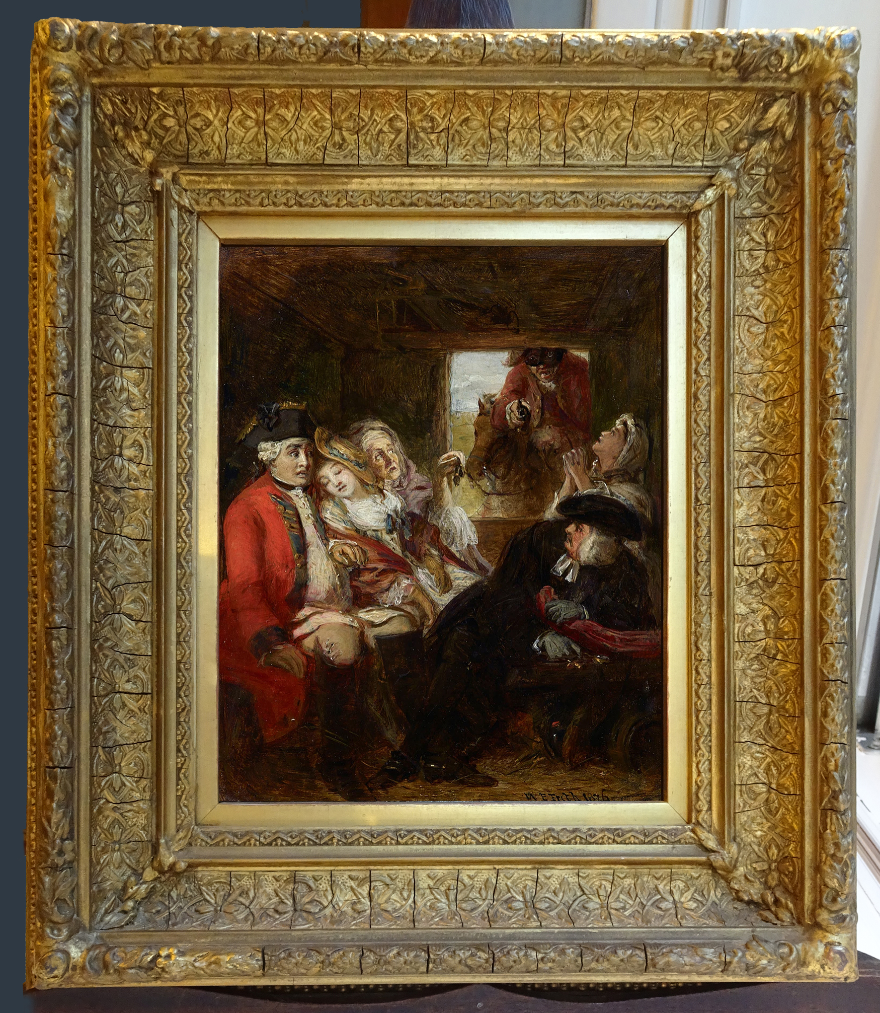
William Powell Frith (1819-1909), A stagecoach adventure in 1750: Bagshot Heath – a sketch, 1876, o/board, 7 7/8 x 6 5/8 ins (20 x 16.9 cm.), Martin Beisly Fine Art
Another Frith in Martin Beisly’s collection is very small indeed in comparison with A private view; it dates from five years earlier, and has a frame completely covered with decorative (if rather brittle) compo. The hollow NeoClassical-style profile is completely different from the French-inspired frame of Dolly Varden, thirty-four years before, but the similar overall pressed compo crust was the medium of ornamental choice for much, if not all, of the 19th century where academic artists were concerned. There is no sense in which the particular motifs used here are in any way attributive or connected with the subject of the painting; indeed, the flower held in the strapwork quatrefoils in the hollow seems to be an edelweiss. The main aim of such a frame was really to create a subtle shimmer of light and movement around the picture, and to provide a wide border between the image and the wall. The patina it has acquired over 150 years has softened it to a gently glowing ochre, which fits the period and subject perfectly.

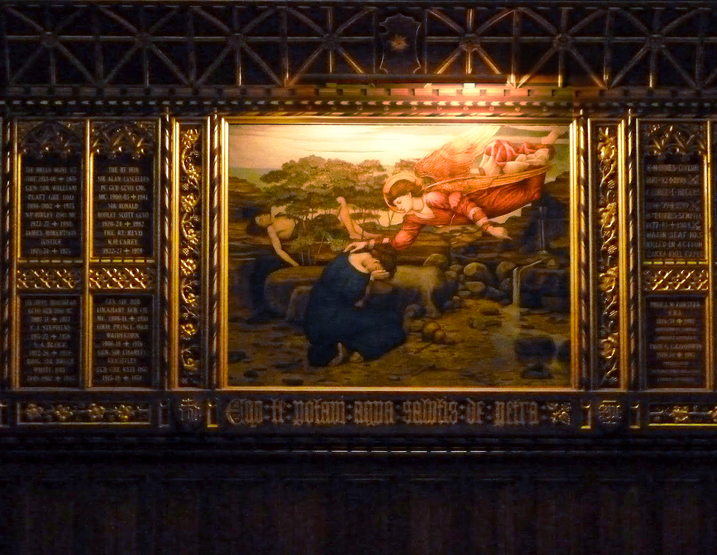
John Roddam Spencer Stanhope (1829-1908), A design for the reredos at Holy Trinity Church, Florence, 1890s, pen-&-ink, watercolour & bodycolour; frame parcel-gilt mahogany, overall 54 ½ x 33 7/8 ins (138.5 x 85.9 cm.), Martin Beisly Fine Art
Also in the gallery is Spencer Stanhope’s study for the full-scale 30 foot-high altarpiece he painted as part of his contribution to the construction of a Protestant church in Florence. This has an extraordinarily elaborate NeoGothic frame, a small version of the final altarpiece, both of which were made in Florence by Spencer Stanhope’s Florentine framemaker, Bertini [6]. He had been spending every winter there from 1863, and in 1873 bought a villa outside Florence, eventually moving to live in it full-time. His niece, Evelyn De Morgan, visited him quite frequently, and began to order her frames in Florence, as did J.M. Strudwick. This small group of artists was thus able to circumvent the lack of experienced carvers in London (the few firms where there were still carvers and gilders must have been up their ears in work, what with the Pre-Raphaelites, Albert Moore and Whistler, and Olympians such as Leighton, Poynter and Alma-Tadema), and also the greater cost of commissioning hand-carved frames in England. The framemakers of Florence still produced revivals and adaptations of Renaissance and Baroque mouldings, very conveniently for artists who lived there or were visiting. Evelyn De Morgan produced a great many paintings in Florence which were framed and left there, only being shipped home at the outbreak of the First World War in 1914. It was less convenient for those, like Strudwick, who lived mainly in England; at one point he was reduced to writing apologetically to his client, excusing the non-appearance of a frame,
‘I always, or almost always, have carved frames for my pictures, and it is not easy to get such work satisfactorily done in England. I used to have my frames from Florence… but I found it troublesome dealing with people so far away… My trouble with the London man is hardly less’ [7].
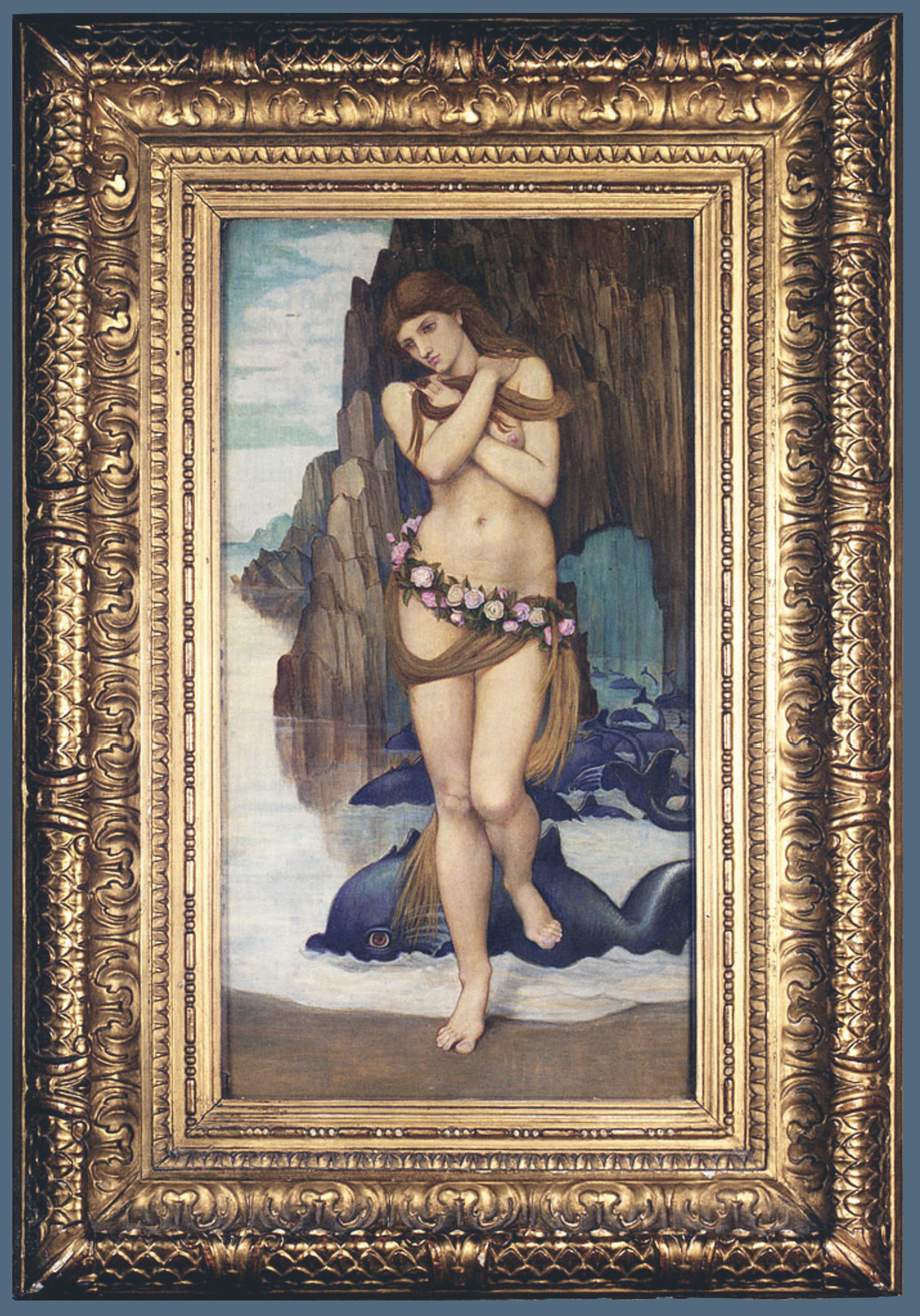
John Roddam Spencer Stanhope (1829-1908), The birth of Venus, 1875, tempera on panel, 20 ½ x 11.81 ins (56 x 30 cm.), ex-The Leicester Galleries
Spencer Stanhope had none of these problems when Bertini was his local framemaker. In the beginning, however, he almost certainly had frames sent back to Cobham, Surrey, where he spent his summers. The frame of the 1875 Birth of Venus is almost certainly Florentine, and a good example of the type of pattern also favoured by Strudwick and Evelyn De Morgan, with multiple orders of boldly-carved ornament. This one in particular has the look of a piece made by someone not unaware of the ‘Medici’ frames in the Uffizi – notably the scaly embrace applied to Titian’s Bishop Ludovico Beccadelli.
The frames or frameworks of the various religious works painted specifically for churches by Spencer Stanhope were completely different from the fleshily sensual gilded frames that he chose for his secular pictures and some general religious subjects. He worked with the architect G.F. Bodley on several churches in England, as well on Holy Trinity in Florence, and another Anglican church there – St Mark’s Church – his job being to provide decorative painting of walls and furnishings, as well as figurative panels, pictures and altarpieces.

George Frederick Bodley (1827-1907), organ case; 1861-63; panels & decorative painting by J.R. Spencer Stanhope, St Martin-on-the-Hill, Scarborough
The organ case of St Martin’s in Scarborough was designed by Bodley, and the panels painted by Spencer Stanhope, who may also have executed the decorative painting of the case. This has a dark reddish ground, picked out in black with parcel gilding, which creates an approximation of the parcel-gilt mahogany frame of the Holy Trinity study. Some of the motifs are also repeated, such as the square four-petalled gold florets.
John Roddam Spencer Stanhope (1829-1908), one of twelve painted panels, c.1886, Chapel of St Michael & All Angels, Marlborough College
In the mid-1880s, Bodley and his partner, Thomas Garner, built a new chapel for Marlborough College, which is decorated around the walls with a continuous Gothic revival screen in dark wood picked out in gold, holding twelve panels painted by Spencer Stanhope. This screen shares further motifs with the Holy Trinity frame, include the parcel-gilt grapevine and the florets (five-petalled, here). Similarly, Spencer Stanhope’s family’s parish church at Cawthorne in Yorkshire was restored by Bodley in 1875, and now contains a dark wooden parcel-gilt pulpit, which was apparently carved in Florence; again it has painted panels by Spencer Stanhope.
This shared history of paintings and design within a number of Gothic revival churches suggests that Spencer Stanhope may not have been solely responsible for the frames of the large Holy Trinity altarpiece and its small study, although he was resident near Florence and commissioning his own frames at the time they were created. They may have been a joint effort by the artist and Bodley, a tripartite design with the help of Bertini, the framemaker, or possibly just Bodley’s alone.

John Roddam Spencer Stanhope (1829-1908), Altarpiece of the Resurrection, Memorial Chapel, c.1892-96, Holy Trinity church, Florence; contemporary photo, probably by Carlo Brogi (1850-1925)
Spencer Stanhope had previously painted panels for another altarpiece in Holy Trinity church, this time in the Memorial Chapel (c.1892-96; illustrated by Judy Oberhausen and Nic Peeters in their article on the study for the main altarpiece [8]). Once again, this seems to be parcel-gilt on dark wood, with tiny florets on the top edge. This altarpiece was later dismantled and sold during the long dark winter of anti-Victorianism, and its panels are now in separate private collections; the frame has long gone. The same thing happened to the main altarpiece of the church, for which the watercolour version in Martin Beisly’s gallery is the elaborate study:
‘Forty years ago, Holy Trinity Church was taken over by the Waldensians, a Calvinist sect, and Stanhope’s altarpiece was removed from public view: today its actual whereabouts is unknown’ [9].

John Roddam Spencer Stanhope (1829-1908), A design for the reredos at Holy Trinity Church, Florence, 1890s, Lady Chapel, Christ Church, Esher, Surrey. Photo: with thanks to John Salmon: The Victorian Web
The study hung for a long time in Christ Church in Esher, having been presented by Spencer Stanhope’s stepdaughter in 1936, but was then moved to Guildford Cathedral and sold by Christie’s in 2016 [10]. The chance to see it close to reveals a striking example of late 19th century sacred art, not only in the piercingly colourful watercolour panels by Spencer Stanhope, but also in the craftsmanship of the frame, with its panels of gilded filigree.
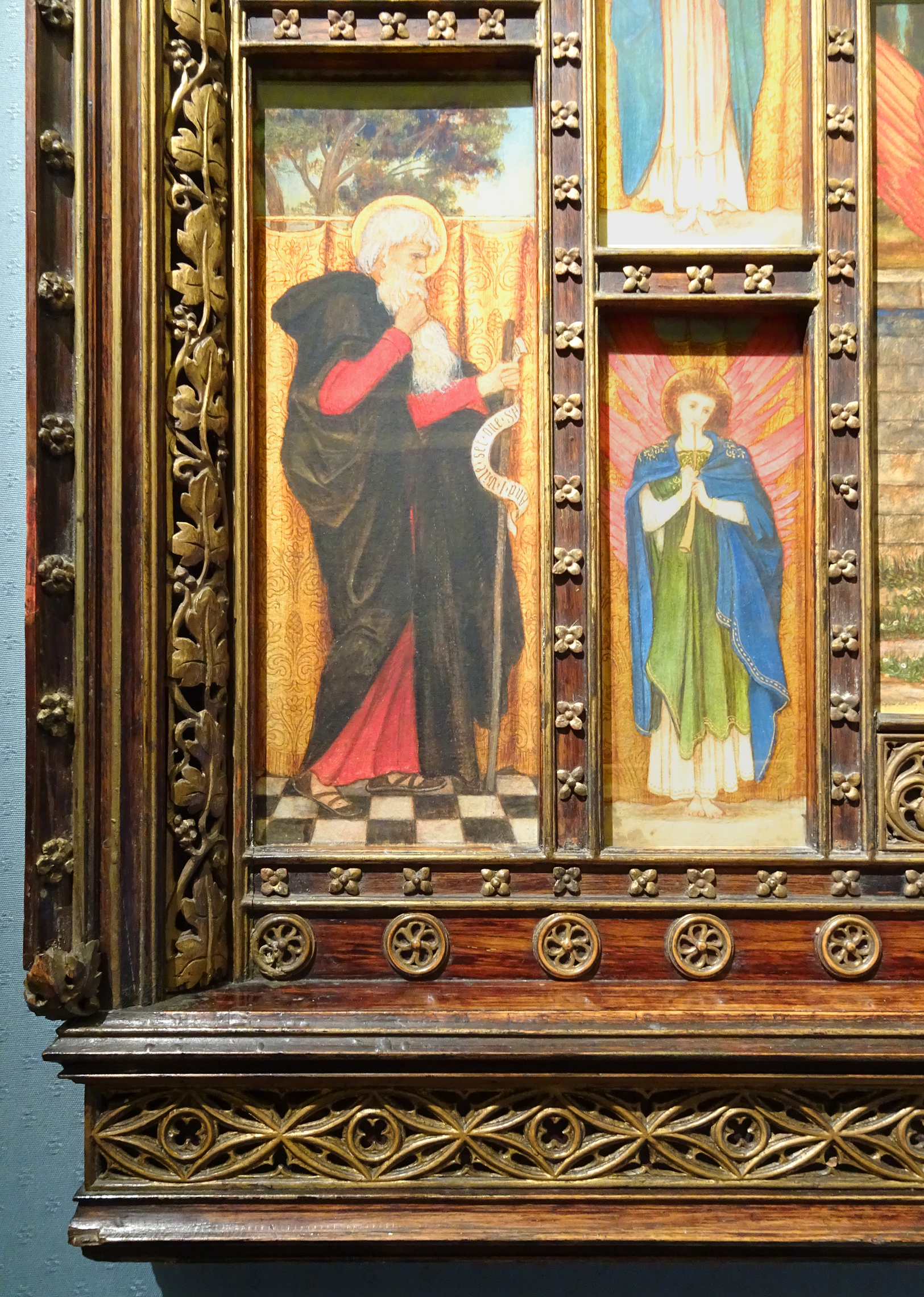
Spencer Stanhope, A design for the reredos at Holy Trinity Church, Florence, 1890s, detail of frame
Both parts of the altarpiece are interpretations of the past, the paintings rooted in Spencer Stanhope’s knowledge of Fra Angelico and Botticelli, and the frame a loose variation on Venetian retables. They are also firmly of their own time, however; in the case of the frame, the combination of dark wood and parcel-gilding is specific to the Gothic revival: an original altarpiece of the 14th-15th centuries would have been gilded overall, possibly with polychrome details. The use of stained wood picked out in gold is a feature of work by other 19th century Italian framemakers, such as Angiolo Barbetti and Pietro Giusti of Siena [11].

James Archer (1823-1904), A hidden sorrow, exh. Royal Academy 1858, o/c, 23 ½ x 20 ½ (59.7 x 52 cm.), Martin Beisly Fine Art
Two more works, equally of their period, complete this review of an interestingly panoramic Victorian exhibition. One is James Archer’s A hidden sorrow (now sold), a tender study of a mother and child, inspired by a poem of Tennyson’s. The hidden sorrow is felt by the mother, a village girl who thought that she had married a poor artist, but discovered on his father’s death that he was now Lord Burleigh, Earl of Exeter, and that she was required to fulfil the rôle of Countess.
James Archer, A hidden sorrow, detail of frame

The frame was evidently created especially for the painting, since, although it appears at first glance to be a run-of-the-mill Louis XIV revival style with calligraphic ornament reproduced in compo, on closer inspection this decorative layer turns out to be an intricately-designed garland of hawthorn leaves and berries. These were evidently intended to evoke the birth of the village maiden in Shropshire, and are realistically produced – quite a feat, when it is considered that either the sprays of hawthorn have been cast, in order to produce moulds for the compo, or even carved in reverse (although for a one-off frame, the former may be more likely). There is a secondary small garland of hawthorn berries along the sight edge. This is the epitome of an attributive frame, and a very charming solution to framing a painting which was accompanied in the catalogue by a quotation from Tennyson, and was thus set firmly in the world of the poem which had inspired it.

Ford Madox Brown (1821-93), May memories, 1869-84, o/c, 16 ¾ x 11 ¾ ins (42.5 x 29.5 cm.), Martin Beisly Fine Art
The second painting is completely different, returning us to the avant-garde frame designs of the Pre-Raphaelites with which this review opened. This is an example of F.M. Brown’s and Rossetti’s reed-&-roundel frames, which were in use from at least 1861, when Rossetti complained about a Ruskin protégé trying to poach instructions for making them [12]. Like the plain, flat architrave frames which Holman Hunt’s family portrait frames exemplify, the reed-&-roundel frames evolved in opposition to 19th century academic revival French Baroque and NeoClassical patterns, and looked to 15th and 16th century Netherlandish frames rather than to Italian models.

Jan van Eyck (pre1390/95-1441), Virgin & Child with Canon Joris van der Paele, 1436, o/panel, 122 x 157 cm., and detail, Groeningemuseum
They used geometric oppositions of half-round, fluted and flat, or circular versus square; this can be seen in the relationship of the three reeds to the flat frieze, and the corner ‘chefs-square’ to the central roundels. The reeds were very probably developed from the stylized half-round mouldings which formed three sides of the inner moulding of Netherlandish altarpiece frames, and which represented the colonets of an architectural window frame, with a sloping rainsill constituting the fourth side. Van Eyck’s Virgin & Child with Canon Joris van der Paele is a particularly good example of one of these, since its size means that the vestigial colonets appear even more stylized and geometric than usual in relation to the flat frieze and outer moulding on the rest of the frame, whilst the square corner ornaments are also suggestive. This work, having been filched by Napoleon’s troops and taken to the Louvre, had been restored to Bruges by 1816, and was on view in the Groeningemuseum when Holman Hunt and Rossetti visited it in 1849-50. Ford Madox Brown, who had grown up and trained in Belgium, would also have been very familiar with it.

F.M. Brown, May memories, 1869-84, detail of frame

Jan van Eyck (pre1390/95-1441), Margaret van Eyck, 1439, o/panel, 25 x 32.6 cm., detail of frame, Groeningemuseum
The frame of Van Eyck’s portrait of his wife is a sort of inside-out version of the reed-&-roundel frame, with the rounded mouldings at the sight edge, and the flat frieze on the outside. The frieze also displays the joints copied by the Pre-Raphaelites as another rejection of academic frames – i.e, through a rejection of the traditional diagonal mitre joint for the horizontal or vertical butt joint. Van Eyck’s are horizontal, here, whereas F.M. Brown and Rossetti usually preferred vertical joints; Hunt used butt joints decoratively in his family frames, swinging them round the rails in a windmilling motion.
A final point about Brown’s frame is that it is made of oak, and gilded directly onto the wooden surface, bringing out the texture of the grain on the frieze in an effect which fascinated critics and clients, and became very popular during the second half of the 19th century. Charles L. Eastlake remarked on this technique:
‘Now, gilding on a picture-frame is not only justifiable by way of ornament, but is much to be recommended as a foil or neutral ground for enhancing the value of colour; but it ought to be laid directly on the wood, without any intervening composition; and if any ornament in relief is attempted, it should be carved in the solid material. The effect of oak-grain seen through leaf-gold is exceedingly good, and the appearance of texture thus produced is infinitely more interesting than the smooth monotony of gilt ‘compo’…’[13]
All in all, this is a small but illuminating group of 19th century paintings and their frames, and very worthwhile visiting.
**************************************

Something else very much worth attending is the Evelyn De Morgan Symposium on 4 May 2019 at the Guildhall Art Gallery in the City of London. Dr Nic Peeters, one of the authors of the article which first drew attention to the Spencer Stanhope study for the Holy Trinity altarpiece, is giving a co-authored paper on Evelyn De Morgan’s portraits, and Dr Jan Marsh is also speaking, in advance of her exhibition, ‘Pre-Raphaelite Sisters’, at the National Portrait Gallery from October 2019.
If you go to the symposium, keep an eye out for any De Morgan frames…

Evelyn De Morgan (1855-1919), Our Lady of Peace, 1902, o/c, 75 ½ x 38 ins, De Morgan Centre
**************************************
[1] The pomegranate is often held by the Christ Child as a symbol of His future conquest of death, and is taken over from the myth of Demeter and Persephone, whose eating of six pomegranate seeds in the halls of Hades condemned her to return to Hades for six months of the year, bringing winter about on earth – but leading cyclically to the resurrection of spring. Rossetti painted Persephone as Proserpine in a number of versions, which he set in medallion frames.
[2] Martin Beisly Fine Art, W.P. Frith: The private view, 2019, pp. 27-29
[3] Sydney Hutchinson, The history of the Royal Academy, 1768-1968, 1968, p. 109
[4] Isabelle Cahn, Cadres de peintres, 1989, p. 27 & note 11, p.81
[5] Details of the exhibition and purchase of The railway station are taken from Nancy Rose Marshall, ‘On William Powell Frith’s Railway Station, April 1862’, BRANCH: Britain, Representation and Nineteenth-Century History, ed. Dino Franco Felluga
[6] Judy Oberhausen & Nic Peeters, ‘Rediscovering a Pre-Raphaelite masterpiece: a Spencer Stanhope altarpiece’, The British Art Journal, 2007, vol. VIII, no 1, p.71
[7] Letter from Strudwick to his patron’s widow, Emma Holt, 29 June 1896. Reproduced in the Catalogue of Sudley Art Gallery; information from Mary Bennett.
[8] Judy Oberhausen & Nic Peeters, op. cit., p.68
[9] Ibid.
[10] See Jacqueline Banerjee, ‘Christ Church, Esher, Surrey, by Benjamin Ferrey (1810-80)’. See also Christie’s sale of Victorian, Pre-Raphaelite & British Impressionist Art, 14 December 2016, Lot 26
[11] See the review of articles on these framemakers by Karen Serres and Nicholas Penny in The Burlington Magazine
[12] Letter from Rossetti to his brother, 14 August 1861
[13] Charles L. Eastlake, Hints on household taste,1872 (3rd ed.)
