
Trophy Frames

Trophy frames include some of the most eye-catching, sculptural and virtuoso examples of framemaking there are. These are the kind of frames which use symbols and attributes to tie the painting inside the frame to some particular individual, profession, trade, family, group, specific religious event or myth, and they are usually designed and made – very expensively – by a highly-skilled craftsman or master carver: someone like Grinling Gibbons or Paul Petit in London, the maîtres sculpteurs of the Bâtiments du roi in Paris, and Antonio Chicari or Filippo Parodi in Rome and Genoa; although often the maker remains completely unknown.
Military trophies
The name is derived from the military trophies (tropaia) which were erected after a battle in the classical world. At first, the arms and armour of the defeated enemy were collected and hung on a tree; later on, a pole would be set up with a crosspiece on which a corselet and often other body armour would be placed, with a helmet at the top and weapons hanging from the wooden arms.

The Trophy Painter, jar with Nike erecting a tropaion, Attic pottery with red figure painting, c. 450-440 BC, Museum of Fine Arts, Boston
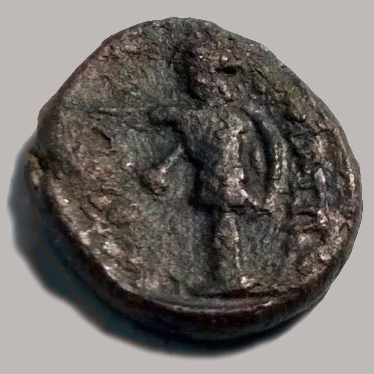
Bronze coin from Boeotia, Greece, 3rd century BC, with trophy on the reverse. Photo: Scott Manning
The shape and form of these trophies can be found depicted on ancient Greek coins and vase paintings, as well as described in contemporary historical texts. The trophy painted on this vase, for instance, dates from the Classical Period, four-&-a-half centuries before Christ; it is seen from the side, and the winged nike or victory appears to be fixing the helmet to the top of a bare tree trunk. On the coin the trophy appears frontally, like a scarecrow with its arms held straight out to the sides – just a very warlike scarecrow.
During the period of Roman domination in Europe, the same tradition was used of displaying captured enemy arms and weapons on a cross-shaped support – however, this was done, not on the battlefield itself, but back in Rome, where such evidence of victory (in the form of the actual arms themselves) could be used to help win votes from citizens during the time of the Republic. During the Empire, this might also be done, but the depiction of a trophy in stone on a monument would redound even more to the permanent glory of the particular emperor.
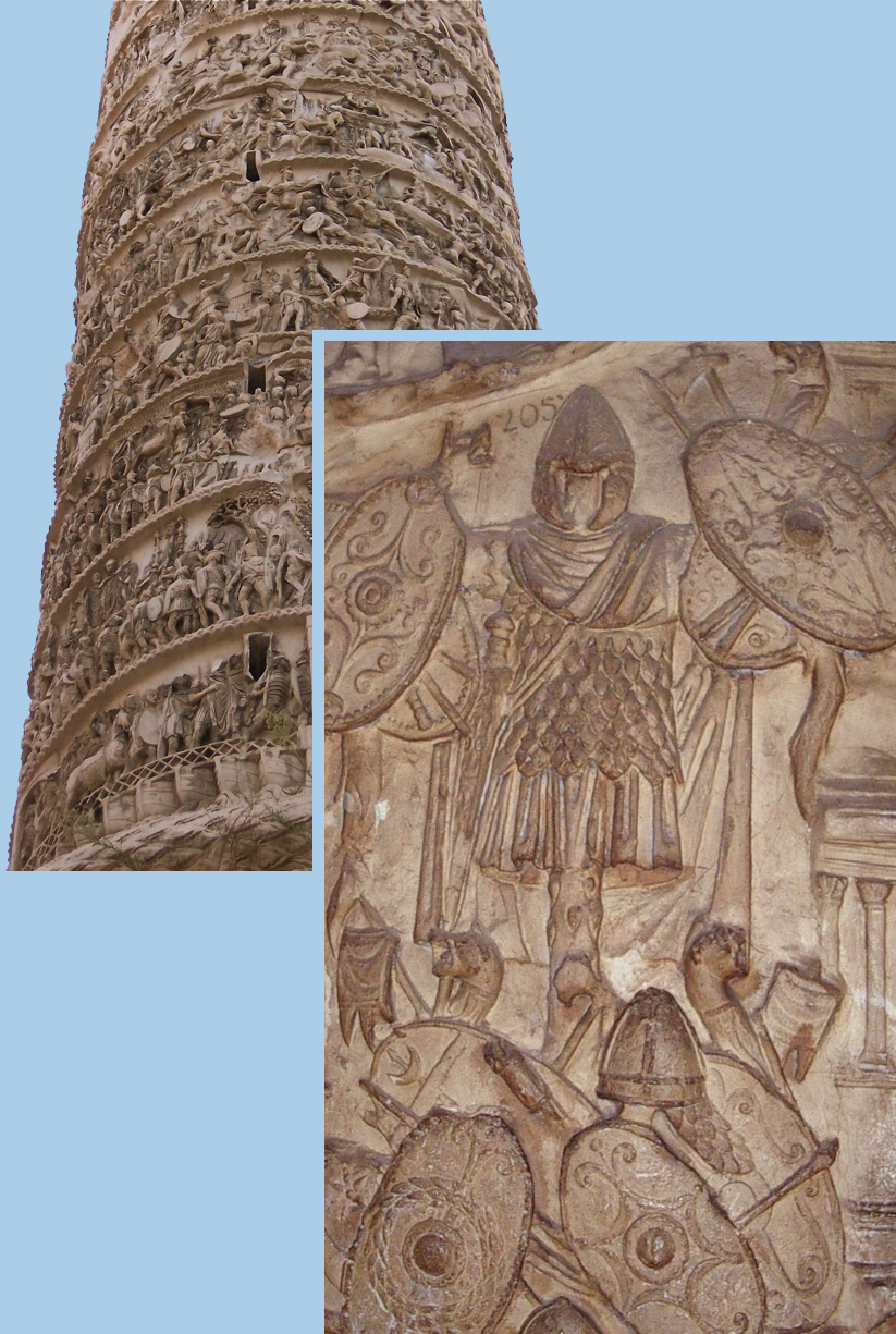
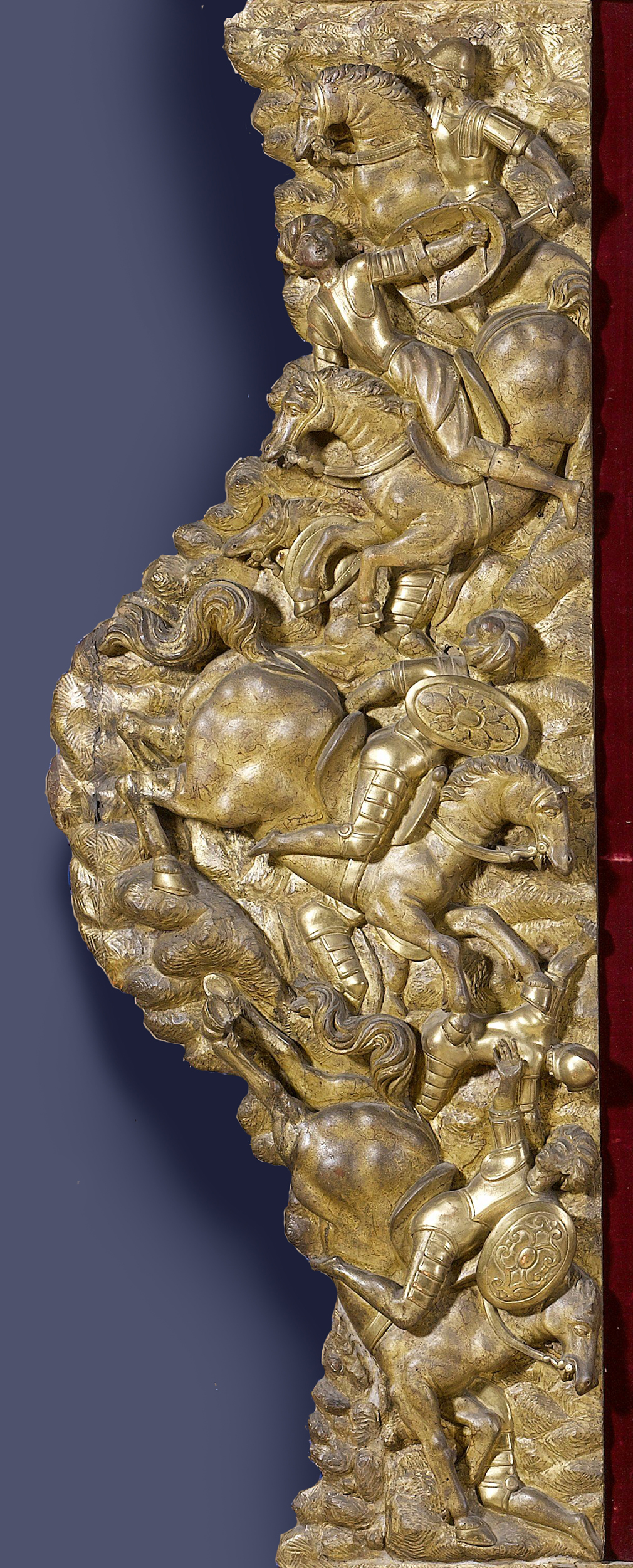
Trophy of arms from the Dacian wars, Trajan’s Column, details, 113 AD, Trajan’s Forum, Rome
The column erected by Trajan is a good example of this, where an arrangement of a whole Dacian uniform can be found, with corselet, kilt, helmet and cloak hung on a tree, shields and weapons on the side branches, and a pile of more armour on the ground beneath. This representation of battle trophies is one tiny detail from the vast carved narrative of the emperor’s battles with the Dacians (in modern Romania), which winds its way around the column.

Military trophy, one panel from a series originally decorating the Hadrianeum, Rome, 145 AD, now Capitoline Museum, Rome. Photo: Carole Raddato
Much simpler trophies were also produced to decorate Roman monuments and buildings; these were the weapons and pieces of armour alone, abstracted from display on a support and arranged in a pattern on a panel or plaque. Shown like this, they presumably represented the arms used by the Romans themselves to keep the Empire in subjugation, rather than captured enemy weapons. These would be as influential for trophies in later Western art as the scarecrow type of tropaion, and already this arrangement of marble weapons suggests a model for what would later be used to decorate a wooden frame.
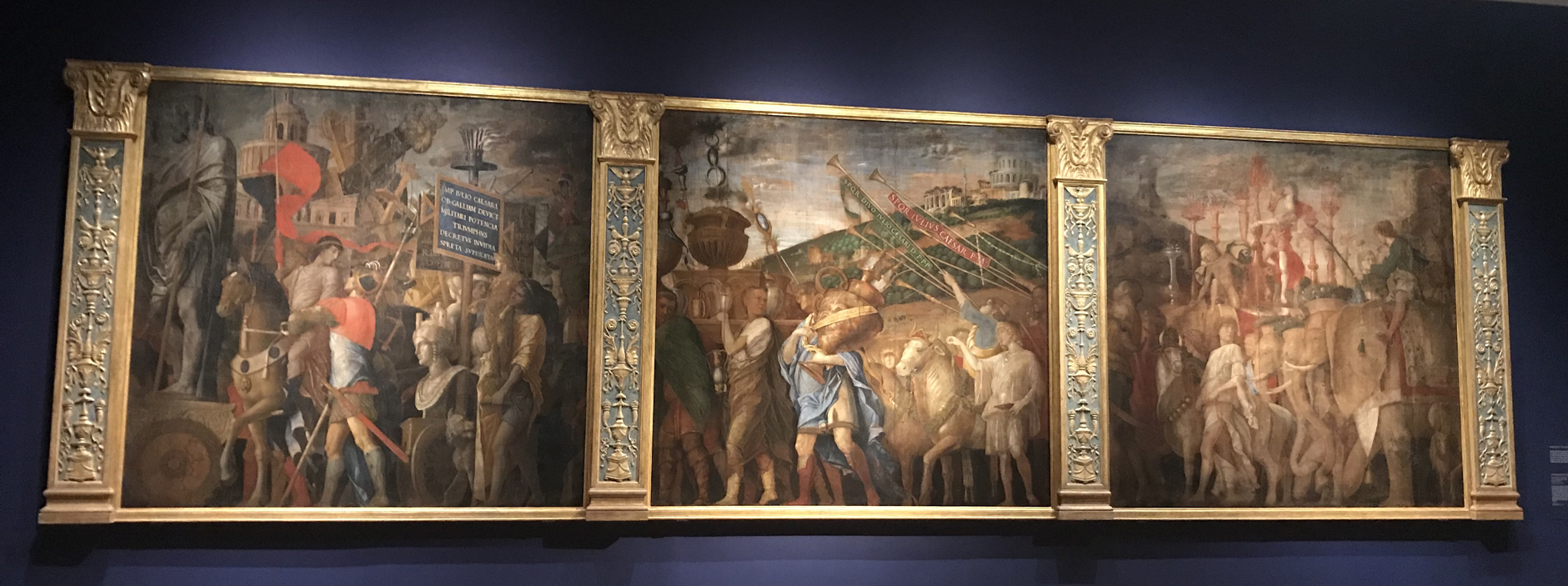
Andrea Mantegna (c.1431-1506), The triumphs of Caesar, mid-1480s-pre-1506, tempera, c. 270 x 280 cm. each, The Royal Collection Trust/ HM Queen Elizabeth II, on display in the exhibition at the National Gallery, Mantegna & Bellini (1 October 2018-27 January 2019)
Much of what we know about trophies set up on the battlefields or in the cities of the classical world, other than from visual sources, is taken from contemporary or near-contemporary authors and historians, such as Polybius and Thucydides, Tacitus and Plutarch [1]. In the late 15th and early 16th century, Andrea Mantegna used some of these sources, possibly from one or more 15th century compendia of classical writers [2], as references for his series of nine huge paintings known as The Triumphs of Caesar (they are nearly nine feet tall). Mantegna was also familiar with the relics of the Roman past which littered Italy, and which, in the enthusiasm for everything classical which had stimulated the Renaissance of the late 14th and the 15th centuries, were being studied, collected and copied. Many of the patrons of contemporary Renaissance art in Italy – the Medici, the Gonzaga, the Farnese and the Barberini, a number of popes, and cardinals such as Domenico Grimani, amongst others – had collections of antique sculpture, coins, medals and cameos, and would allow artists to examine and draw them; those artists who were able, like Mantegna himself at a certain point, also made their own collections.
Mantegna’s Triumphs of Caesar had been commissioned by one of his most important patrons, Francesco Gonzaga, Duke of Mantua, and were installed in the form of a continuous processional work around one of the great halls in the small township of palaces which made up the Palazzo Ducale of Mantua. They show Julius Caesar returning in triumph to Rome from his foreign campaigns (which actually took place in separate wars against the Gauls and Persians); he brings with him all the loot he has captured in these wars, and each canvas deals with a separate part of the procession: The vase-bearers, The picture bearers, The standard bearers and The captives.

Mantegna, The triumphs of Caesar III: The trophy-bearers, Hampton Court Palace
The third canvas shows the trophy bearers, and the centrepiece of this part of the procession is a cross-shaped support mounted on one of the chariots, holding several pieces of body armour, greaves, shields and weapons, just as Mantegna might have observed for himself on a Roman sculpture or coin. Other wooden poles slant out around the central trophy, carrying further criss-crossed weapons, helmets, and armour.
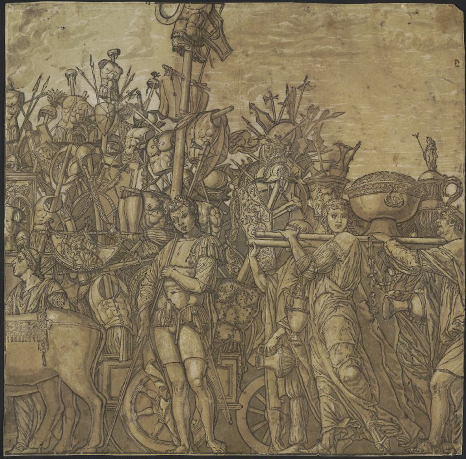
Andrea Mantegna (after; c.1431-1506), The trophy bearers, Bernardo Malpizzi and Andrea Andreani, woodcut print, 1599, British Museum
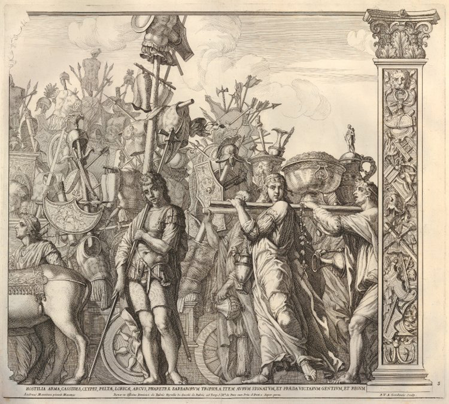
Andrea Mantegna (after; c.1431-1506), The trophy bearers, Robert van Audenaerde and Domenico De Rossi, etched & engraved print, 1692, British Museum
The Triumphs of Caesar were seen as amongst Mantegna’s masterpieces both during and after his lifetime, and have always been greatly valued. When the Mantuan dynasty ran out of heirs and wealth in the 17th century, the series was bought by Charles I of England, and was retained by Parliament rather than being sold with the rest of his collection when he was executed. The paintings have been displayed at Hampton Court Palace for almost 400 years, and both there and whilst in the Gonzaga collection in Mantua have been reproduced as drawings, woodcuts and engravings, including as prints from Mantegna’s own workshop. This meant that they could be distributed very widely indeed, finding a much larger audience than the original canvases, and were thus more responsible than perhaps any other single source for spreading the concept of the military trophy through Europe.
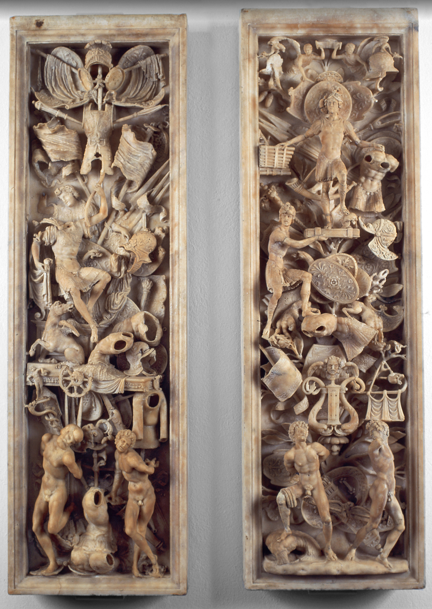
Agostino Busti (1483-1548), pilaster panels from a funerary monument to Gaston de Foix, nephew of Louis XII, d.1512, marble; carved 1516-17, Pinacoteca Ambrosiana, Milan
There were, of course, other Renaissance artists and sculptors also beginning to produce images of military trophies in the early 16th century. The Italian sculptor Agostino Busti, for instance, was commissioned to carve a funerary monument to the French general, Gaston de Foix, killed in battle at Ravenna in Italy at the age of twenty-two. Gaston, nephew of Louis XII of France, had fought a tactically brilliant engagement with the papacy of Julius II, the Spanish, and the Venetians in 1512, allowing Ravenna as well as Bologna to be won by the French, before he was shot after being thrown from his horse. François II, son-in-law of the French king, was duke of Milan from 1515 to 1521, and commissioned a tomb from Busti, who had already produced a funerary monument for a Milanese citizen based on classical models.

Agostino Busti (1483-1548), fragment of a funerary monument to Gaston de Foix, nephew of Louis XII, d.1512, marble; carved 1516-17, Museo d’arte antica, Milan
The use of classical military trophies for the tomb of an heroic, contemporary commander may possibly have been initially inspired by Mantegna’s Triumphs of Caesar, but it is clear that Busti’s arrangements of armour and weapons are the work of someone who has studied antique Roman trophies independently. This particular panel, with much of the trophy carved almost in the round, uses a Roman standard surmounted by a wheel of Fortune as the basis for its arrangements of greaves, helmet, weapons, shields and banners, in a striking anticipation of the way in which very similar motifs would later be applied to picture frames.
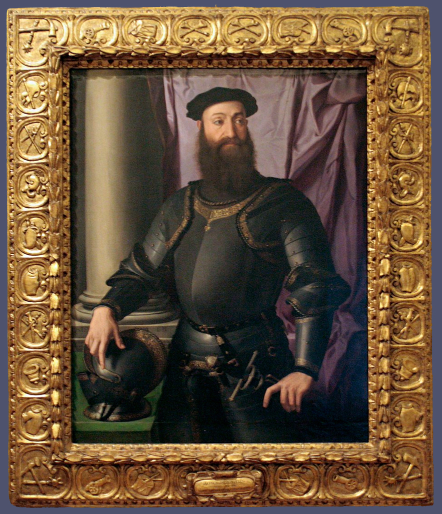
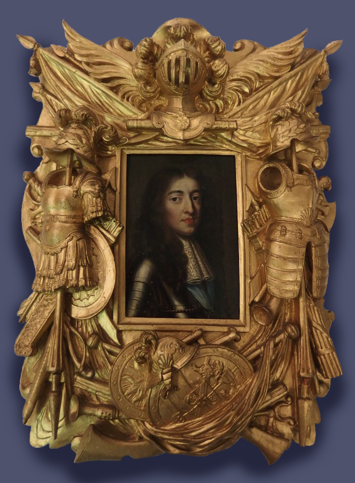
Agnolo Bronzino (1503-72), Portrait of Stefano IV Colonna, 1546, o/panel, 125 x 95 cm., Palazzo Barberini, Rome
One of the first carved giltwood picture frames to carry contemporary military trophies uses them in a very different way from these marble monuments – either Roman or Renaissance – and differently from the way Mantegna depicts them in a painting, too, since the framemaker was trying to accommodate them to a long narrow border, rather than to a wider, more spacious panel. When we examine the frame of Bronzino’s painting of Stefano Colonna, it is obvious that this is an early attempt to identify, not just a soldier’s, but a military commander’s portrait by placing around it motifs of every sort of armour and weaponry which he could have called upon; and the carver has struggled slightly both with how to arrange all these images, and with the details of the weapons themselves.

Duccio di Buoninsegna (c.1255-1318/19), The Rucellai Madonna, 1285, & detail, Galleria degli Uffizi, Florence
As there was no model for fitting large rectangular plaques of trophies onto a long decorative band, he may have looked at the frames of sacred paintings and altarpieces to see how to place symbolic motifs in a narrow space. He may possibly have turned to a well-known if old-fashioned painting in a local church, with which he would have been familiar: the 13th century Rucellai Madonna, painted by Duccio for Santa Maria Novella in Florence. This has a relatively simple frame, with a flat frieze surrounded by shaped mouldings, painted on the frieze with roundels holding the heads of prophets, saints, and the disciples. Each head is angled to look at the Christ Child from whatever position it holds. Although the two frames come from different stylistic eras two-&-a-half centuries apart, and although one is sacred and one is secular, they do have some basic similarities. There is one simple moulding at the back edge in both, and several complex mouldings at the sight edge, with a relatively wide frieze between the two which is covered with small roundels holding images relevant to the painted composition. And Duccio’s frame is not a single example of this type of early altarpiece; others have survived, indicating that there were originally even more. The likeness of the painted roundels at regular intervals to the round cartouches on the frame of the Bronzino is at least an interesting parallel, given the wide range of sources from which the average framemaker took inspiration.
Colonna had been a captain of infantry for the papacy for much of his career, working for the last two years of it for Cosimo de’ Medici of Florence. This portrait was painted during his retirement in Tuscany, so it is not an advertisement of what he could do but a summation of everything that he had done. When he died in 1548 Cosimo buried him with great ceremony, and this portrait was used as a funerary image, so it is probable that the Medici workshops made the frame.


Bronzino, Portrait of Stefano IV Colonna, 1546, details, Palazzo Barberini
It’s in a 16th century Mannerist style, with a bolection moulding which projects the painting forward, away from the wall and towards the spectator. It is carved along the frieze with exaggerated C-scrolls forming little oval cartouches, which are decorated against a punched ground with all the weapons and military equipment that Colonna would have been in charge of as an army captain. These include axes and morning stars; trumpets, drums and banners; cannon, powder horns and ramrods for pushing the cannon ball and powder into the barrel of the gun; swords, shields, helmets and corselets. The frame is symmetrical about the central vertical axis, which means that the left half mirrors the right half, and the military motifs are the same on both halves. As a way of presenting the portrait of a distinguished army commander it is very striking – it provides a wide, rich border to the painting, guaranteeing that it will stand out in any setting; but the low relief detail of the trophies means that they are not too obtrusive or over-emphatic. The whole frame generates a relatively subtle shimmer of light along its margins, and is the perfect foil for the large areas of single colour in the portrait – green, lilac, stone and black. Its appropriateness must have been recognized by every generation, to have allowed its survival for so long, since most of Bronzino’s work has been reframed – often several times – because of his importance to successive collectors. This frame, therefore, is a rare and very important model.
Trophy versus attributive frames
Having looked at what unarguably IS a trophy frame, perhaps we should pause here for a moment just to consider what is NOT a trophy frame. This is because there are a great many frames out there which might be called ‘attributive frames’ – that is, frames which are decorated with motifs which reflect the subject of the painting in a very generalized way. Attributive frames are much more vague and amorphous than trophy frames, which carry very specific objects linked to and illuminating the painted subject.
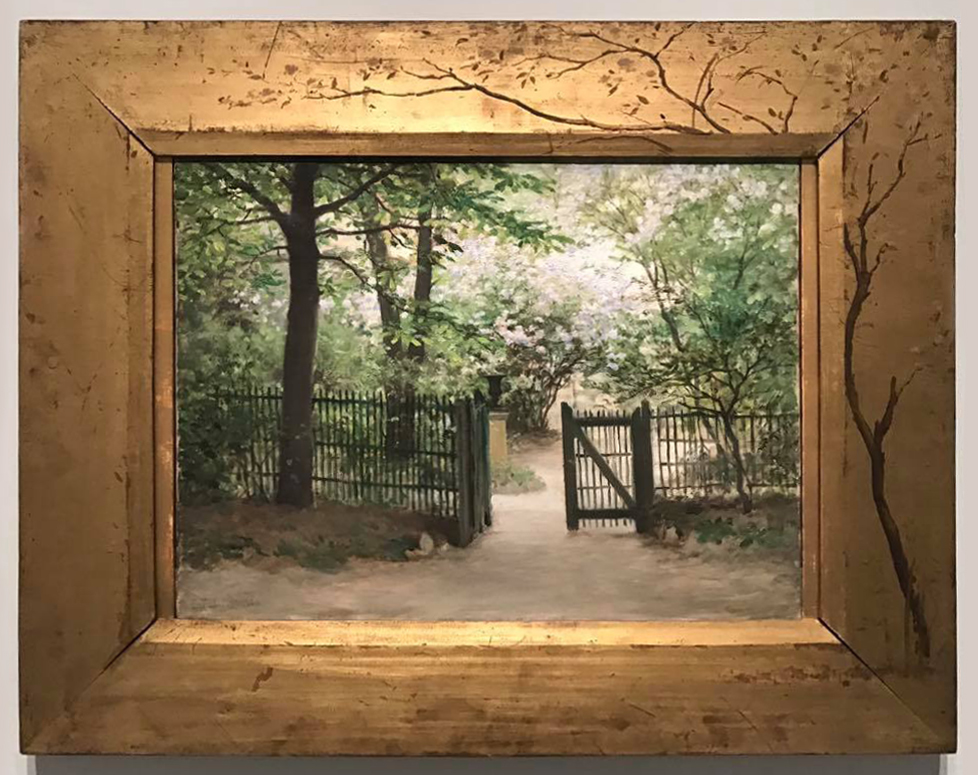
Édouard Debat-Ponsan, Le jardin du peintre à Paris, c. 1886, o/c, 46 x 61 cm., Musée des Beaux-Arts de Tours
For example, this is a picture in which a path leads from the spectator’s space directly into a painted garden, through an invitingly open gate. It’s a garden full of trees which create a receding vista, drawing the spectator further in; and a tree of similar kind to the saplings on the right has been painted on to the side and top rail of the frame. This binds frame and painting closely together, and extends the garden outwards, across the delimiting boundary of the frame and into the spectator’s world. This tree isn’t a trophy – it’s an attribute – and almost a continuation – of the painted garden.

Alexandre-François Desportes (1661-1743), A royal hunting dog watching two partridges, 1734, o/c 90 x 117 cm., Galerie Eric Coatalem, Paris (with thanks to George Shackelford)
Here, on the other hand, is something which might be described as the essence of a trophy frame. It’s an example of a very specific genre of trophy frames – one which represents the hunt; and it surrounds a painting by the French painter François Desportes, an artist who was patronized by both Louis XIV and Louis XV, and who painted many ‘portraits’ of royal hunting dogs, amongst other things. This one shows a hound from the king’s pack and still has its original giltwood frame, which is decorated with a net entwined with branches of oak leaves and acorns twisted around the contour. Inserted into this at intervals are other trophies of the chase – a hunting horn, gun and sword at the top; a powder flask and knife on the left; a bow and quiver of arrows on the right. At the bottom is the bag of game – a hare, a woodcock and a partridge. The coat of arms at the crest of the frame is composed of a bunch of fasces with a coronet above, but the family it belongs to has not been identified. Everything carved on the frame is the representation of a real, specific object with as much application to the hunting of wild game as the dog, partridges and oak trees in the painting (and analogous to the arms carved around the portrait of Stefano Colonna).

Sebastian Pether (1790-1844), Eruption of Vesuvius with destruction of a Roman city, 1824, o/c, 28 1/8 x 36 ¼ ins (71.4 x 92 cm.), Museum of Fine Arts, Boston
Similarly, we can compare two frames with motifs from the natural world. First is Sebastian Pether’s striking nightscape with Vesuvius erupting, which is set in a flat plate frame, covered with random splats of what are meant to be volcanic larva – as though the eruption had thrown gobbets of molten rock out of the painting and onto the frame. These are attributes of the volcano and its eruption; they are not specific trophies. They help to set the scene, and to make it more vivid for the spectator – as though he were really standing on a hillside outside Naples, with fragments of larva falling around him.

Giovanni Maria Morandi (1622-1717), Portrait of Alexander VII in frame with stemma of the Chigi, third quarter 17th century, originally from Palazzo Chigi, Rome; Sotheby’s Rome, 18 May 2004, Lot 479
Second is this portrait of Pope Alexander VII. He was a member of the Roman Chigi family, whose impresa or emblem was a pyramid of six hills with a star above it – an impresa which can be seen at the centre of each rail of the frame, with the star above the bottom centre. An earlier member of the family, Agostino Chigi, had been a banker, one of whose clients was Pope Julius II, and he was granted the right the use the impresa of Pope Julius’s family, the Della Rovere, which was an oak tree. This explains the rather mad triffid-like tree, with its roots curling down from the bottom of the frame, and its branches twining up and around it to the six hills at the top. Sprays of oak leaves and acorns gather at the corners. This oak tree is just as much a manifestation of the natural world as the blobs of larva on Pether’s frame; but it also has emblematic significance in that it identifies the portrait as a member of the Chigi family, after the adoption of the oak tree into its impresa (which happened between 1503 and 1513). The imaginative way in which these emblems have been brought to life, engulfing the whole structure of the frame, may be credited to a design by Bernini, realized by the sculptor Antonio Chicari. But they are also trophies – specific signifiers of the Chigi family, and of this particular pope.

Venetian frame, c.1550-75, & detail, 123.3 x 102.8 cm./ 216.5 x 189.2 cm. Rijksmuseum
Returning to military motifs, this is a Venetian frame which dates from just after the Florentine example on the portrait of Stefano Colonna. It’s an extraordinary achievement; it shows a battle between Turks and western Europeans, of which there were a series during the 16th century (it may possibly refer to the Siege of Malta in 1565, where Venice might have had a small interest through the Sicilians who took part). As in Trajan’s column, where the emperor’s wars and victories were carved in a long spiralling band which circled up and around the column, the carver of this frame has ingeniously fitted scenes of the battle along the two horizontal rails, and down the two sides, managing to produce a fairly naturalistic representation of a chase and struggle, down a steep hillside and along the flat.
Objects like these may have helped in the development of the military trophy frame, but once again it is not a trophy frame itself; it is attributive – the carved image of a battle, which most probably surrounded a portrait of the commander who led the victorious western army. Like the frame painted with a tree on Édouard Debat-Ponsan’s Le jardin du peintre, this frame may have acted as an extension of the painted landscape background of the portrait, which would probably have shown further scenes from the battle. As with the frame of Vesuvius erupting, these carved warriors locked in combat have erupted from the painting under the pressure of their struggle, to make the achievement shown by the artist more vivid and realistic for the spectator.
The spread of the military trophy
The engraved print was, as has been indicated, one of the most effective means by which styles, fashions, and motifs such as the military trophy were diffused through Europe, becoming easily and cheaply available to artists and craftsmen of all descriptions. The engraving and printing of pictures had begun in Germany in the 1430s, and engravers soon developed their own forms of integrated frame, which were part of the image, and could be elaborated with all sorts of ornaments as contemporary taste decreed. Such ornaments could also be symbols and trophies, which were handled more and more skilfully, and were used to communicate information about the subject of the engraving.
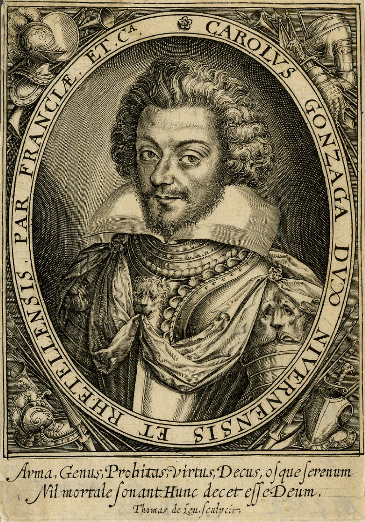

Carlo Gonzaga, Duke of Mantua, engraved by Thomas de Leu, 1600-12, & detail, British Museum
By the beginning of the 17th century, prints which used military trophies in this way were already fairly sophisticated. This one (above) applies them to an engraved portrait, an example of a genre which proliferated through the 17th century, as it was only through the medium of this kind of print that people could discover what their leaders, heroes, political and national opponents, writers and philosophers looked like. Here we see the Duke of Mantua and Nevers depicted as an armed military leader, in an image copied from an unidentified painted portrait. The engraver has inserted a plain oval border to identify the sitter by his Latinized name and titles, but then he has used the corners or spandrels to expand on the portrait itself by adding military trophies – emphasizing the duke’s rôle as a warrior and a leader of troops.

Jacob de Gheyn II (c.1565-1629), frontispiece of his book, The exercise of armes, 1608, Jesus College, Cambridge
This print is, more directly, the frontispiece of a military manual, The exercise of armes, which was published in both Dutch and English as an illustrated guide for inexperienced military men, and also as a reference for the more knowledgeable. In this case, trophies of weapons and armour decorate an integral frame like an altarpiece, of very plain and massive architectural form, which supports two putti with crowns of bay leaves for victory, and at the top centre the coat of arms of James I of England and VI of Scotland [3]. The engraved trophy was growing closer to an actual wooden frame, and it served a similar purpose by providing an appropriate means of displaying a panel of text – especially useful for the title page of a book. However, the trophies in this case hark back to their classical roots, with (on the left) a corselet and helmet mounted on a pole, and weapons of various kinds crossing this diagonally. The trophy on the right of the frame is more contemporary, with no suit of armour but a helmet, and the weighty butts of an infantryman’s rifles replacing the spear shafts of the knight. This economically encapsulates both the traditional practice of military drill and its reform under the Prince of Orange, as well the rôle of the gentleman commander and the lower class militiaman.

Hendrick ter Brugghen (1588-1629), Sleeping Mars, 1629, o/panel, 106.5 x 92.8 cm.; frame: gilded limewood, Centraal Museum, Utrecht
In another Dutch work, the frame of Hendrick ter Brugghen’s image of Mars, god of war, the use of military trophies has moved on significantly since the frame of Bronzino’s portrait, about 80 years earlier. Although a memory of the classical method of displaying enemy arms remains at the top right, with the corselet mounted on the pole of a banner and other arms and weapons piled beneath it, what became the accepted military trophy is emerging all around it, with diagonally-crossed weapons, other arms swung on a chain, and careful arrangements of objects in patterns. This carver has found it easier to place all the various items in a fluid rhythm along the frieze of the frame, and the carving is in deeper relief and much more detailed. The Roman god of war has also been equated with a contemporary Dutch commander – not only by his armour in the painting, but by the modern pistols and rifles carved around him, the drum at the top left, and the powder horn in the bottom right corner.
The 17th century was the Golden Age of Dutch art; it was also a time of continual wars and sea battles, when the Netherlands, powered by new wealth from its colonies, was fighting – as it were – above its weight, and struggling to free itself from the grasp of the Holy Roman Empire, in the shape of Spain. In 1581 the mainly Protestant United Provinces of the Netherlands had declared independence from Spain, which held on to (mainly Catholic) Flanders. The United Provinces remained at war with Spain until 1648, and after that were at war with France, and also at times with England; so there was, so to speak, a large market for portraits of military commanders, and also for the group portraits of the civic guards of each city, which are an idiosyncratic feature of Dutch portraiture. Both kinds of portrait – single and group – might be further heroized by having military trophy frames, and another sub-section of war-like painting – the sea-battle – might also be made more important by a similar dramatic setting.

Military trophy frames hanging in the Staircase Gallery of the Mauritshuis, The Hague
The Mauritshuis in The Hague has a splendid group of original trophy frames on portraits of military commanders, which were restored not long ago. These include portraits of Admiral Michiel de Ruyter (on the left), who was 60 when Ferdinand Bol painted this image of him in 1667; Engel de Ruyter, Michiel’s younger son (on the right; 1669); and Wolfert van Brederode (in the centre; c.1663), who was painted aged 14, when he was Master of Horse for the Dutch cavalry.

Ferdinand Bol (1616-80) & Willem van de Velde II (1633-1707), Portrait of Michiel de Ruyter, 1667, o/c, 157 x 135 cm., Mauritshuis, The Hague
Michiel de Ruyter was originally a merchant, who became known for ransoming and freeing Christian slaves, but at the age of 45 he joined the Dutch fleet to take part in the Anglo-Dutch wars. He had many victories during a naval career of a quarter of a century, and was regarded as a hero by the Dutch people and by his men. Six versions of this portrait were painted by Ferdinand Bol, five of them being hung in admiralty buildings in the largest Dutch cities, and four in total surviving.
Only this one retains its trophy frame, which is completely covered with military trophies carved in the round, some of which are separately-made attachments. They include the classical displays of armour and helmets on poles at the sides, with kegs of gunpowder, cannon on carriages, chains, pikes and halberds and other weapons, all mounted on a ground of draped banners and coils of rope. The sitter’s coat of arms is at the crest, surmounted by a helm and leafy mantling and crowned by a ‘rider’, signifying his name ‘De Ruyter’. A chain, echoing the chain of the order he wears around his neck, circles the shield, and the order may, at some point, have hung from it down over the painting. By this point the use of military trophies had become a convention, in which any customary use of frame mouldings apart from the sight edge was dispensed with, and the framemaker may have been free to use his imagination to some extent in the way he arranged the various objects to cover the whole area of the flat substructure – or, at least, free in his interpretation of a drawn design (the heraldic elements would have been more strictly controlled).
Ferdinand Bol (1616-80), Portrait of Engel de Ruyter, 1669, o/c, 131 x 112 cm., Mauritshuis, The Hague
This freedom can be seen in the different arrangement of motifs on the frame of his son, Engel, where there is no armour, and no arrangement of arms in a classical tropaion form. There are, however, many more kinds of handgun, rifles and powder horns, as well as some naval instruments, buoys and an anchor. Engel’s frame also includes a coat of arms at the top and the crown for a barony he had been given, both supported by a crest of palm leaves, bay leaves and oak branches with acorns. Paintings and frames are intriguing for both their differences and their likenesses.

Jan Mijtens (1614-1670), Portrait of Wolfert van Brederode, c.1663, o/c, 106.5 x 85.5 cm., Mauritshuis, The Hague
The frame of Wolfert van Brederode’s portrait may well have been made by a different craftsman from the two De Ruyter frames; it is four years earlier than Michiel de Ruyter’s, and is not made so emphatically in the round as the others.. Although slightly flatter, it is still immensely striking in its assembly of so many disparate items into a balanced whole; it includes further variants on the range of objects, such as an animal’s head at the centre left and an eagle on the right, streamer-like banners with mottoes, and two representations of the hammer that Van Brederode holds in the painting. His portrait also wears a suit of Roman armour with a sword at his hip, but the landscape behind him is pastoral rather than the aftermath of a sea battle, and without the frame it would be hard to associate this very young-looking fourteen-year-old with a rôle in the army and with probable experience of war.
It might be expected that the sculptural technique used in these frames and the size of the trophies relative to the portraits would make them very obtrusive, but – as can be seen – because they are gilded overall, the paintings have in contrast a powerful dominance of tone and colour, especially in reference to the two De Ruyter frames, which are more three-dimensional, and where more conflict might have been expected.
Trophies for monarchs and rulers
The idea of the trophy frame, once established, evidently piqued the imagination of framemakers, clients, and – probably – artists, in ways which went beyond experimenting with effects of surface technique and decoration. The expansion of the genre was inevitable, given the power of such a frame to highlight a painting and imbue it with greater drama and significance than it might otherwise possess; and it was also inevitable that monarchs and other rulers, whose function had historically overlapped with that of military commanders, should be one of the first and main groups to profit from such added magnificence.
Netherlandish School, William III of England, Prince of Orange (1650-1702), c.1677-80, o/panel, 16.5 x 11.8 cm., Museum of Rotterdam
William, Prince of Orange, later William III of England, was both ruler and military leader. He was Stadtholder of the Dutch Republic from the age of 22; he later married the daughter of James II of Great Britain, also his cousin, and ruled with her as joint monarch. This portrait shows him in his late twenties, when he was fighting to avert a French invasion of the Netherlands. It is a small painting, and the area of the frame is almost six times greater than that of the canvas; yet once again the portrait doesn’t suffer from this disproportionate difference. Instead, a rather undistinguished image is given a great amount of added authority and punch by a comparatively vast frame. It is all armour, weapons and banners; we are left in no doubt at all as to William’s eminence in battle, its importance to him, and his to it. He smiles out between two displays of his enemies’ arms in full classical style, and the helmet at the crest is supported by palm leaves, which indicate victory and heroism. The coat of arms at the bottom shows William’s arms as Prince of Orange and Duke of Nassau.
David Klocker Ehrenstrahl (1629-98), Charles XI of Sweden, post-1680, o/c, 82 x 66 cm.; frame, c. 1700-10, to a design by Nicodemus Tessin II (attrib.), Sinebrychoff Museum of Foreign Art, Helsinki
The frame made for the portrait of Charles XI of Sweden is near in time, but completely different from William’s military confection. It is basically an oval version of a French Louis XIII-style acanthus leaf frame, which has been turned into a trophy frame after a design attributed to the Swedish architect Nicodemus Tessin the Younger. It was probably made by the sculptor to the Swedish court, Burchard Precht. The acanthus moulding, which is very finely carved, has been overlaid by large branches of palm leaves and bay leaves – both of which stand for victory; these spring from the base of the frame up two-thirds of its height.
The main feature of the frame, however, is a lion skin, which has been carved to produce the trompe l’oeil effect of its having been draped over the back of the frame, like a cloak, with its back paws hanging near the bottom, and its tail curled round the branches at the base. Its head is surmounted by the Swedish crown, beneath which it slumps in defeat, whilst trumpets with banners are upraised to celebrate the coronation of the king. It represents the Nemean lion killed by the hero Hercules, the skin of which he wore for the rest of his life, with its head over his own. It is meant to suggest that Charles XI is symbolically ‘wearing’ the lion skin like Hercules, just as he – as monarch – wears the crown on the frame above him, and that therefore he is not only a king, but also semi-divine like Hercules, and he will subdue all opposition from his opponents as the lion was subdued. Thus a chubby man with a double chin is elevated by regal propaganda through the agency of the frame; – since what would he be without it? Once again, the commentary of the frame upon the painting gives the latter far greater authority and significance than it would otherwise possess.
From the 17th century onwards, royal portraiture adopted the trophy frame with enthusiasm, and there are a great many paintings of monarchs of various kinds and various periods and nationalities, in all sorts of gloriously enriched and symbol-full frames.
Sir Godfrey Kneller (after; 1646-1723), Anne, Queen of Great Britain, in coronation robes (r. 1720-14), c. 1710, private collection[4]
This small copy of Kneller’s coronation portrait of Queen Anne, for example, is framed in an exuberant, decorative and allegorical way which solves what must have appeared a slight problem at the time – the difficulty of presenting a queen, rather than a king, without either the trappings of militaria or the heroic symbolism of Charles XI’s frame. Instead of these, Anne is presented as mistress of land and sea, able to pour the blessings of both upon her loyal subjects in the form of grain, fruit and flowers from the land, and fish and shellfish from the sea – all of which cascade from the two cornucopiae on which the putti sit at the top. They hold the crown over her head, echoing the putti which decorate her throne and the crown painted on the table. At the base of the throne the supporters of the royal arms, the lion and the unicorn, here support the inscribed cartouche, and small weapons are tucked behind them, as if to suggest that, whilst Anne herself is not about to pick up a lance and go after her enemies, her more fleshly supporters are well able to do so. It is a clever, beautifully judged and finely carved answer to the male monarchical trophy frame.
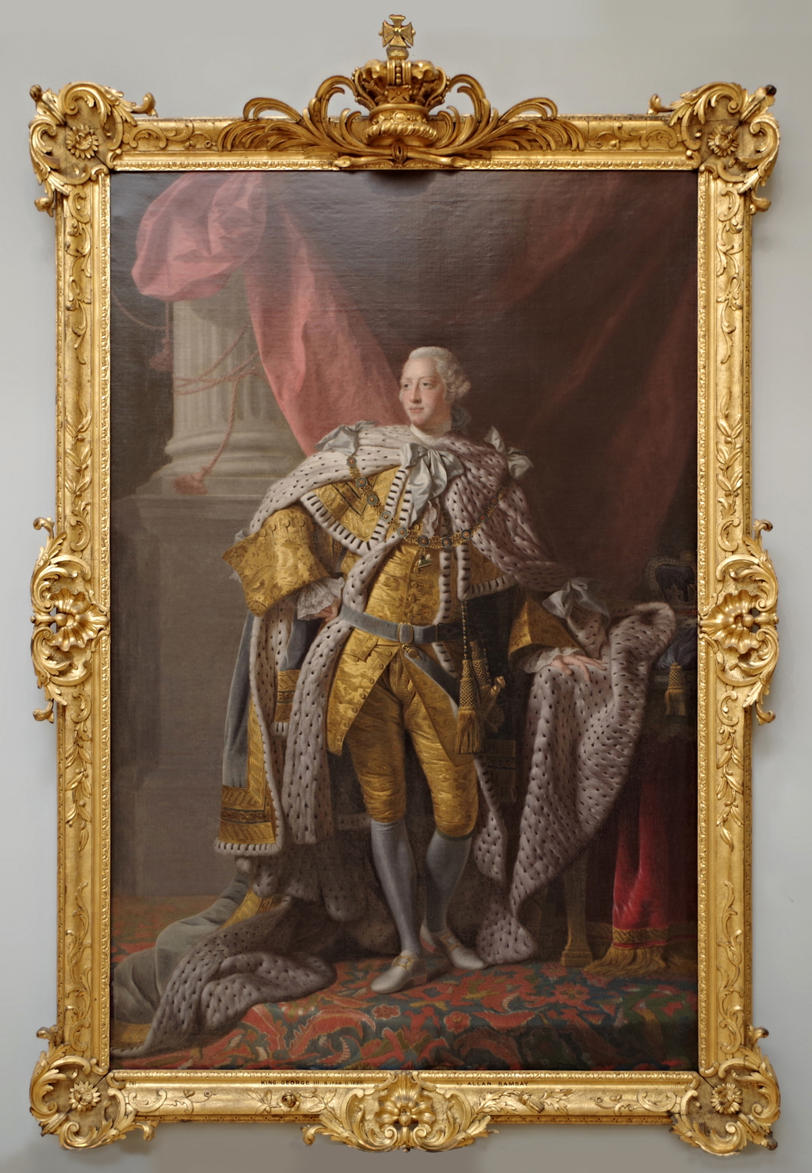
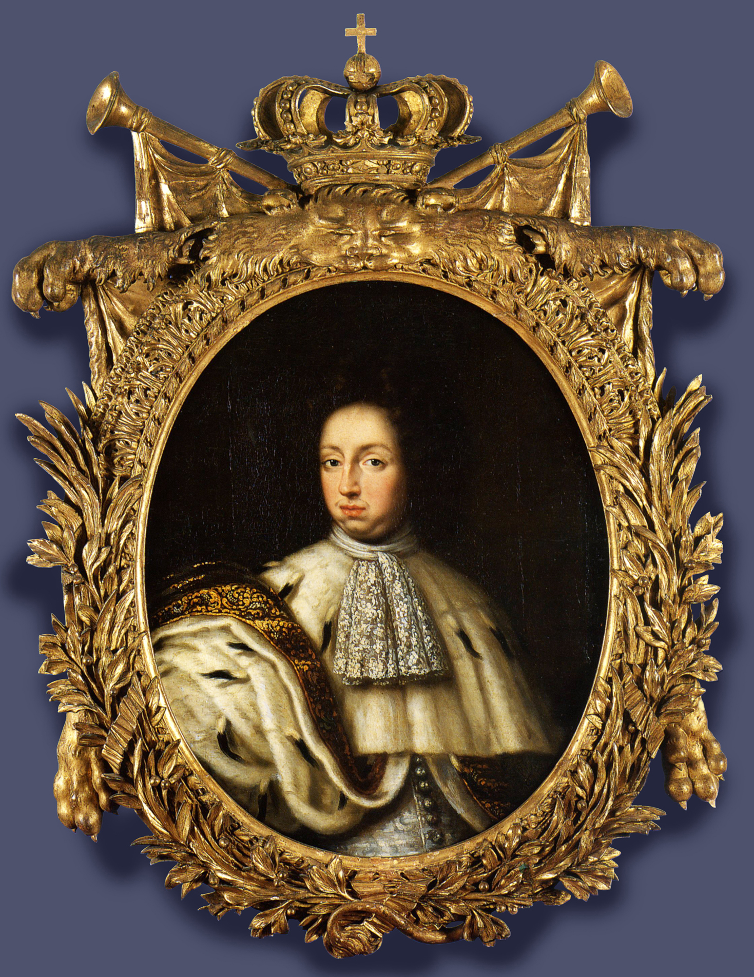
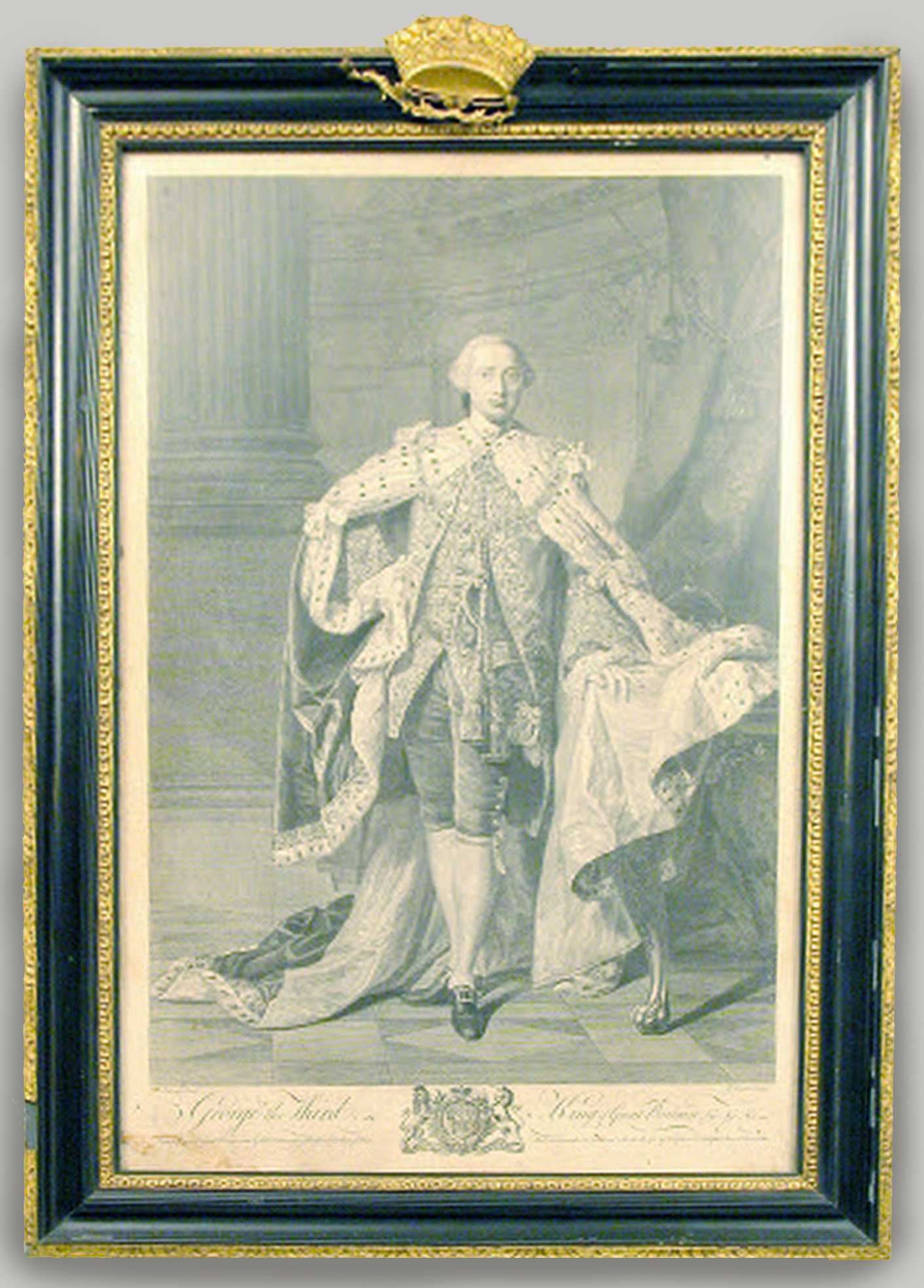
Allan Ramsay (workshop of; 1713-84), George III, c.1763, o/c, 249.7 x 163 cm., National Galleries of Scotland
To return to the latter, the kingly portrait frame, this appears fairly simple after those on William of Orange and the king of Sweden; it is actually one of very many which were carved for full-scale images of George III, king of Great Britain (r.1760-1820), in a sort of mass-production line of coronation portraiture; and it had a very important function with respect to the portraits.
The royal accounts for George’s reign reveal that about 175 frames were made by the king’s framemakers, René Stone (until 1773/74), Isaac Gosset (from 1774 until 1785), and William Adair (1785 onwards) for Allan Ramsay’s coronation portraits of the king and his queen [5]. The reason that there were so many is that they were presented to important courtiers, political figures and the king’s friends in Britain; relatives; British ambassadors to foreign countries and the odd foreign ambassador to Britain; foreign monarchs or rulers; important bodies, such as the South Sea Company or the Excise; and the governors of British colonies. Some framed portraits were paid for by those receiving them, but most were presented.
In the images of both Charles XI of Sweden and George III, it is noticeable that they are bareheaded– they are not crowned, although they are wearing their coronation robes. When a portrait was hung in an embassy or governor’s palace anywhere in the world, it would generally have a state canopy hung above it. The ambassador or governor would sit in front of the portrait and thus effectively would become not just the representative of the monarch, but the king himself [6]. For British outposts overseas this was a way of enforcing the idea of the presence of the king in that particular country; however, beyond this, the representation of the king at the moment of his coronation, with the crown hovering above his head, would also suggest that all subjects of the king should remember their vows to their monarch, made or implied at the coronation ceremony.
Allan Ramsay (after; 1713-84), George III as Prince of Wales, engraving by William Ryland, 1761/62, 58.8 x 38.1 cm., Saltram, Devon, National Trust
Even engravings of the heir to the throne, set in an 18th century print frame, might have a gilded crown added, indicating that those who might never see a painted portrait of king or heir, let alone any of the royal family in the flesh, were still symbolically in the royal presence and owed him their duty.
In comparison with the British royal frame, French versions tend to be more solidly sculptural, and their regal crests and crown much grander: here, an ordinary trophy frame (if a trophy frame can ever be ordinary) and an extraordinary military extravaganza enclose two portraits of the Sun King, Louis XIV.
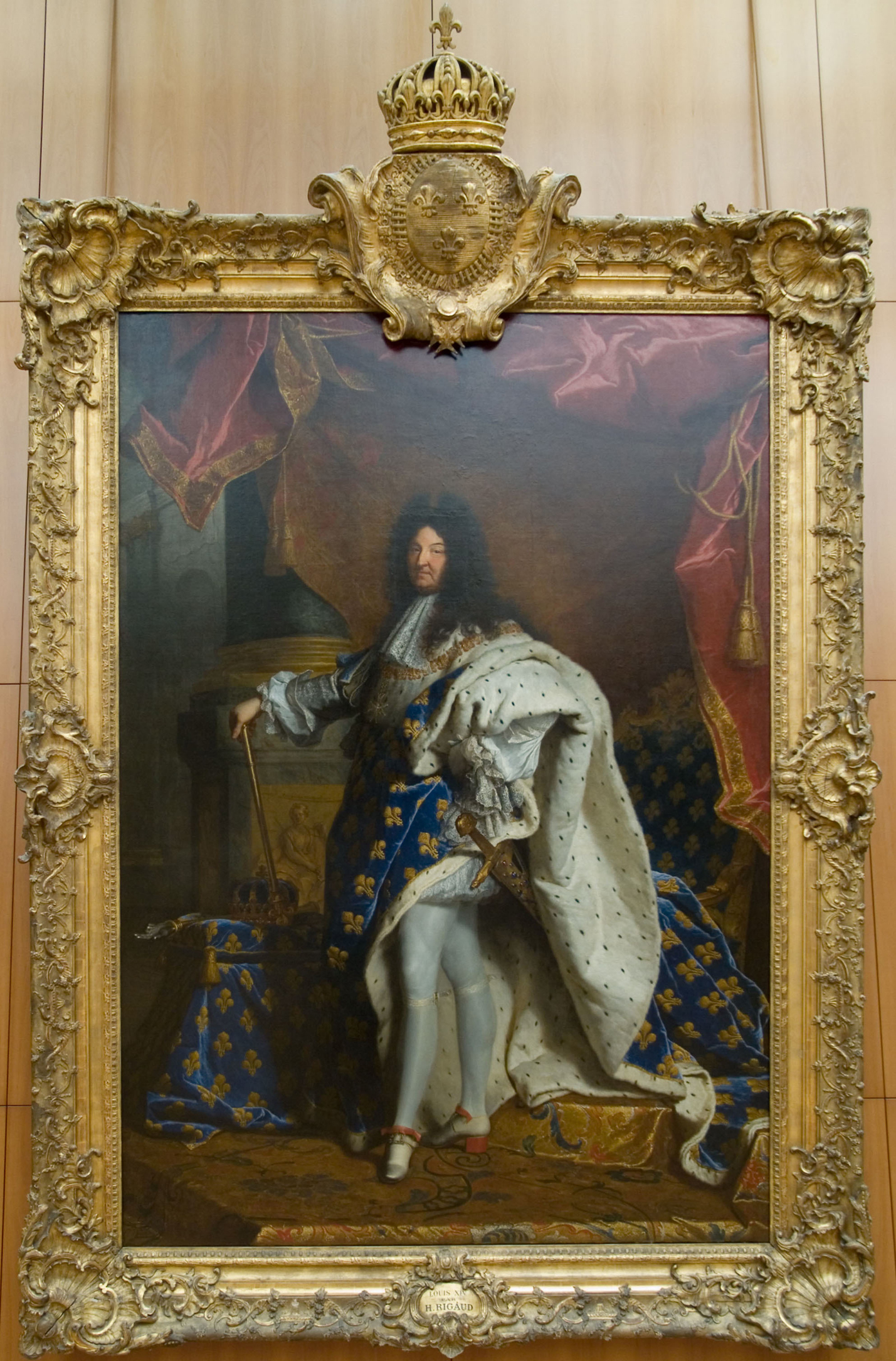
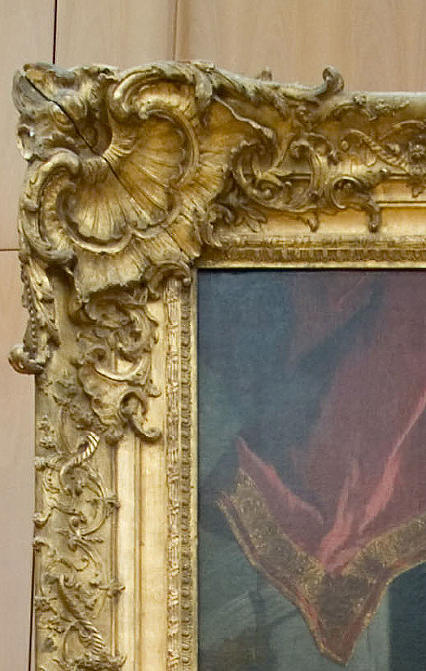
Hyacinthe Rigaud (1659-1743), Louis XIV in coronation robes, & detail, 1701, o/c, 277 x 194 cm., Musée du Louvre
The first is a large and splendid version of a Louis XIV frame, with ogee profile and beautifully sculptural scrolling foliate and shell corners and centres, the ogee carved with high relief fluted scrolls like miniature cornucopiae, and foliate flourishes. A mammoth cartouche with the French fleurs-de-lys supporting an oversized crown weighs down the top rail; and the invisible focal lines which the eye draws between all the corners and centres reinforce the compositional lines – the vertical of the king’s back leg as a central axis running up to his head, the horizontal of his arms, and the diagonals of his ermine-lined mantle. The refinement of the carving, allied to the scale of the whole structure, reflects the grandeur of the portrait itself, and the detail of its execution. The French frame withstands minute scrutiny from close up, as much as it awes from a distance.

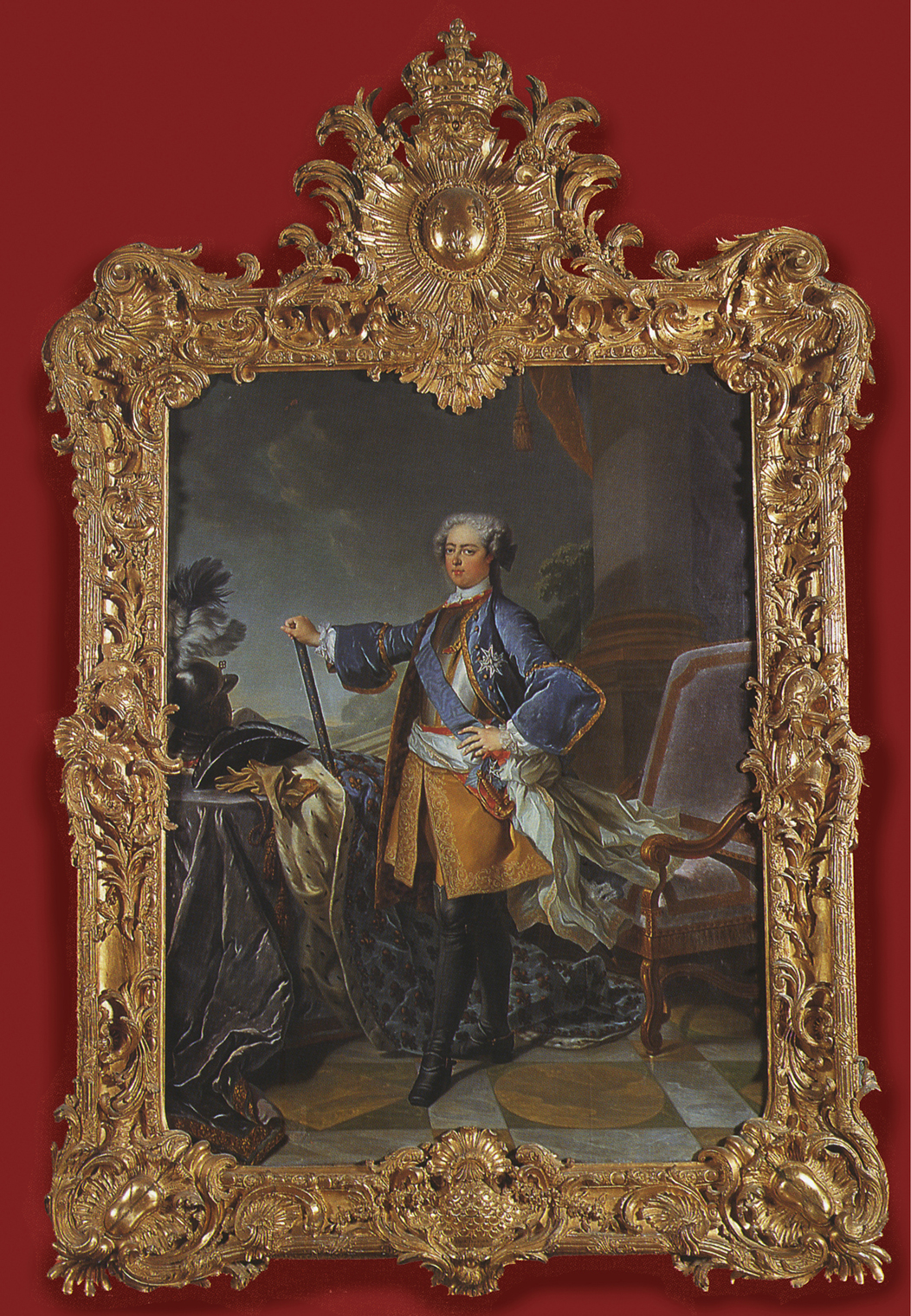
Hyacinthe Rigaud (workshop; 1659-1743), Louis XIV, 1700, o/c, Chateau de Chenonceau
The second portrait is a variation on a related image after Rigaud by his assistants, made for a favourite uncle of the king, Césare de Vendôme. The frame was carved for it by the sculptor Pierre Lepautre, the arched top giving it the vague air of an altarpiece, and the convex moulding which describes the arch being the only moulding belonging to a regular Louis IV frame (this is ornamented with a giant egg-&-dart moulding, the eggs replaced with fleur-de-lys cradled in curling leaves). The other three sides are made of gigantic palm branches decorated with bay leaves, draped in fringed curtains which fall from the arched moulding, and modest military trophies of plumed Roman helmets on crossed sheathed words. Figures of Fame sit on the crest, amplifying the king’s exploits through their trumpets, supporting a globe covered with fleur-de-lys and holding a garland of bay leaves. At the bottom an eagle carries a lion’s pelt, recalling the one on the frame of the Swedish king, as well as a helm and shields, and naturalistic lilies for France. This arrangement is astonishing enough, but it is also notable for having been carved from four solid pieces of wood. Most trophy frames are assembled from various carved elements which are pinned or laminated together before gessoing and gilding; this frame is rather like four great solid statues, built into a proscenium arch, within which painted curtains – the underside of the outer carved draperies – are drawn back to reveal the king in his glory. He hardly needs coronation robes when the frame is broadcasting his global and semi-divine power, his nationality, military exploits and fame.
Comparing these regal trophy frames is a dynamic way of experiencing the stylistic changes in presentation through successive rulers of a country.
Hyacinthe Rigaud (1659-1743), Louis XIV in coronation robes, 1701, o/c, 277 x 194 cm., Musée du Louvre

François Stiémart ( 1680-1740; after Hyacinth Rigaud, 1659-1743), Louis XV in coronation robes, 1739, frame by André Tramblin (d. 1742), private collection, Sweden

Maurice-Quentin de La Tour (1704-88), Louis XV, Salon 1748, Musée du Louvre
Jean Baptiste van Loo (1684-1745), Louis XV, late 1720s, Drottningholm Palace, Stockholm
The images above and below chart a hundred years of French rulers, comprising three kings and one emperor. They begin (in series, above) with the Baroque of Louis XIV, which has already been examined in more detail, with its rectangular contour and ornament all over the rails, through two versions of Louis XV Baroque, with swept rails and even more important corners and centres, to the flamboyant Rococo frame in Stockholm. The copy by Stiémart after Rigaud, which cost 900 livres, was framed by André Tramblin, framemaker to the Parisian aristocracy and the crown; the frame cost 850 livres [7]. The cartouche at the base records the whole work as a gift from the French king to the Swedish Count Gyllenborg. The carver and gilder of La Tour’s frame for his pastel of Louis XV has not yet been disentangled from the accounts [8]. This pastel frame is an exemplar of the French Louis XV frame, with bold, plastic corners and centres perfectly balanced within a relatively small space, and having regard to the scale of the sitter (the relative sizes of heads and carved crowns in Rigaud’s Louis XIV and this La Tour of his great-grandson are, at a glance, strikingly disproportionate, but they are, of course, designed for very differently-sized spaces). There may be some losses in the garland of flowers supporting the crown.
In comparison to Rigaud’s Louis XIV and La Tour’s Louis XV, the Rococo frame on Van Loo’s portrait of Louis XV is a restless, asymmetrical forest of accreted ornament, where slightly ungainly palm branches occupy the centre of each lateral rail, beneath military trophies of helmets, chains and corselets mixed up with acanthus fronds and shells. The wildly skewed rocaille corners are orbited by foliate and shelly C-scrolls, and the vast cartouche at the crest has the French fleur-de-lys surrounded by a glory which radiates over the picture surface, and contains a carved copy of the diamond order that Louis wears on his coat. It is supported by further large palm branches curling up to a fairly modest crown. All the decoration is deeply undercut, and every corner and centre also encroaches onto the painting; the Rococo elements exist alongside straight top rails of bound fasces. Within this writhing jungle of ornament, the figure of the king is slender and insubstantial, only gaining presence from the wide grey space which surrounds him, and the clarity of the colours in which he is painted. No records for this frame have been discovered yet; the portrait was presumably a gift from Louis XV to Gustav of Sweden, and the frame probably made in Sweden – possibly by Huguenot immigrants or by a Swedish carver trained in Paris.

Antoine-François Callet (1741-1823), Louis XVI in coronation robes, frame by François-Charles Buteux or Butteux (1732-88), 1781-82, Waddesdon Manor, Aylesbury, National Trust
Following chronologically are two versions (above and below) of Louis XVI NeoClassical frames with linear architectural mouldings and festoons of flowers, which contrast radically with the Drottningholm Rococo. This does not prevent them achieving their own degree of great opulence. The portrait by Callet and its frame by François-Charles Buteux are close in kind to Allan Ramsay’s coronation portrait of George III, although the originals of each are seventeen years apart. The artist in both cases produced many copies of the same image (ten times more in Ramsay’s case than Callet’s), and each framemaker carved trophy frames in the same style, or variants of it.
In the case of Buteux’s frames, they follow either Buteux’s own drawing of 1780, in the Musée des Arts décoratifs, or a design by Richard Lalonde (fl. 1780s-90s), which was approved in 1779 [9]. However, Buteux’s drawing diverges notably in its political trend from Stone’s and Gosset’s frames for the portraits of George III: it is annotated on the back, indicating that, as originally conceived, the frame would have been decorated with a rattlesnake and the cap of liberty, which, in association with the royal sceptre and the Hand of Justice, would have implied the support of the French king for the revolt of the American colonies against British rule [10].
Callet, Louis XVI in coronation robes, detail
However, peace seems to have intervened before this design was realized, and the trophies on the crest of the Waddesdon frame are limited to the royal coat of arms and order, banners, and a cushion supporting the sceptre, the Hand of Justice, and the crown. Incendiary trophies certainly seem more in the militaristic spirit of the Thebans and Boeotians rising up against the Spartans, or Syracusans invading Carthage.

Joseph Siffred Duplessis (after; 1725-1802), Portrait of Louis XVI, c.1774, Gobelins Manufactory, Walters Art Museum, Baltimore
A rather less controversial and highly decorative oval frame surrounds a Gobelins tapestry portrait of Louis XVI, after a painting by Duplessis. The trophy is very similar to that on the Callet portraits, including the sceptre, Hand of Justice and crown; but the coat of arms is replaced by drapery covered with fleur-de-lys which spread its tassels down the contour of the frame, beneath the festoons of flowers, which are carved in the round and completely undercut. The frame itself is decorated with four orders of very finely-carved ornament: beading on the back edge, enriched ribbon-&-stave, acanthus, and rais-de-coeur. It is both ironic and tragic that the trophies on these two Louis XVI frames include the royal sceptre and the Hand of Justice – ironic and tragic, seeing that Louis himself got no justice, but was guillotined by a kangaroo court during the French Revolution.
The last in this century of French rulers is Napoleon, and he is, of course, the odd one out here, since he was not a king by heredity, but an army leader who became the First Consul of France in the wake of the Revolution, and then its Emperor.
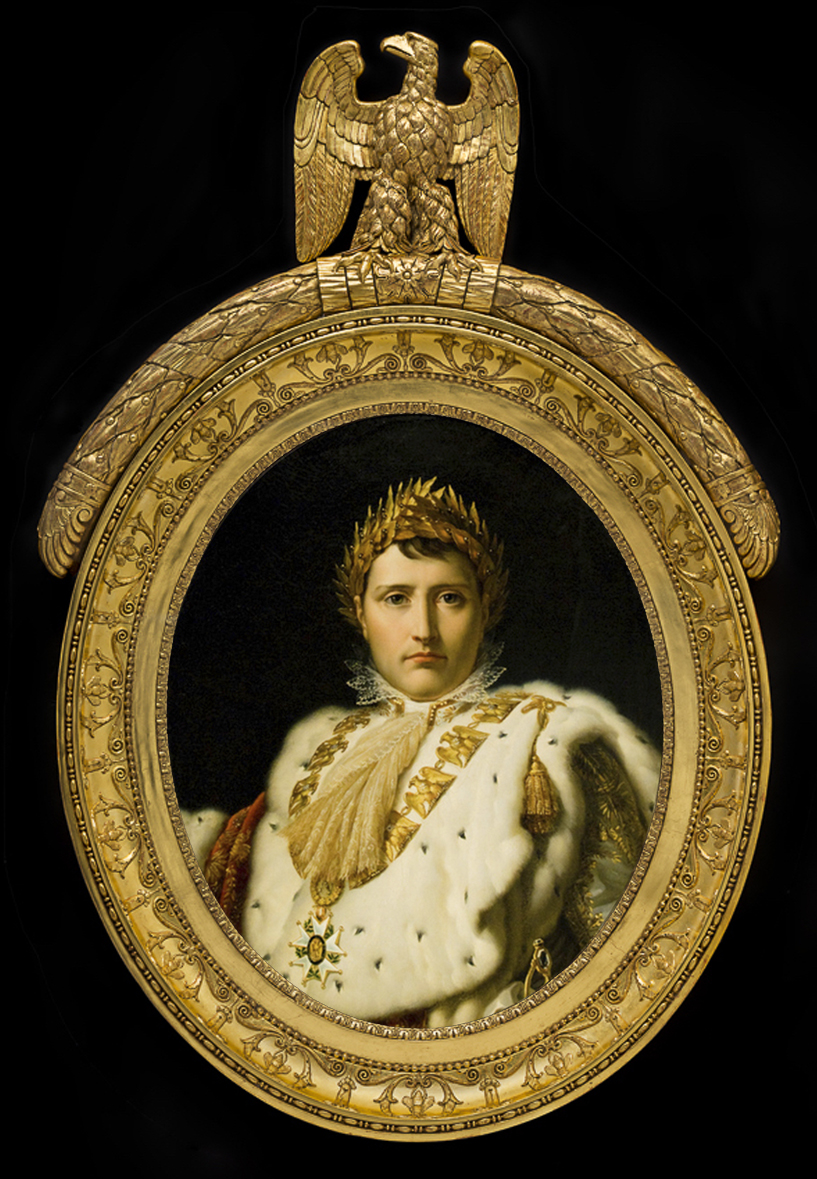
Baron Gérard (1770-1837), Portrait of Napoleon in coronation robes, c.1805-14, o/c, 82.2 x 65.5 cm., & detail, Musée des Beaux-Arts de Montreal. Photo of frame: Christine Guest
Napoleon employed a great deal of time and a lot of committees in choosing the emblems which would represent his rule, provide him with a retrospective lineage, and also differentiate him from the previous monarchy. He finally chose the eagle, which was associated with the Romans, with Jupiter, king of the gods, and with the 8th century French king Charlemagne. He also picked the bee, which was the badge of the ancient Merovingian dynasty in France, and represented industry and the production of sweetness and healing. The frame of this oval portrait by Gérard or his workshop is decorated with low-relief bees in the scotia, enclosed in single honeysuckle flowers and alternating with lilies in bud. The frame breaks with tradition further by having no crown at the crest: Napoleon does not appear to us in the process of being crowned, but as having gone through the coronation ceremony already; he is fully an emperor, and he is wearing his coronation crown of gold bay leaves in his portraits. Instead, the frame is surmounted by the Roman eagle on a garland of bay leaves. These trophies combine to suggest a history of power and achievement, but also healing and sweetness, and a pedigree which stretches back through the ancient past of France to the Roman Empire, avoiding the decadence of the ancien régime.
Trophies of love and marriage
There are, of course, many other kinds of trophies which developed from the military and regal ones, as those with enough money to commission or collect portraits and other paintings decided to invest in striking frames which would provide spectacular centrepieces to their collections, or perhaps just enhance one specific picture. The 17th and 18th centuries were the high point for carvers and gilders, and frames were created which were extraordinarily intricate and theatrical wooden sculptures.

Johannes Verkolje (1650-93), Johan de la Faille, 1674, 30.4 x 41.3 cm, Wadsworth Atheneum, Hartford

Johannes Verkolje (1650-93), Margaretha Delff, wife of Johan de la Faille, 1674, 30.4 x 41.3 cm, Wadsworth Atheneum, Hartford
One genre was that of the betrothal or marriage portrait, which might be the gift of a single portrait to the other partner, or could be a pair of portraits of the couple, like engagement or wedding photos.. An example is the small Dutch portrait of Johan de la Faille and the pendant of his wife, each of which has an operatically grand trophy frame, suited to its occupant. So Johan, dressed for hunting and equipped with a kennel-boy, gun, hunting horn and hounds, has a frame draped with nets, in which putti play with a deer at the top and a lion’s head at the bottom, while on the sides more putti play with rifles, pouches, spears and powder horns. His wife’s frame, however, seems almost exclusively concerned with the attributes of Venus – love and beauty. Her putti struggle with Cupid’s bow and sheaves of arrows, and with a dog’s head at the bottom, for fidelity. At the top a jewellery box is open, spilling necklaces down to the base, and giving the rather unfortunate impression, not that she is adorning her beauty for her husband, but that she has married him for his shopping skills.
Both portraits are painted on copper panels, a foot high; the putti are half the height of the painted, static figures, and overflowing with exuberant life. This sense of vigour and movement means that the portraits, although so relatively small, could not be overlooked in an interior, and something at least might be divined about the sitters from looking at their frames. The received opinion, therefore, that these frames overwhelm and diminish their contents, is not necessarily just; they depend on the whirls of vibrantly carved giltwood to project them from the wall, and their colour and the fineness of their detail is set off by the foil (so to speak) of the uniform gilding.

Nicolaes Maes (1634-93), Admiral Jacob Binkes (c.1640-d.1677), o/c, 17 ¼ x 12 7/8 ins (43.8 x 32.7 cm.), Metropolitan Museum, New York

Nicolaes Maes (1634-93), Ingena Rotterdam (d.1704), 1676, o/c, 17 ¼ x 13 ins (43.8 x 33 cm.), Metropolitan Museum, New York
With this second pair of frames containing portraits of a betrothed couple, the man is an Admiral in the Dutch navy, and we are back to military trophies, with a figure of the god of war (or perhaps Poiseidon, god of the sea) mounted on a sea horse at the top, baby tritons blowing horns, a tropaion, weapons, armour and naval instruments at the sides, and more sea horses, cannon and ammunition at the base. His betrothed has a frame with Venus holding a rose at the top, whilst roses and other flowers cascade down to the base where a pair of doves kiss; more doves, which are Venus’s birds, sit among the leaves with winged erotes or cupids. Sadly, the Admiral was killed in the West Indies in a battle with the French; but although his fiancée eventually married someone else, she must have hung onto the portraits.
The comparative scale of portraits to frames is the complete opposite from the previous pair: these sitters are shown half-length, and the figures, birds and horses on the frames are very much smaller, less dynamic, and much more integrated with the underlying flat substructure of the frame. This contrast within the individual work of art means, paradoxically, that these portraits, too, have found their own complements; although they would be better set off if the frames were less blurred with over-gilding.

18th century French school, Portrait of Pierre Marie Morin, c.1780, o/c, 51 x 40 cm., Delorme Collin du Bocage, 15 December 2016, Lot 65
This 18th century French oval portrait may have lost its pair. Here, the trophy is concentrated in one grand flourish at the crest, overlarge for the portrait and balanced rather unstably, but beautifully carved. This is a NeoClassical design from the very end of the ancien régime and the beginning of the French Revolution, with just two rich but very controlled mouldings around the frame itself (a ribbon-bound garland of imbricated bay leaves on the frieze, and a leaf tip sight edge). The trophy consists of a sheaf of Cupid’s arrows and the burning torch of love, with two doves in a basket nest, crowned with garlands of roses. The imagery is exactly the same as on the frame of Maes’s portrait of Ingena Rotterdam, yet here it is applied to the man, so it may be that this is a single painting, a gift from him to his beloved. The trophy can hardly be seen as integrated with the work of art as a whole, however; without it, we might be looking at the portrait of a writer, an earnest politician, composer or architect – there is nothing specific in the painting to tell us that this is the image of a lover, save for the top-heavy collection of love emblems above it – which are carved in meticulous detail.
Trophies of arts and occupations
Work and occupations also began to generate trophy frames – work that was different from naval and military service, and which included quite a number of frames related to the arts. In the case of painting, drama and music, trophies relating to these had developed much earlier, through pictures and engravings of personifications of the art in question, and had then been abstracted into arrangements of the associated objects.
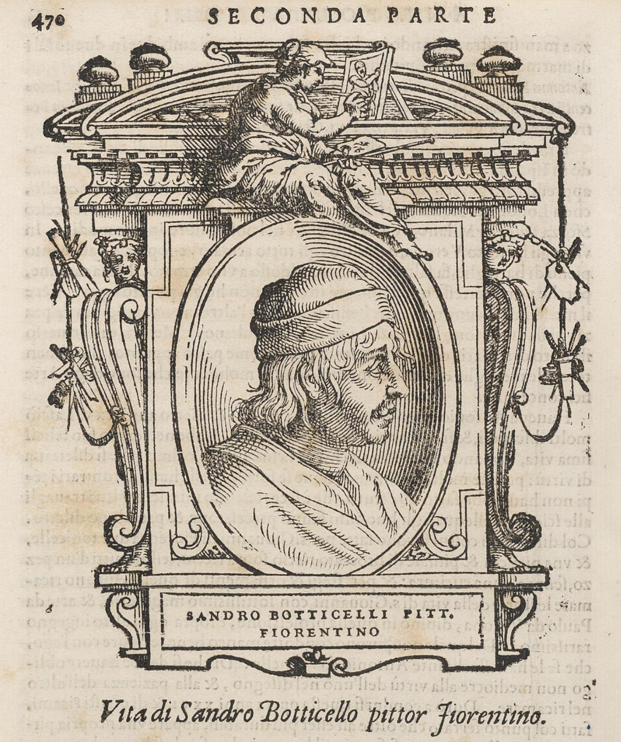
Giorgio Vasari (1511-74), Lives of the artists…, chapter heading for the ‘Life of Sandro Botticelli’, 1568, Royal Collection Trust/ HM the Queen
This sub-frontispiece is one of the chapter headings from what is probably the first book on the history of art – Vasari’s Lives of the painters, sculptors and architects. It was published in 1550; the engraved chapter headings appeared in the second, longer edition of 1568. Each biography in this edition opened with a woodcut of a frame, holding the personification of the appropriate art – for Botticelli, a Mannerist tabernacle with a female figure painting a picture on an easel, holding a palette, mahl stick and brushes. At the sides, trophies of instruments of all the arts hang from the pediment – chisels, set squares, dividers, palettes, brushes, pens and ink bottles. They are shown crossed, just as if they were weapons in a military trophy. For artists with as many talents as Michelangelo, a different frame could hold several female personifications, of sculpture, painting, and architecture, all with the tools of their various arts.
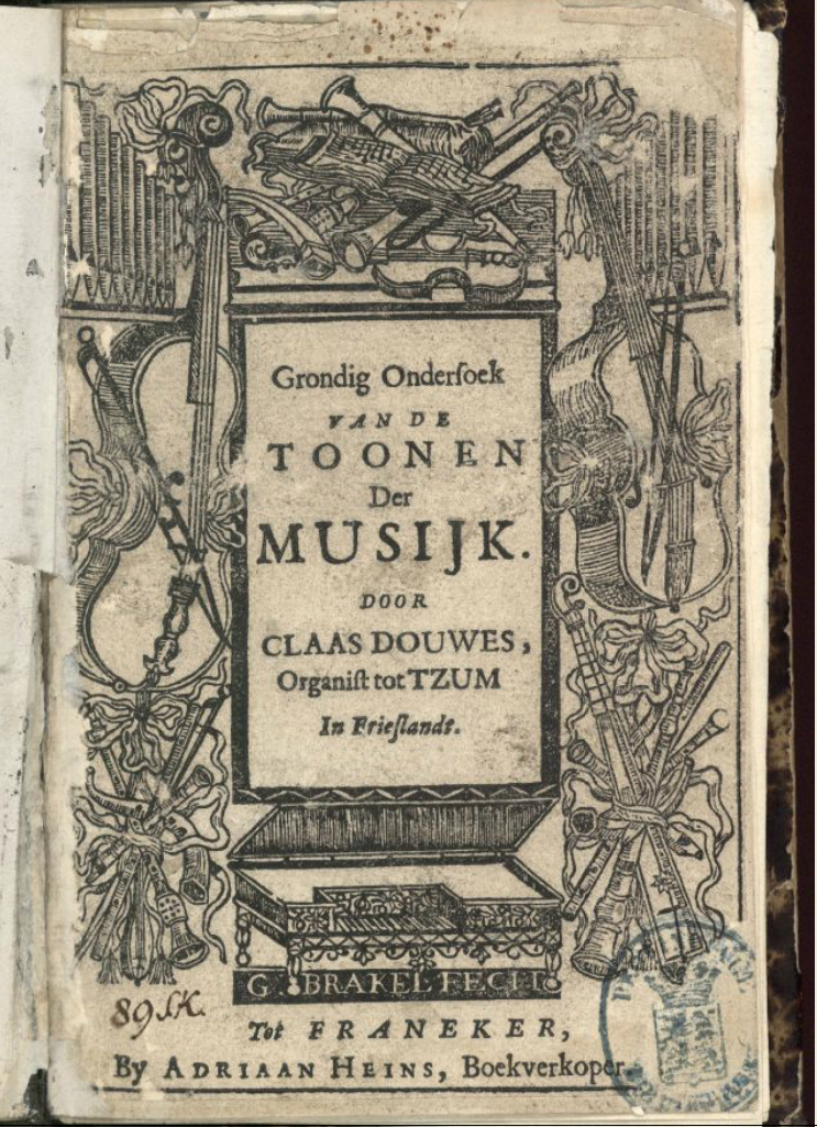
G. Brakel, title page with musical trophies for Claas Douwes (c.1650-c.1725), Grondig ondersoek van de toonen der musijk, or A thorough examination of music, 1699
Similarly, a Dutch book on music from the end of the 17th century could deploy musical trophies for its title page rather as Jacob de Gheyn II had done with military trophies for the frontispiece of his book, The exercise of armes, ninety years earlier. They are abstract arrangements of musical instruments, analogous to the instruments of the arts in Vasari’s book, and the crossed diagonals, bound with ribbon, of the pipes, recorders, horns and bows at the bottom are clearly based on the military tropaion. Engravings like these helped to spread the use of trophies of the arts for stuccowork on walls and ceilings, woven onto the borders of tapestries, and as wood carvings on frames and panelling.
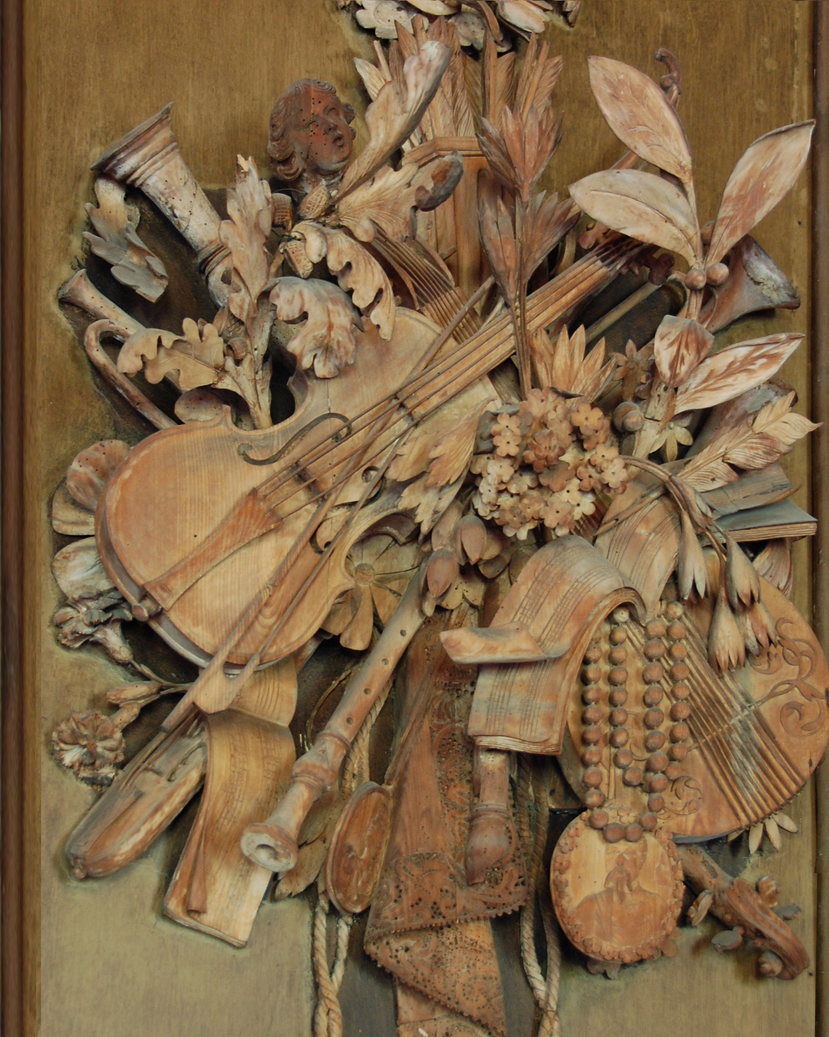
Grinling Gibbons (1648-1721), musical trophy carved in limewood, 1696, Petworth House, National Trust
The Flemish-trained Englishman, Grinling Gibbons, brought these flat, graphic designs into vivid, three-dimensional reality in the delicate limewood trophies he excelled in. The musical trophy in the Carved Room at Petworth is shaking off the constraints of the military diagonal; although the instruments cross each other they do so at every angle, in a starburst of objects which include a quiver of arrows, a length of lace, a singing putto, carnations, bay leaves, oak leaves, a pearl necklace, as well as a violin, a cittern, bows, recorders, flutes and trumpets, with sheet music for Purcell’s The Faery Queen. The various objects are deeply carved, apparently in the round – although they are made out of pieces of wood laminated together and only the parts which show, so to speak, are really in the round; part of the virtuosity of Gibbons’s art lies in the assured technique with which he reveals or conceals how it is achieved.
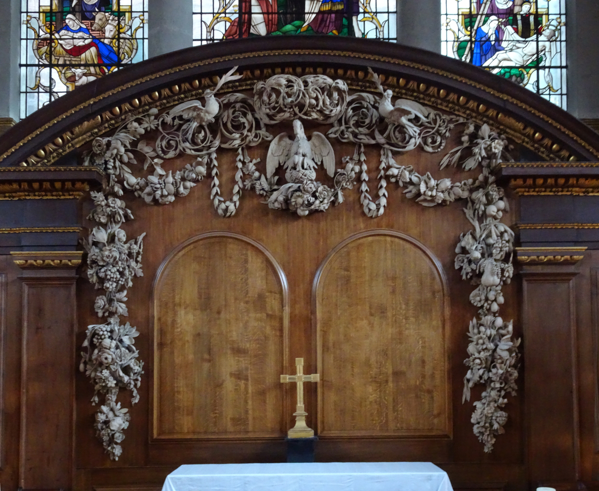
Grinling Gibbons (1648-1721), altarpiece, 1684, St James’s, Piccadilly, London
The limewood in its natural, unstained state would originally have been a pale blond, floating against the darker colouring of the oak panelling, reinforcing the delicacy and evanescence of the carvings. Later on, as it aged and darkened, and wood- and tobacco-smoke took their toll, the work of Gibbons (and his peers) tended to fade into the supporting panelling; some owners, however, whitened the carvings with limewash to preserve the contrast, as has happened to the retable of St James’s, Piccadilly. The structure of this altarpiece was described in 1708 as
‘fine Bolection, Pannels, with Architrave, Friese, and Cornish, of Cedar; and . . . a large compass Pediment’;
whilst the diarist John Evelyn noted the
‘flowres and Garlands about the Walls by Mr. Gibbons . . . a Pelican with her young at her breast’ [11].
This is itself a religious trophy, which, as it were, frames itself. The pelican in its piety (i.e. piercing its breast to feed its young with its blood) is a type of Christ; the festoons of flowers, fruit, and shells represent the bounty of earth and sea, and the doves the air, as well as being symbols of peace and love.
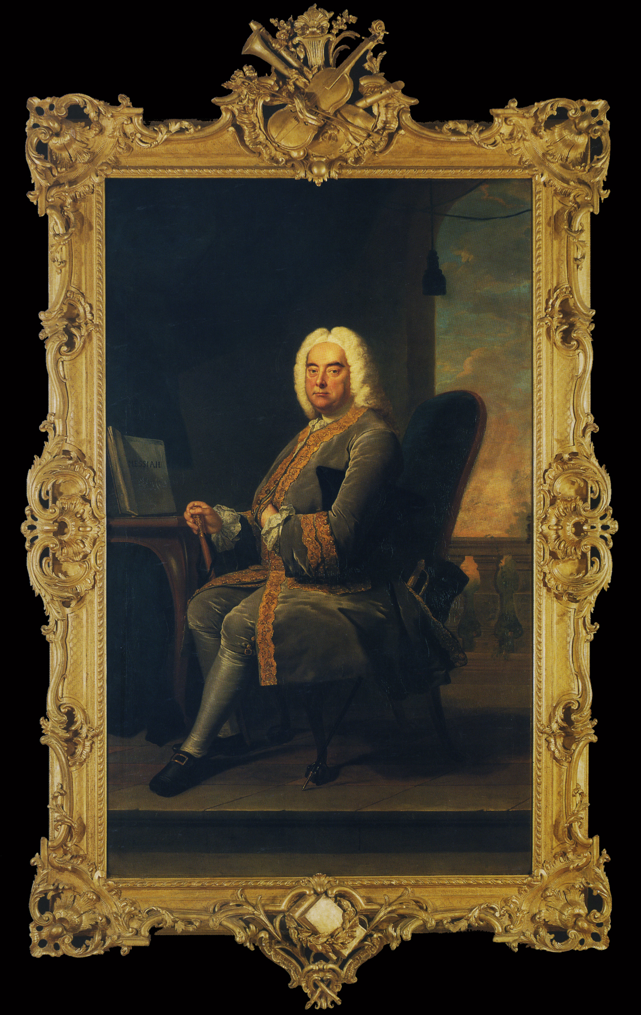
Thomas Hudson (1701-79), George Frideric Handel, 1756, o/c, 94 x 57 ½ ins (238.8 x 146.1 cm.), National Portrait Gallery
A rather less explosive bouquet of musical instruments than Gibbons’s made its way fifty years later to the top of the Rococo frame on Handel’s portrait, commissioned for the friend who supplied the words to the Messiah, the score of which is painted into the portrait.

Jacques Dumont Le Romain (1701-81), Musical trophy, 1736, sanguine on paper, 33.2 x 12.4 cm., Ecole des Beau-Arts de Paris

Nouveaux Trophéz inventez par J. Dumont Le Romain, published c.1735, one engraved plate of five, with two trophies of twelve: the fine arts and music, © Victoria and Albert Museum
Musical trophy from the frame of Hudson, George Frideric Handel, 1756, detail


Musical trophy from the overmantel looking-glass of the Music Room, Norfolk House, © Victoria and Albert Museum, and detail: Photo: BearTomCat
Musical trophies decorate both the crest and base of the frame; the one at the crest is adapted a plate from a booklet of etched trophies – the Livre de Nouveaux Trophéz, after drawings by Jacques Dumont Le Romain, published c.1735 [12]. The drawings were made in red chalk by Dumont (the first governor of the Ecole des Beaux-Arts, Paris), who designed all twelve trophies, the title page being drawn by Gilles-Marie Oppenord.

Joseph Duffour/Dufour (fl. 1730-d.776), trade card, British Museum, Prints & Drawings, Heal Collection
The carver of Handel’s frame was probably Joseph Duffour, to whom Hudson made payments in the 1750s [13]. Duffour has simplified Dumont’s trophy and altered it to suit a classical composer by changing the guitar for a violin, adding a bow, and swapping the book of music for a folded sheet; otherwise this is a fairly direct quotation of the source: he keeps the tambourine, oboe and recorders precisely as in the engraving. His friend, also a Frenchman, Jean Antoine Cuenot, used the same source for his carving of a trophy in the Music Room of Norfolk House [14], where it is suspended from the apex of the overmantel looking-glass frame. Cuenot has retained the guitar with its ribbon strap, pan pipes, recorders and pipes, but has replaced the tambourine with a harp – rather more appropriate to the probably accomplishments of the ladies of the house. The whole trophy is woven with branches of bay and oak leaves, and swings from a magnificently ruffled bow, beneath a Rococo-fied tête espagnolette. It is fascinating to trace the different manifestations of Dumont’s original drawings – which Peter Fuhring, as quoted by Stephen Ongpin, refers back to trophies engraved by Enea Vico.
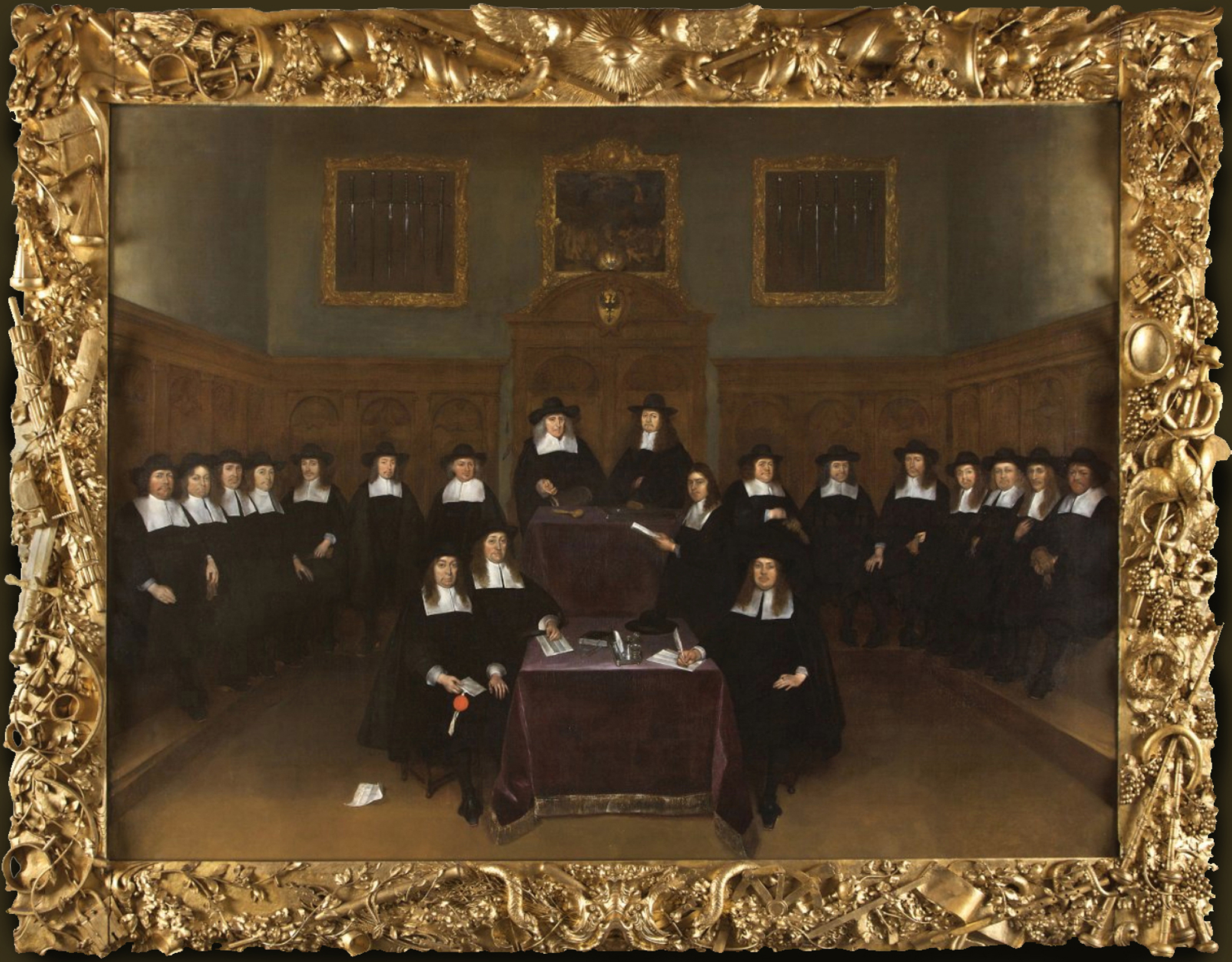

Gerard ter Borch (1617-81), The town council of Deventer, 1667, o/c, 186 x 248 cm., frame by Derck Daniels (1632-1710), gilt limewood, overall 238 x 294 cm., & details of top left & bottom right corners, Town Hall, Deventer, Netherlands
Musical trophies also turn up, in a completely different context, on a frame which is devoted to the description of Justice. This is a three-dimensional, sculptural specimen of carving which encompasses a whole allegory, from the all-seeing eye of Justice at the top, supported by measuring rods, indicating the moderation of justice, and by two cornucopiae or horns of plenty. The horn on the right pours out fruit, wheat and other benefits, in the traditional manner, with a hand holding a palm of victory; but the one on the left is a sort of anti-cornucopia – it pours out justice on the sinner, in the form of a hand holding a cat-o’-nine-tails, a bunch of rods and a form of ankle restraint, whilst down the left-hand side are the scales of Justice, the sword of Justice, fasces (the badge of Roman justice), handcuffs and padlocks, all entwined in a barren vine. The horn of plenty on the right side produces a fruitful vine covered with bunches of grapes, in which there are doves and keys and garlands, as well as the caduceus or staff of Hermes wound with two snakes, carved in the centre, behind the dove. This signifies protection for merchants and fair trade. Beneath it, in the bottom right-hand corner, are pipes and a recorder, indicating the harmony which results from justice flourishing in a good society [15].
The frame contains a group portrait of the magistrates of the town of Deventer in the Netherlands – the men who had to orchestrate justice to obtain a good society. It was painted by Gerard ter Borch, who received 600 guilders, while the framemaker, Derck Daniels, received 500. Daniels may have worked more often for Ter Borch; the frames of the latter’s portraits of Willem and Geertruid Marienburg (1660-62) in the Národní Galerie, Prague, have been attributed to Daniels , as has the frame of Ter Borch’s portrait of Gisbert Cuper (c.1675) in the Museum De Waag, Deventer [16]. Daniels also executed the two frames seen in the background of the Deventer group portrait, which hold arrangements of the swords used to punish evil-doing; these are still preserved in the old Town Hall, and the frames carry symbols of justice and retribution similar to those on the portrait frame.
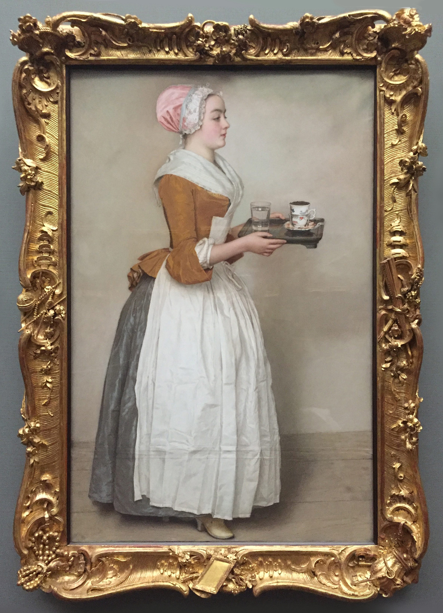
Jean-Etienne Liotard (1702-89), Das Schokoladenmädchen or La belle chocolatière, c. 1744-5, pastel on paper, 82.5 x 52.5 cm., Staatliche Kunstsammlungen, Dresden
The trophies for occupations and work could be very diverse indeed, and sometimes quite as surprising as in the frame for the Deventer magistrates. One example is the collection of carved objects on the frame of a pastel by the Swiss artist, Jean-Etienne Liotard, which shows a maidservant with a tray of hot chocolate. This is set in a Dresden Gallery livery frame [17] which has been adapted to its subject, with finely-carved details at the corners and centres of items which a might be in the care of a lady’s maid, when she is not carrying cups of chocolate to wake her mistress in the morning. 

Liotard, Das Schokoladenmädchen, details
For example, held in the C-scrolls at the centre of the left side is a ball of wool with knitting needles and a pearl necklace, whilst in the bottom right-hand corner is a purse and a bunch of keys, and in the bottom centre a small framed looking-glass. All are carved with the same precision as conventional frame ornaments, such as shells and flowers, and they fit happily in with the other rocaille ornaments of the frame. They are the attributes of a lady’s maid, but they are treated here with an élan which raises them to the status of trophies.
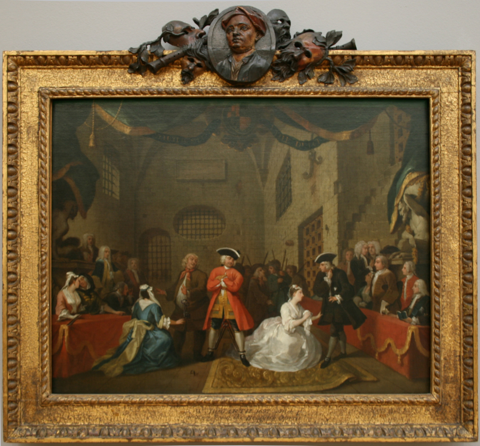
William Hogarth (1697-1764), A scene from ‘The Beggar’s Opera’, 1731, o/c, 57.2 x 76.2 cm., Tate Britain
Trophies relating to domestic service are very rare, but – for instance – theatrical trophies provide a rich seam of occupational celebration. Hogarth’s painting of a scene from the satirical musical The beggar’s opera, which took London by storm when it was staged in 1728, is an example. It was bought by a William Huggins, who was probably responsible for ordering the carved frame with a painted wooden trophy at the crest.

Hogarth, A scene from ‘The Beggar’s Opera’, detail
The trophy is composed of musical instruments, satyrs’ masks, bay leaves, and a medallion with the head of John Gay, who wrote The beggar’s opera. Huggins was a friend of Hogarth, who was very interested generally in the framing of his work and may have advised him on the design of the trophy. The satyrs’ masks, connected historically with drama in the classical world, also underline the fact that the play was a satire – both on the Italian opera favoured by the aristocracy, and on corruption in the government of the day; whilst the portrait medallion heroizes its author, removing the painting from being seen as no more than a generalized depiction of the theatre.
Hogarth’s portrait of David Garrick as Richard III (1745; Walker Art Gallery, Liverpool) also has a trophy at the crest of its Rococo frame, but this is a military trophy referring to the actor’s rôle, rather than to the theatre as an occupation.


Joshua Reynolds (1723-92), David Garrick between Comedy & Tragedy, 1760-61, o/c, 183 x 147.6 cm., & detail, Waddesdon Manor, Aylesbury, National Trust
Reynolds’s portrait of Garrick torn between Comedy and Tragedy (and succumbing to Comedy) can more truly be called a trophy frame, as it includes a number of motifs with slightly different meanings, which combine into a greater significance. At the centre of the left-hand side are a violin and a comic mask; facing it on the right are two goblets (theatrically and tragically speaking, the usual container for poison); at the crest is a medallion with the bust of Shakespeare, writer of both comedies and tragedies, and – like Garrick himself – also an actor-manager; and at the base is another mask, almost hidden behind a scroll of paper carrying the script. Garrick, who seemed to be particularly keen on collecting portraits of himself, is equating himself with Shakespeare, as well as making it clear that both Comedy and Tragedy have chosen him as their favoured vessel, and that it is his choice to follow Comedy.
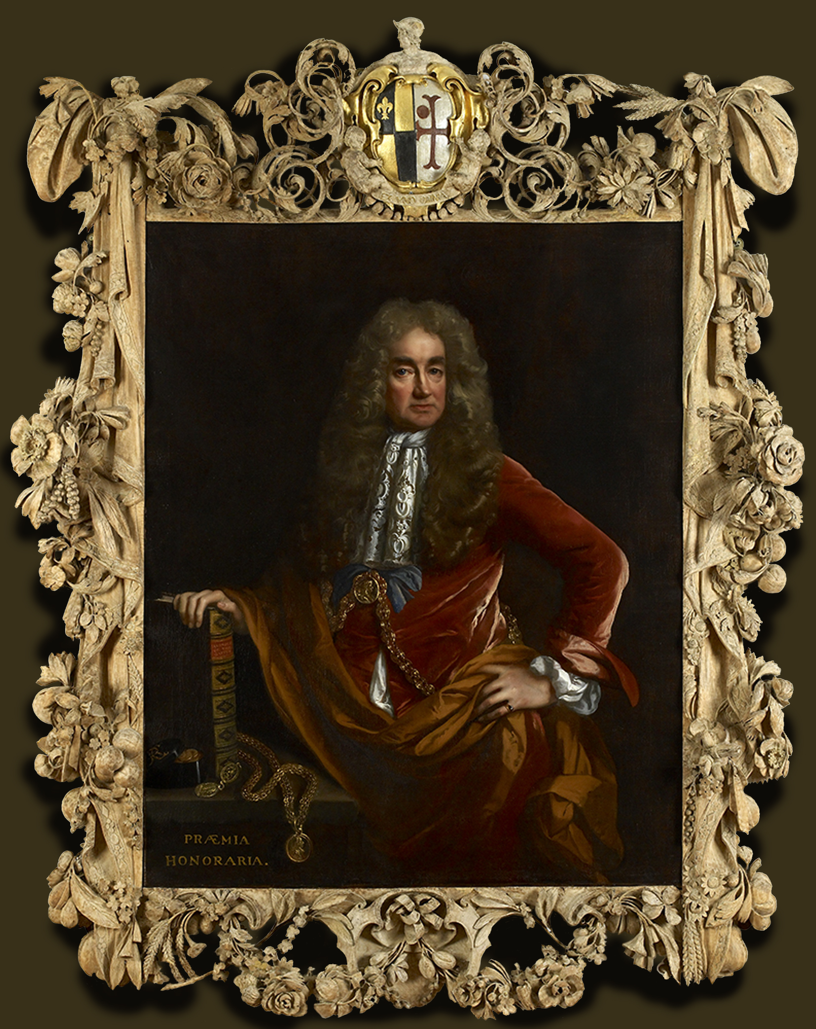
John Riley (1646-91), Elias Ashmole, 1681-81, o/c, 124 x 101 cm., frame by Grinling Gibbons (WA1898.36), © Ashmolean Museum, University of Oxford
As time goes on, we find a bewildering number of occupations which can be carved into a frame, to explain the contents. The fantastic flourish around Elias Ashmole’s portrait was carved by Grinling Gibbons from limewood, intended – like the Petworth and Piccadilly church carvings – to be seen ungilded, and the whole work was hung in Ashmole’s museum in Oxford, which was then opened to the public, and eventually became the Ashmolean Museum. Elias Ashmole was a lawyer and antiquary, interested in sciences and natural history, who inherited the botanical collection (which he had catalogued) of the Tradescants, a family of travellers, collectors and gardeners. This, along with his own collection, formed the core of the museum. The frame is carved with around fifty different species of plants from across the world – as well as from England, from the Americas, East Asia and Africa – which highlight the extent of knowledge of the natural world in the late 17th century. Without this frame, Ashmole would be only a wealthy man who had written the book on heraldry which he holds in the painting; within it, he regains his status as a scientific member of The Royal Society with an abiding thirst for the acquisition and cataloguing of natural wonders, and also the founder of a museum.
Guild trophies
There are also trophy frames (as, of course, there are ordinary frames) on objects other than ‘painted representations’, as it is put in Prijst de lijst: there are frames on
‘memorial plaques, hatchments, coats of arms, guild tablets or blazons of rhetoric’ [18].
The footnote to this reminder adds that,
‘considerable effort went into the frames of guild tablets in particular’,
picking out two of them as ‘high points’ – the Visserji-bord of the Fishermen’s Guild in Maassluis, and the ‘Caert’ of the Dordrecht Coopers’ Guild in the Dordrechts Museum [19].

Abraham van Beyeren (c.1620-90), Visserij-bord, 1649, c.700 x 300 cm., Groote Kerk, Maassluis, Netherlands
The Visserij-bord is a vast construction like a memorial tablet, painted in faux-marbre, which was apparently commissioned by four sea captains in 1649; they were reimbursed for it after some years of pleading and rejections by the Maassluis Guild of Fishery. The inscription in the central panel is a poem celebrating the 1648 peace treaty between Spain and the Netherlands which freed local fishermen to go about their business, and thanking God for this, His bounty and protection from danger; it also mentions various species of fish which are depicted on the frame. There are three painted rectangular marines in the tiers above and below this inscription, and two oval marines in the lateral ‘wings’, all of which are surrounded by various trophies of sea life (figures of fishermen, sea monsters, a whale at the crest, the fish from the poem hanging down as if caught, seashells on the apron). These trophies are painted on the flat panels of the frame, and those at the edges are cut out around their contours. The board has the monogram of Van Beyeren painted on it, and another monogram, which has been attributed to the unknown framemaker [20].
It looks like a large altarpiece in tabernacle-form – which it is, in some sense, given the invocation to God in the poem, the celebration of the natural world, and the very small cherub on the apron. Two carved models of fishing boats have been restored and returned to sit on the top of the cornice – they were removed in 1850 so that the painting behind was more visible, and hadn’t been returned at the point the article cited, by Scott Sullivan, was published in 1987 [21]. The latter includes a 19th century painting of the interior of the Groote Kerk, in which the Visserik-bord is a towering presence; this depiction of the church with a congregation reveals the huge scale of it, in comparison to the tiny worshippers.

Trophy frame of the Dordrecht Coopers’ Guild, holding list of members, dated 1682, Dordrechts Museum
This frame is also a guild item; it was made for the Dordrecht society of wine coopers, and depicts the whole process of wine-making, with scenes and objects carved in various levels of relief and scale. This includes the harvesting of grapes, pressing and storing the wine, delivering it by horse-drawn drey, organizing a tasting for merchants and even exporting it by sea. At the top, in miniature, is the Wijnkopers’ chapel, with a working clock, and two baby Dionysoses enthroned on barrels, each with a cloud-engulfed arm which holds up a sun on the left and a moon on the right, presumably indicating that there is never a time when drinking wine is out of the question. The frame holds a list of members of the Coopers’ Guild, dating from 1682; the importance of the barrels they made is underlined by the number shown on the frame. The whole thing is designed on an Auricular base which takes the form of a scrolling-edged skin, as though this is the parchment within come to life; it is a stunning design, meticulously designed and carved, from the screw and vat on the left-hand side, with a tap to emit the pressed grape-juice, to the block and tackle on the right, with a tiny barrel being loaded onto the ship.
Ecclesiastical trophies
The Church, both Catholic and Protestant, made use of trophy frames for other images as well as for sacred pictures, and besides slipping into the prayer of the Visserij-bord and the chapel of the wine coopers. Here, for instance, are the portraits of two Catholic archbishops and one Anglican bishop.

Hyacinthe Rigaud (1659-1743), Portrait of Charles de Saint-Albin, Archbishop of Cambrai, 1723, o/c, 57 ½ x 44 ½ ins (146.1 x 113 cm.), The J.Paul Getty Museum
The archbishops are both also cardinals, identified by the hats with tassels on their respective frames, the swords and the croziers. The Archbishop of Cambrai (above) is – although also a bastard – of royal blood, which is signified by the crown, eagle and coat of arms with fleur-de-lys at the crest of the frame. There is a cross of Lorraine tucked under the eagle’s wing, or, as it was probably still known then, a cross of Anjou [22]. His nationality, pedigree and status are thus all carefully laid out in this weighty sculpture, which rears mountainlike above his head in the very solid and three-dimensional way of French frames. This one was shorn of its projecting corners, crest and apron at some point, being reduced to a rectilinear Régence frame; the missing parts were restored with the help of a drawing by Gilles-Marie Oppenord.
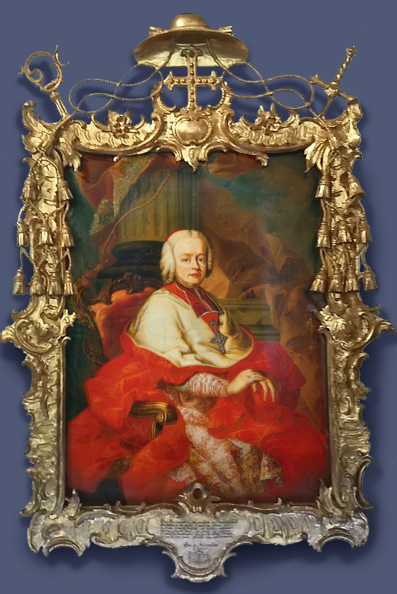
Franz Xaver Konig (1711-82), Siegmund III Christoph von Schrattenbach, Archbishop of Salzburg, 1755, o/c, dimensions not available, Salzburg Museum
The frame of the Austrian cardinal-archbishop is, in contrast, an airy, pierced Rococo confection, all flyaway corners, waves of rocailles, and impossible fishing-nets of dangling tassels depending from cords in double figures-of-eight. Where the French archbishop’s frame is four-square in its grandeur, mimicking the structure and presentation of a monarch’s frame, this frame is designed for what Holman Hunt would call a ‘Dresden china shepherdess’, with the emblems of archepiscopal power added in appropriate style – for the frame, if not perhaps for the archbishop. The crozier and sword are not as immediately visible as they are in the heaped trophies of Saint-Aubin’s frame; they seem to cross at the back of the frame, emerging at the top corners, but the hook of the crozier is so curly as to appear like another Rococo flourish, whilst only the hilt of the sword can be seen. The cross is large and central, but it is cast (literally) into the shade by the immense umbrella brim of the cardinal’s hat and its weaving cat’s cradle of cords and tassels. Style has won out, in this case, over the symbolic and descriptive functions of the trophy.
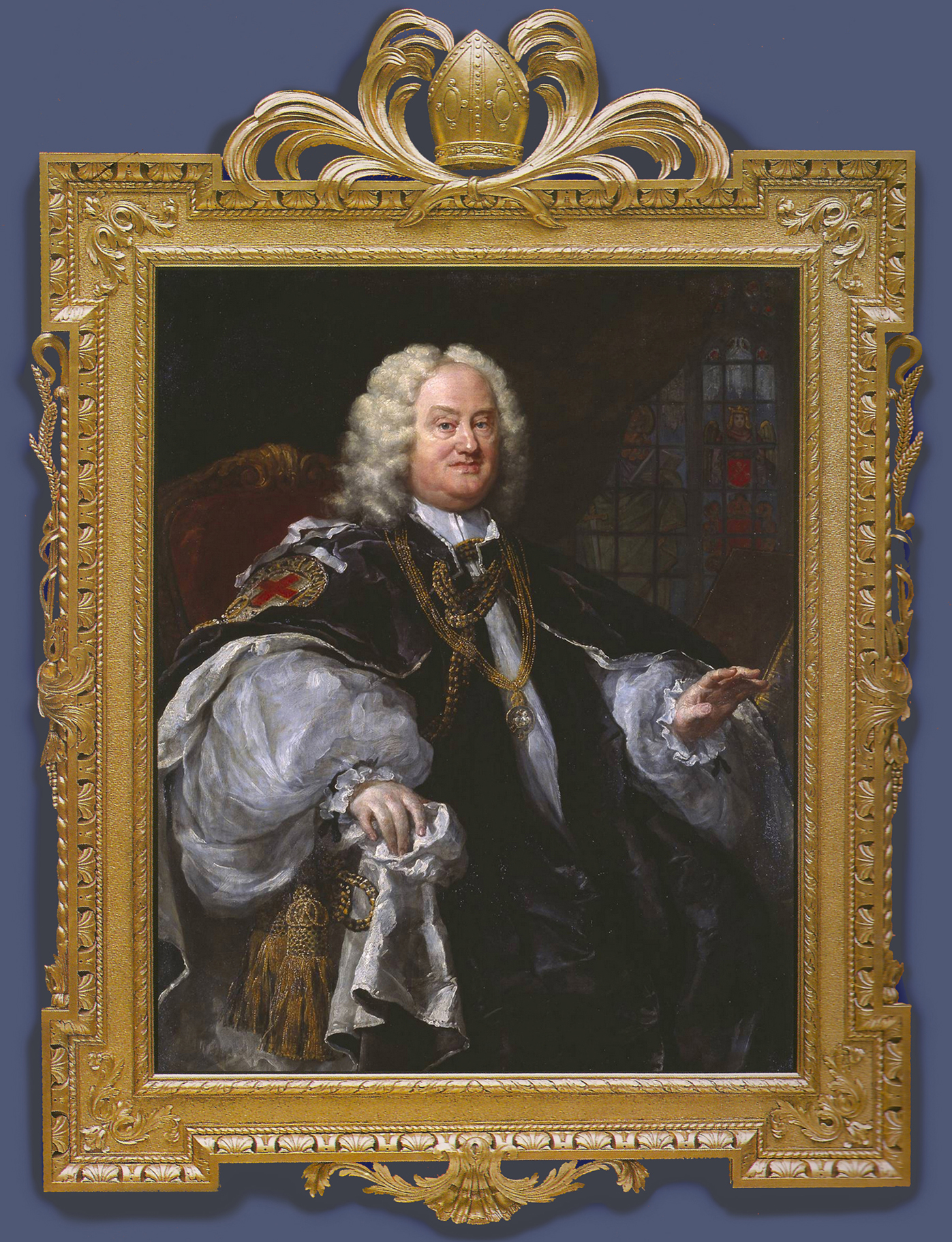
William Hogarth (1697-1764), Dr Benjamin Hoadly, Bishop of Winchester, 1741, o/c, 127.3 x 101.5 cm., Tate Britain
Dr Hoadly, as an English Protestant bishop, has a frame of a much more retiring and modest nature. It is a typical Palladian or ‘Kent’ frame, given a slightly ecclesiastical cast in the main structure by the pierced moulding of scallop shell-&-dart beneath the top edge, with its reference to pilgrimage and to the sacrament of Baptism. The added trophies include a bishop’s mitre at the crest, supported in flourish of scrolling palm branches, with a crozier, ears of wheat and pendant grapes added at the sides (these were replaced some years ago). The wheat and grapes refer to the sacrament of the Eucharist; the barley-sugar twist of the croziers echoes the cable moulding around the frame. It is interesting to note that this Protestant frame has the symbols for two different sacraments on it, whilst the Catholic frames are innocent of all sacramental references, only containing the instruments of power.
A framemaker: Paul Petit’s trophies
Siegfried von Schrattenbach’s frame demonstrates the possibilities of the trophy frame in the 18th century, when the Rococo style was already conjuring wood into towering follies of sugar-spun fantasy. In Britain, the quality of wood-carving – and thus of picture frames – had been immensely improved by the influx of French Huguenot carvers and gilders, escaping Catholic persecution after the Revocation of the Edict of Nantes in 1685. The population of Huguenot silk weavers, clock- and watchmakers, metalworkers and engravers, as well as woodworkers, was so great that by 1700 it supported twenty-three Protestant churches in London alone [23]. Amongst the discrete tribes of specialists in particular arts, 18th century London harboured numbers of framemakers with French names, or names anglified from their original French; many of them supplied the higher quality of carved work demanded by the Crown and the ton, and also imparted their skills in carving, réparure (or recutting in the gesso) and gilding to their English assistants and apprentices.
One of them was Paul Petit (fl. 1722 to the late 1750s ), whose work for Frederick, Prince of Wales has been extensively researched [24]. Frederick’s forebears ruled the Electorate of Hanover, but he was the great-great-great-grandson of James I of Great Britain, and the random quirks of death left him, at 20, heir to the British throne. He arrived in London a year later, having been parted from his parents for fourteen years and accustomed to act as their proxies in Hanover. The set he established in London functioned as another court, at a tangent to his father’s (George II), and was the centre of his patronage of music and the arts (not to mention the ‘Leicester House Faction’, a gathering of political opponents of the king, which included both Whigs and Tories [25]).
William Kent, Royal Barge, 1731-32, Royal Collection Trust / © Her Majesty Queen Elizabeth II 2014. Photographer: Bruce White
Part of Frederick’s political activity was stimulated by his father’s refusal to increase his income, which was inadequate to support his wide-ranging patronage of everything from cricket to the work of Paul Petit. The latter’s first work for Frederick appears to have been his gilding and painting of the Royal Barge, designed by William Kent in 1731-32, and executed by the King’s Master Carver, James Richards. This itself is rampant with trophies – shells, mermaids, dolphins, oak branches, the Prince of Wales’s feathers and a crown. The Prince must have seen the need for his own master carver (or perhaps his father refused him Richards’s probably costly services, in an effort to reduce his expenditure). In any case, Petit produced a group of fabulously extravagant frames for Frederick over the next seventeen years, some of them for his portrait, surrounded by bouquets of trophies, designed to celebrate his prowess in battle, the arts – and the field.

John Wootton (c.1682-1764), The shooting party: Frederick, Prince of Wales, with John Spencer & Charles Douglas, 3rd Duke of Queensberry, 1740, o/c, 88.9 x 74 cm., frame by Paul Petit; Royal Collection Trust / © Her Majesty Queen Elizabeth II
Here is a major wooden sculpture which epitomizes that branch of the trophy frame created for pictures of the hunt. Surpassing even the Netherlandish frame for Jan Verkolje’s Portrait of Johan de la Faille (1650-93), and the French Baroque frame of Alexandre-François Desportes’s A royal hunting dog watching two partridges (1734), both shown earlier, not to mention the pair of French Louis XIV frames for Annibale Carracci’s La pêche (with its nets and dolphins) and La chasse (boars’ heads supported by hounds), Petit’s frame for Wootton’s scene of slightly etiolated huntsmen employs the full panoply of hunting trophies on a prodigal Rococo structure of S-scrolling rails trailing rocailles and lambrequins, projecting asymmetric corners, inscribed plinth and flourishing crest.
This crest comprises the Prince of Wales’s crown, surmounted by his plumes and mounted on a lion’s head and bay leaves, with two dead mallards depending from the top rail. The sides have a hunting knife and powder flask on the left and a bow and quiver of arrows on the right, both trophies with branches of oak leaves above and bullrushes below. In the lower corners are two hounds’ heads, and on the plinth (inscribed ‘J. Wootton’) a hawk places its talon proprietorially on a defunct pigeon and looks down its beak at one of the dogs. Jacob Simon suggests that this is the frame for which Frederick paid Petit £21 in 1742 [26].

Thomas Hudson (1701-79), Frederick, Prince of Wales, 1745-48, o/c, 115 x 73 ins, Trinity College, Dublin
According to Desmond Fitzgerald, the Knight of Glin,
‘Undoubtedly the finest frame in Ireland is the one by Paul Petit for Thomas Hudson’s portrait of Frederick, Prince of Wales, hanging in the dining-room at Trinity College. The account survives in the Library at Windsor Castle, dated 2 June 1748 and records: “In burnished Gold in the Best manner. Sent to Dublin College £197. 7s. 6d.”. This was an enormous amount of money.’ [27]
It is, however, a huge frame, and the trophies in the corners and centres celebrate the prince in his rôle as Chancellor of Trinity College, a position which he held from 1728 until his death in 1751. They are sited in the corners and centres of a Rococo structure which is like a greatly extended version of that on the Wootton, with broken fragments of architectural mouldings and irregular scrolled endings breaking up the swept rails, undulating waves of rocaille and juxtaposed lambrequins. They are trophies of the arts – a palette and brushes, books, a lute, sheet music, the head of Atlas at the base, supporting the globe. Jacob Simon fills out the contemporary description of the frame:
‘…richely carved with the Prince’s Crest at top with Cornicopies powring out Orders and several Medals, neatly carv’d with several emblembes of arts and Sciences… sent to Dublin College’ [28].
This, with its advertizing in such grandiose terms the arts of peace and civilization, is perhaps the opposite of the military trophy, where these frames originated: or, at least, at one extreme end of the spectrum, where military trophy frames are at the other.

Jonathan Richardson (1665-1745), Frederick, Prince of Wales, 1736, o/c, 100 x 59 ¾ ins, frame by Paul Petit; one of a pair; Warwick Castle. Photo: Clare McLeod
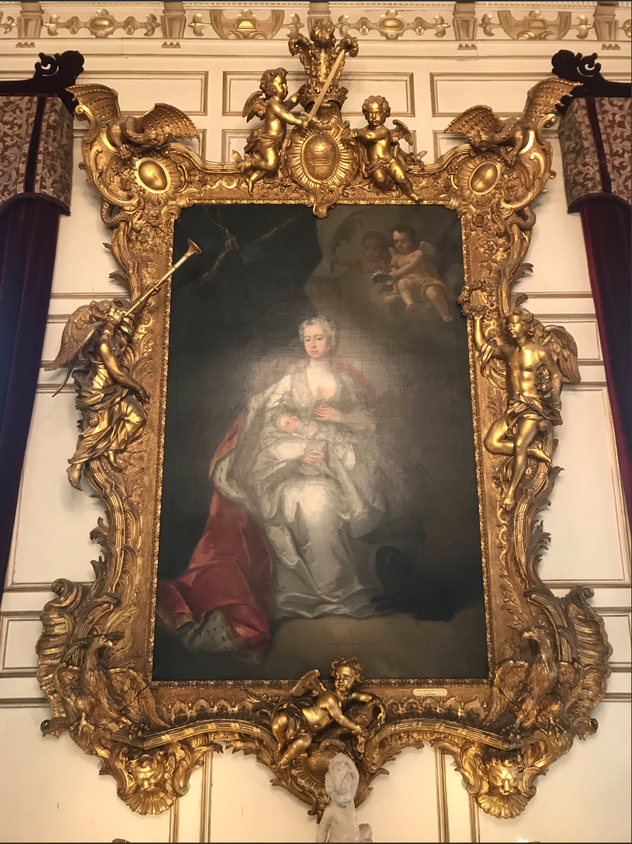
Jonathan Richardson (1665-1745), Augusta, Princess of Wales, c. 1736, frame by Paul Petit; one of a pair with the Prince of Wales; Warwick Castle. Photo: Peter Schade
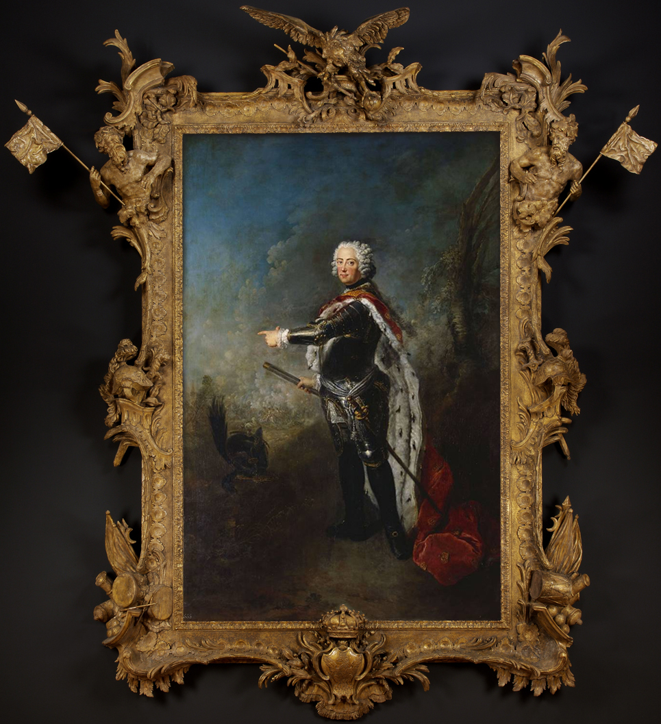
Antoine Pesne (1683-1757), Frederick II, King of Prussia (1712-86), o/c, 265.8 x 177.7 cm., Royal Collection Trust / © Her Majesty Queen Elizabeth II; montaged with original frame attributed to Paul Petit, Carlton Hobbs LLC
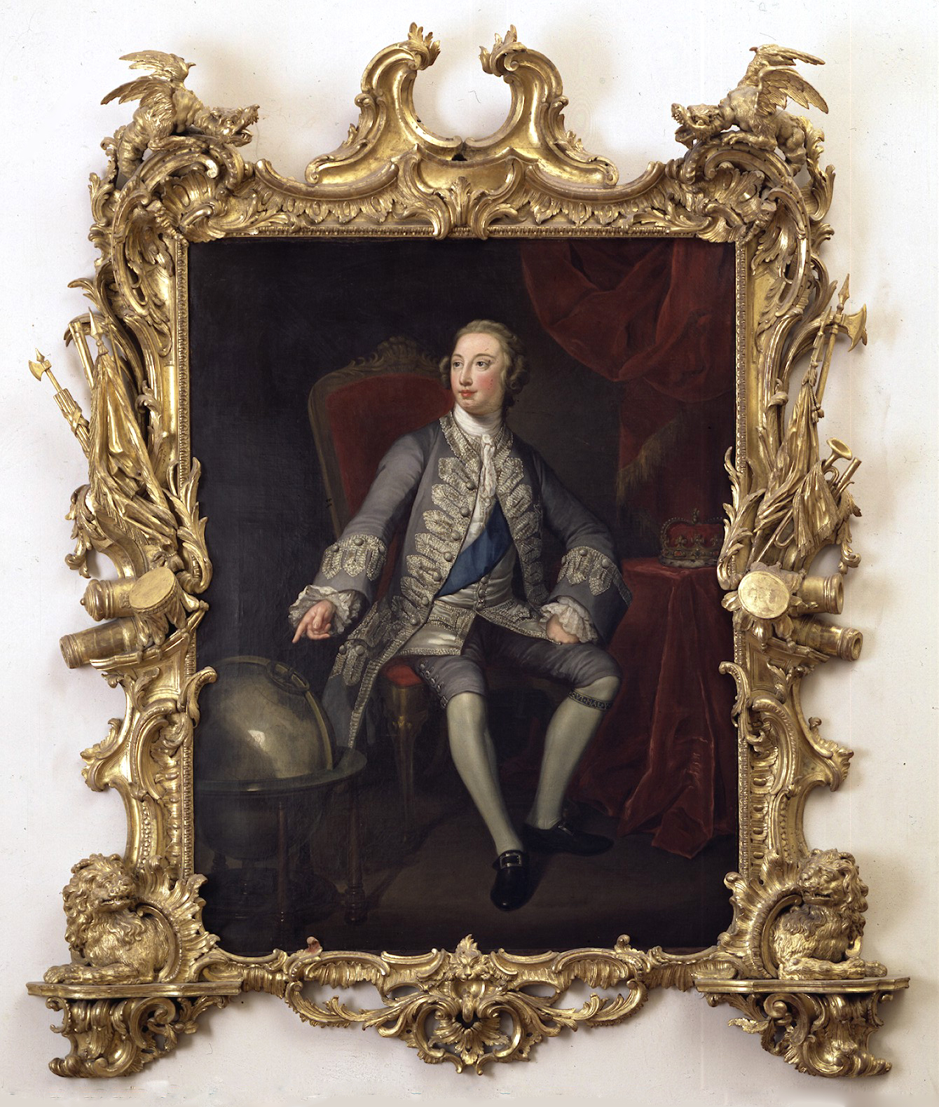
George Knapton (after; 1698-1778), Frederick, Prince of Wales, c.1751, o/c, 215.9 x 185.4 cm., frame attributed to Paul Petit, © Victoria and Albert Museum
Paul Petit provided military trophy frames as well, of course; one of the more assertive is half of a pair created for the portraits of the Prince of Wales and his wife by Jonathan Richardson [29]: ‘In 1739 Petit and Henry Joris, another craftsman who worked with Petit, submitted a bill for “a Picture frame Carved in ye Grandest Manner with boys and Roman Eutropheus Richly Ornamented Neatly repair’d [recut in the gesso] and gilt In Burnish Gold in the best Manner… £160” ’ [30]. The trophies at the sides, in classical tropaion style, are practically life size, in that the corselets and helmets look as though they would fit the prince, which is unusual in a genre of frame where there is usually a discrepancy of scale between sitter and trophy. They, like the putti at crest and base, are carved so much in the round as to give the impression of being actual pieces of armour that Frederick might have brought back from some imagined battlefield, and set up, like a Roman commander, around his likeness [31]. The frame for the princess has a figure of Fame publicizing her worth and beauty with a trumpet, a youth awarding her a wreath, dragons at the top corners for Wales, and eagles in the bottom corners for her Germanic birth.
The frame for the portrait by Antoine Pesne of King Frederick of Prussia, a cousin of the Prince of Wales, was sadly sold out of the Royal Collection at some point, although the painting itself remains. It emerged onto the art market some years ago, and has been thoroughly researched by David Oakey on behalf of Carlton Hobbs, resulting in the conclusion that frame and portrait were in some sense a propaganda statement, expressing the prince’s support for the Prussian side in the War of the Austrian Succession in opposition to the support of his father, George II, and thus the country as a whole, for the Austrians [32].
The frame in the V & A surrounds a posthumous portrait of the prince, copied from the group portrait of him with his family in the Royal Collection. The trophies are scaled down to much less aggressive proportions than in the Warwick Castle frame, and are accompanied by a convocation of lions at the base – a central mask, and two sculptural lions couchant, emerging from rocaille-fringed grottos, balanced by two snarling (hissing?) dragons on the top corners. The central trophy has been lost from the open C-scrolled support at the crest; this would presumably have held the Prince of Wales’s feathers. Petit’s trademark use of misaligned fragments of the rails and other architectural mouldings, plus infills of large-scale rocailles and lambrequins which morph into one another, are very apparent in this late example of his work, which contains a complex interplay of mouldings and motifs, linear and shaped inner contour, structural elements and trophies.
Additional military trophy frames
Other British Rococo and later trophy frames, naval and military, could be mentioned; there is the spectacular pierced and trellised frame, crowned by an imposing head of Poseidon with cannon and banners, for Samuel Scott, Vice Admiral Sir George Anson’s victory off Cape Finisterre (1749, Yale Center for British Art), with a companion piece (The Tower of London, 1753) in an almost identical frame. There is the frame for Thomas Hudson’s Portrait of the Hon. John Byng, Admiral of the Blue (c.1756, private collection), which, it has been suggested, may have been designed by Mathias Lock; this is a very slender, airy and pierced framework of scrolls and palms, laced with small-naval trophies, including a compass at the base and another large head of Poseidon at the crest.

Joshua Reynolds(1723-92), Field Marshal Jean-Louis Ligonier, c.1755, o/c, National Army Museum
There is also Lord Ligonier’s portrait by Reynolds; this is described by the museum as having an ‘ornate gilt frame, carved with military trophies, thought to be contemporary and made for the painting’, and it is tempting to think that this ‘son of a refugee Huguenot family’ might have known a Huguenot carver only too willing to carve a piece of military Rococo for a national hero. However, this frame is nothing like a mid-18th century frame, never mind in the French-derived vocabulary of a Huguenot carver. It looks, at first glance, as though it is either a fortuitous reframing from the time it was painted or later, or that Reynolds may have painted this portrait to fit an existing frame. It is certainly appropriate in its continuous border of arms and militaria – if rather flat for Reynolds’s style – but it has no coat of arms or any emblem relating to Ligonier (his tomb, and his memorial to his brother, can be seen in Westminster Abbey), which is slightly suspicious. If it is, indeed, antique rather than mid-18th century, then it is rather nice that it should have been recycled so effectively.
Mythological trophies

French School, Venus at her toilet, second half of the 16th century, Musée Granet, Aix-en-Provence
Framing may work in precisely the opposite way from what appears to be the case with Lord Ligonier’s frame: it is never a surprise to see that a painting has been updated by being set in a more fashionable frame than the style of its own era, and, the more precious the art or the artist, the more often this is likely to happen.
Here, however, and rather more unusually, an 18th century trophy frame has been produced specifically to frame a 16th century work of the Fontainebleau School. A Mannerist painting of Venus at her toilet is set in a heavy scotia frame in Transitional style, which would be quite austere without the trophies which cover it. These include motifs from the story of Adonis in the top left corner – Adonis’s hunting horn, arrows, axe, net and sword, along with the head of the boar which killed him; trophies from Venus’s dalliance with Mars in the top right (helmet, fasces, sword and banner); one of the swans which draws her chariot in the bottom right-hand corner and a cygnet in the left; a trophy at the bottom centre with elements from the Judgement of Paris (Juno’s peacock, Venus’s dove, the bagpipes Paris played when disguised as a shepherd, the golden apple he was given by Discord to present to the most beautiful goddess, and a sword, representing the war between Greece and Troy which was the result). At the crest of the frame is a cloud bearing Venus’s shell-shaped chariot, Cupid’s bow and arrows, the flaming torch of love, and a dove. Roses and other flowers fall in festoons to meet the bullrushes and hart’s tongue ferns growing up from the base, and water (Venus is a watery goddess) cascades from the two bottom corners.
This is possibly one of the most informative of secular trophy frames ever to be made; it sets out whole episodes from the stories associated with Venus around a painting which is completely free of any narrative – the frame is intended to be unriddled by a spectator who is well-read in Ovid’s Metamorphoses, and its information applied to the contents: so that that spectator would know without being told that the central figure in the painted pyramid of attribute-free women is Venus.
Mythological trophy frames also encompass a group by two masters of Baroque sculpture which were coincidently none of them designed for paintings, but for looking-glasses.

Johann Paul Schor (1615-74; also known as known as Giovanni Paolo Tedesco), Venus looking-glass frame, location somewhere in Genoa
The Austrian Baroque designer, Johann or Giovanni Schor, spent most of his life in Rome, working for the Vatican amongst other patrons, and collaborating with artists such as Bernini, Carlo Rainaldi and Pietro da Cortona. He designed everything from tables, ceilings and coaches to silks, altarpieces, and secular frames. Both of the two included here, above and below, exhibit and play on the theatricality and dynamism of the Baroque; both use a reverse cassetta with a fluted frieze as the foundation for a particular mythological theme.

Johann Paul Schor (1615-74), Pallas Athena looking-glass frame, location unknown
The first is for a looking-glass which takes the conceit that the woman who looks into it is the embodiment of Venus, or Aphrodite; so that the attendants who stand on either side seem to peer in to it, entranced by the beauty of the reflection. Above, the scallop shell on which the goddess was borne to land after her birth in the ocean is drawn by a pair of her emblematic doves, and supported by baby tritons riding sea-horses. At the base, two harpies have been conquered by love and beauty, and are tied together by their long golden hair.
The second frame now houses a flowerpiece, but it was probably also conceived as a looking-glass – although in this case the theme is not quite so flattering to the viewer. The whole structure is supported at the base by two grimacing centaurs, personifying lust, whilst two figures of Athena sit on the top. Athena is the virgin goddess of wisdom, so the idea of the frame is that of reason and chastity subduing lust. Each figure is contemplating what appears to be the mirrored shield given by Athena to Perseus, so that he could look into it while killing the Gorgon, thus evading her gaze which turned men to stone. In Ovid’s retelling of the myth of the Gorgon, Medusa, she was originally very beautiful, but was turned into a monster with snakes in her hair for defiling the temple of Athena; thus what the looking-glass frame seems to be suggesting is that if the user behaves promiscuously, she will end up like Medusa: just the gift for a young bride or the daughter of the house.

Filippo Parodi (1630-1702), frame with The judgement of Paris, now containing Ferdinand Vouet, Portrait of Maria Mancini, Palazzo Spinola, Genoa
Like the slightly younger Schor, the Genoese sculptor Parodi was also greatly influenced by Bernini, and also produced looking-glass frames which play with the idea of the viewer’s reflected image as part of the work, and which marry this with classical myths. The looking-glass frame with the judgement of Paris uses a Baroque leaf frame as the foundation for the story, which again casts the viewer as the embodiment of Venus. The other two goddesses in this contest to find the most beautiful are Hera (or Juno), Queen of heaven, wife of Zeus, on the left, with a small identifying peacock tucked down by her knees, and Athena on the right, with helmet and spear. Hermes, the messenger of the gods, swoops in from the top left, carrying the golden apple which Paris must give to whichever of the three goddesses he judges most beautiful (in the myth, being bribed by Venus, who promises him Helen of Troy, the most beautiful of mortal women). Paris has already chosen, however; in Parodi’s version he needs no bribe or time to choose – he immediately points down at the looking-glass, which (of course) should be reflecting the image of the goddess of beauty. Unfortunately, replacing the glass with Maria Mancini has destroyed the whole conceit with an image not in any case quite up to Paris’s confidence choice. At the base a baby Eros occupies Venus’s scallop shell. The wildly asymmetrical scrolling leaves and contrapposto figures give the myth an urgency and tension which anticipates its ending on the battlefield of Troy.

Filippo Parodi (1630-1702), frame with Narcissus, looking-glass, 1667, Villa Durazzo Faraggiana, Albisola
Parodi’s second frame is an extraordinary melding of a piece of furniture, a frame and a sculpture into a retelling of the legend of Narcissus, which also implicates the viewer in the narrative. The looking-glass, which appears to descend on a rocky plinth to the floor, is actually poised at the back of a console table, the reflecting surface of which is level with the paws of the greyhound on the left, so that Narcissus, leaning down from the top of the frame, is looking down into a horizontal ‘pool’. The vertical glass becomes another pool, into which the approaching spectator looks, being drawn vertiginously into the same pose as Narcissus, and aping his vanity and self-love. The rocky surround stands simultaneously for the caves where Echo hid to watch Narcissus in her love for him, gradually fading away until she was just the vibration of other people’s voices.
Trophy frames in the 19th and 20th centuries
The trophy frame never really acquired much traction in the 19th century. The proportional expense for wood-carving, with rising labour costs due to war and the Industrial Revolution, and the ubiquity of compo, which is not particularly suited to large flourishes, made the attributive frame a much better proposition. Motifs which were appropriate to the painted subject could be produced as running compo mouldings, supporting (for example) the trend for orientalist picture frames, much more easily and economically.

David Wilkie (1785-1841), William IV (r. 1830-37) wearing the robes of the Garter, c.1831, o/c, 521/8 x 421/8 ins (132.4 x 107 cm.), Philip Mould

Thomas Sully (1783-1872), Queen Victoria, 1838, o/c, 94 x 58 ins (238.8 x 147.3 cm.), Metropolitan Museum of Art, New York
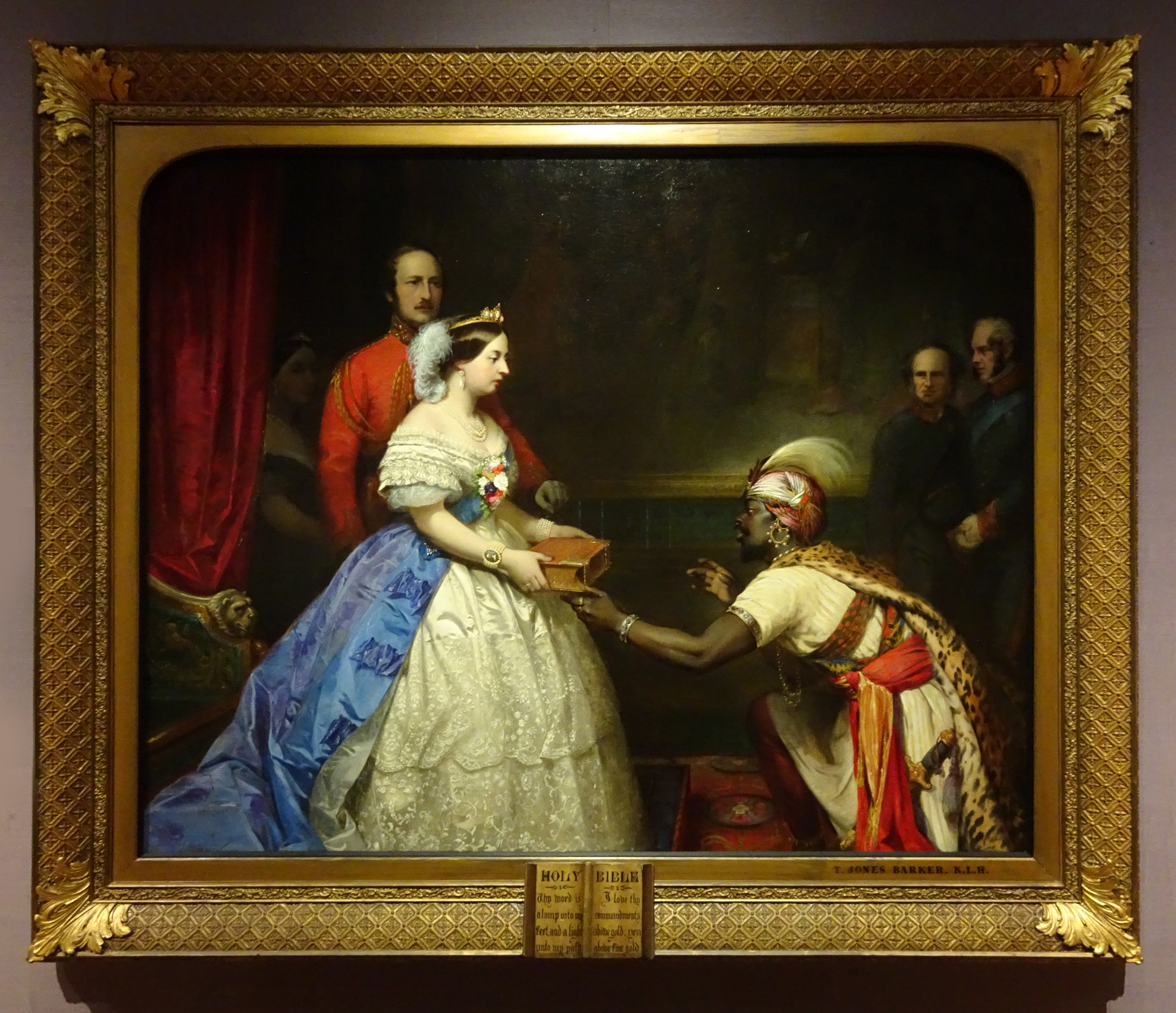
Thomas Jones Barker (1815-82), The secret of England’s greatness, c.1862-63, o/c, 66 x 841/8 ins (167.6 x 213.8 cm.), National Portrait Gallery, London
Monarchs still required regal trophies, but these were usually restricted to one flourish at the top (or bottom) of the frame, and there was the occasional military or historicizing frame produced for some particularly special commission, often – if carved – in Italy.

Emanuel Leutze (1816-68), Washington crossing the Delaware, 1851, o/c, 149 x 255 ins (378.5 x 647.7 cm.), Metropolitan Museum of Art, New York
The most famous 19th century trophy frame to rise above the general dip in such productions was the original setting for Leutze’s Washington crossing the Delaware, an imaginary evocation of an American hero which was given a frame on the same heroic scale as the canvas – itself twelve feet five inches high and more than twenty-one feet across. This brings the consideration of the genre back to its beginnings, as the crest of the frame was a gigantic sculptural military trophy which any Roman might have recognized (although the cannon and ramrod might have given him pause for thought). Very sadly it was reframed around the time of the first World War, and the original must have been sold or broken up; also sadly there seems to be no record of the original framemaker. It was reframed between 2007-11 by the New York firm of Eli Wilner & Co., using photos taken in 1864 by Mathew Brady, also an heroic project [33].
Modernism, in the form of modern art, post-modern art and conceptual art, rarely finds itself in need of anything more than a plain moulding, a strip frame or a shadow box, never mind the elaboration and symbolism inherent in a trophy frame; Leutze’s painting had been reframed in a very simple moulding which it occupied for most of the 20th century.

Thomas Eakins (1844-1916), Professor Henry Rowland, 1897, o/c, 80 ¼ x 54 ins (203.84 x 137.16 cm.), Addison Gallery of American Art, Massachusetts
Possibly even Thomas Eakins’s frame for his portrait of the head of the physics department at John Hopkins University may at first be considered less a trophy frame than an attributive frame, surrounding the painting with inscribed equations and diagrams as appropriate to the subject, but it has the same effect and impetus as the cardinals’ hats and bishop’s mitre do in the three ecclesiastical portraits. The most important diagrams are those at the top and bottom of the frame, which show spectroscopic information generated by Rowland’s improvement of the measuring devices used, allowing the chemical composition of the sun and other stars to be measured far more accurately than before. This invention perhaps equates with the collection of botanical specimens on Elias Ashmole’s frame, or the sheet music and instruments on Handel’s, as an art in itself which added to the knowledge and enjoyment of the physical world.

Gustav Klimt (1862-1918), Josef Pembauer, 1890, o/c, 69 x 55 cm., Tiroler Landesmuseum Ferdinandeum, Innsbruck
Eakins’s frame is very similar, in both structure, technique and decorative symbolism, to the frame painted by Klimt for his portrait of the Austrian composer and conductor, Josef Pembauer. This has the figure of Apollo, god of music and the arts, playing the lyre on the right hand-side, modelled on a red-figure vase, with a tripod for burnt offerings on the left. It is more attributive, perhaps, than it is a trophy frame; by this point the lines between the two were blurred, and the lack of demand for more sculptural settings meant that the attributive frame had all but replaced the trophy frame.

Jean-Léon Gérôme (1824-1904), Enseigne pour un opticien/ Shop sign for an optician, 1902, o/c, 86.3 x 66 cm., private collection
Gérôme’s optician’s sign is perhaps a much more commercial and mundane confection, but, even more than Klimt’s and Eakins’s frames, it contributes to the general joy of the world, as it includes a rather splendid pun in French. The monocle-wearing terrier allows Gérôme to indicate that the shop is to be found ‘Au petit chien’ – or at the sign of the little dog – which is also phonetically the same as the French word ‘opticien’ written on the canvas. The frame is an ordinary stock frame with compo decoration, which has been customized with real magnifying glasses and binoculars in the top corners, and a pair of pince nez with coloured glass at the bottom. At the top centre is the trompe l’oeil of a vast painted eye behind a magnifying glass made out of a hand mirror. It’s a long way from the military trophy frame, but it’s great fun, and it celebrates an important genre of picture frame whilst pricking some of its pomposity.
*******************************************************
[1] Polybius, The histories (2nd century BC); Thucydides, The history of the Peloponnesian War, early 5th century BC; Tacitus, The Annals, early 2nd century AD; Plutarch, Lives of the noble Greeks & Romans (early 2nd century AD).
[2] Giovanni Marcanova; Roberto Valturio, De re militari, 1472; Flavio Biondo, Roma triumphans, c.1472; all noted in Caroline Campbell et al., eds, Mantegna & Bellini, exh. Cat.,National Gallery, London, 2018, p.242 & notes
[3] In this edition, the Dutch coat of arms and title have had the English equivalents glued – very neatly – on top of them.
[4] A better and large-scale version of this very small copy can be seen at Merchants Hall, Society of Merchant-Venturers
[5] See Jacob Simon, ‘Frame studies: II. Allan Ramsay and picture frames’, The Burlington Magazine, vol. 136, no 1096, July 1994, pp. 444-55. There were, of course,
[6] Ibid.; p. 452
[7] See Bruno Pons, ‘Les cadres francais du XVIII siècle et leurs ornaments’, Revue de l’Art,1987 (no 76, pp. 41-50), translated on The Frame Blog as ‘18th century French frames and their ornamentation’
[8] See Neil Jeffares, ‘Framing the Louvre’s pastels’
[9] The design by Lalonde is reproduced in Serge Roche, Cadres du XVe au XVIIIme siècle, Paris, 1931, pl.79. Another copy of Callet’s portrait in a frame to this design is now in the Museo del Prado, Madrid; the history of the Waddesdon version can be found in Sarah Medlam’s ‘Callet’s Portrait of Louis XVI: A picture frame as diplomatic tool,’ Furniture History, vol. 43, 2007, pp.143-54, where Buteux’s 1780 design is reproduced (fig. 2)
[10] Medlam, ibid., pp. 146-47
[11] Survey of London, quoting E. Hatton, A New View of London, 1708, vol. i, p. 298, and The Diary of John Evelyn, ed. E. S. de Beer, 1955, vol. iv, p. 397
[12] See Jacob Simon, The art of the picture frame, National Portrait Gallery, London, 1996; entry for no. 37, Hudson’s portrait of Handel, p.160, which notes not only that the trophy on Handel’s frame is based on a design by Jacques Dumont, but that the same design was used in the Music Room of Norfolk House, London. (now installed in the V & A). Dumont’s drawings were engraved (or etched) by Jacques-François Blondel, and published by Gabriel Huquier.
[13] Ibid., entry no. 36, pp. 159-60
[14] Ibid.; see note 12
[15] See P.J.J. van Thiel & C. J. de Bruyn Kops, Prijst de lijst, 1995, Rijksmuseum; translated by Dr Andrew McCormick for John Davies Framing Ltd., as Framing in the Golden Age, 1995, UK, pp. 273-74
[16] Ibid., and see pp. 300-01, & pp. 307-08
[17] See Peter Schade, ‘Dresden Gallery frames’ on the National Portrait Gallery website
[18] Framing in the Golden Age, op. cit., p. 28
[19] Ibid., note 7, p. 38
[20] All the information on the Visserij-bord is taken from Scott A. Sullivan, ‘Abraham van Beyeren’s Visserij-bord in the Groote Kerk, Maassluis’, Oud Holland, vol. 101, no. 2, 1987, pp. 115-25
[21] Ibid., p. 123
[22] A cross of Anjou, after the Vraie Croix d’Anjou, made from a piece of the true Cross
[23] ‘Where do Londoners come from?’, Pocket histories, Museum of London. See also the last remaining French Protestant Church of London
[24] As well as Jacob Simon’s entry for Paul Petit in the Directory of British Picture Framemakers , he is the subject of Geoffrey Beard, ‘William Kent and the Royal Barge’, Burlington Magazine, vol. CXII, August 1970, pp. 488-95; David Buttery, ‘The picture frames of Paul Petit and Frederick, Prince of Wales’, Apollo, vol. CXXVI, 1987, pp. 12-15; Louis Frederick & Oliver Millar, Frederick, Prince of Wales, & his circle, exh. cat., Gainsborough’s House, Sudbury, Suffolk, 1981; David Oakey, ‘A royal frame of colossal scale…’, Carlton Hobbs LLC; Kimerly Rorschach, ‘Frederick, Prince of Wales (1707-51) as collector & patron’, The Volume of the Walpole Society, vol. 55, 1989-90, pp. 1-76
[25] ‘The Leicester House Faction’, The history of Parliament
[27] Desmond Fitzgerald, Knight of Glin, et al., Irish furniture: woodwork and carving in Ireland from the earliest times to the Act of Union, Yale University Press, 2007, note 95, p. 309
[28] Quoted from Oliver Millar, The Tudor, Stuart and early Georgian pictures in the collection of Her Majesty the Queen, 1963. The Trinity College frame is due to be photographed in detail; at the moment this is the best image on offer (it is hung quite high)
[29] Kimerly Rorschach, op. cit., p.3 35, notes that these portraits were given to Lady Archibald Hamilton. The latter was mother of the 1st Countess of Warwick, which explains how they have ended up in Warwick Castle.
[30] Ibid. The quotation is taken from the household accounts of Frederick, Prince of Wales, in the Duchy of Cornwall Office.
[31] The portrait of the prince’s wife is surrounded with figures of Fame blowing a trumpet, Eros, palm branches, eagles, and rampant putti.
[32] David Oakey & Carlton Hobbs, op. cit., and see ‘Two Fredericks and a Frame: a rediscovered giltwood masterpiece by Paul Petit’, Furniture History, vol. LI (2015), pp. 87-104, and a summary of this in ‘Reframing a Frame: New Discoveries on a Masterpiece of English Giltwood’, Newsletter: The Furniture History Society, no. 194, May 2014, p. 4
[33] See Eli Wilner & Suzanne Smeaton, ‘Setting a jewel: Recreating the original frame for Washington Crossing the Delaware’, reprinted from
The Metropolitan Museum of Art Bulletin, v. 69, no. 2, Autumn 2011, p. 2

Louis XIV giltwood trophy frame with antique looking-glass, Christie’s, 6 December 2012
